# 安装包
if (!requireNamespace("dplyr", quietly = TRUE)) {
  install.packages("dplyr")
}
if (!requireNamespace("ggplot2", quietly = TRUE)) {
  install.packages("ggplot2")
}
if (!requireNamespace("gapminder", quietly = TRUE)) {
  install.packages("gapminder")
}
if (!requireNamespace("hrbrthemes", quietly = TRUE)) {
  install.packages("hrbrthemes")
}
if (!requireNamespace("viridis", quietly = TRUE)) {
  install.packages("viridis")
}

# 加载包
library(dplyr)
library(ggplot2)
library(gapminder) # 是一个 R 语言的数据包,它提供了来自 Gapminder.org 的数据摘要。这些数据包括了 142 个国家从 1952 年到 2007 年每五年的生命期望值、人均 GDP 和人口数据。
library(hrbrthemes)
library(viridis)气泡图
气泡图是一种散点图,其中第三个数值变量映射到圆圈大小。本文介绍了使用 R 构建气泡图的几种方法。
示例
环境配置
系统要求: 跨平台(Linux/MacOS/Windows)
编程语言:R
依赖包:
dplyr,ggplot2,gapminder,hrbrthemes,viridis
sessioninfo::session_info("attached")─ Session info ───────────────────────────────────────────────────────────────
setting value
version R version 4.6.0 (2026-04-24)
os Ubuntu 24.04.4 LTS
system x86_64, linux-gnu
ui X11
language (EN)
collate C.UTF-8
ctype C.UTF-8
tz UTC
date 2026-05-09
pandoc 3.1.3 @ /usr/bin/ (via rmarkdown)
quarto 1.9.37 @ /usr/local/bin/quarto
─ Packages ───────────────────────────────────────────────────────────────────
package * version date (UTC) lib source
dplyr * 1.2.1 2026-04-03 [1] RSPM
gapminder * 1.0.1 2025-06-12 [1] RSPM
ggplot2 * 4.0.3.9000 2026-05-04 [1] Github (tidyverse/ggplot2@6870419)
hrbrthemes * 0.9.2 2026-05-04 [1] Github (hrbrmstr/hrbrthemes@45ac19c)
viridis * 0.6.5 2024-01-29 [1] RSPM
viridisLite * 0.4.3 2026-02-04 [1] RSPM
[1] /home/runner/work/_temp/Library
[2] /opt/R/4.6.0/lib/R/site-library
[3] /opt/R/4.6.0/lib/R/library
* ── Packages attached to the search path.
──────────────────────────────────────────────────────────────────────────────数据准备
主要运用 R 内置的 iris 数据集,TCGA 数据库和 gapminder 内置数据集。
# R内置的data——iris
head(iris)
Sepal.Length Sepal.Width Petal.Length Petal.Width Species
1 5.1 3.5 1.4 0.2 setosa
2 4.9 3.0 1.4 0.2 setosa
3 4.7 3.2 1.3 0.2 setosa
4 4.6 3.1 1.5 0.2 setosa
5 5.0 3.6 1.4 0.2 setosa
6 5.4 3.9 1.7 0.4 setosa# TCGA数据库(运用2020年肺癌的临床数据)
TCGA_clinic <- readr::read_tsv("https://bizard-1301043367.cos.ap-guangzhou.myqcloud.com/raponi2006_public_raponi2006_public_clinicalMatrix.gz")
TCGA_clinic$T <- as.factor(TCGA_clinic$T)
# gapminder包
data <- gapminder %>%
filter(year=="2007") %>%
dplyr::select(-year)可视化
1. 基本绘图
# 以iris数据为例
p <- ggplot(iris, aes(x=Sepal.Length, y=Sepal.Width, size = Species)) +
  geom_point(alpha=0.4)

p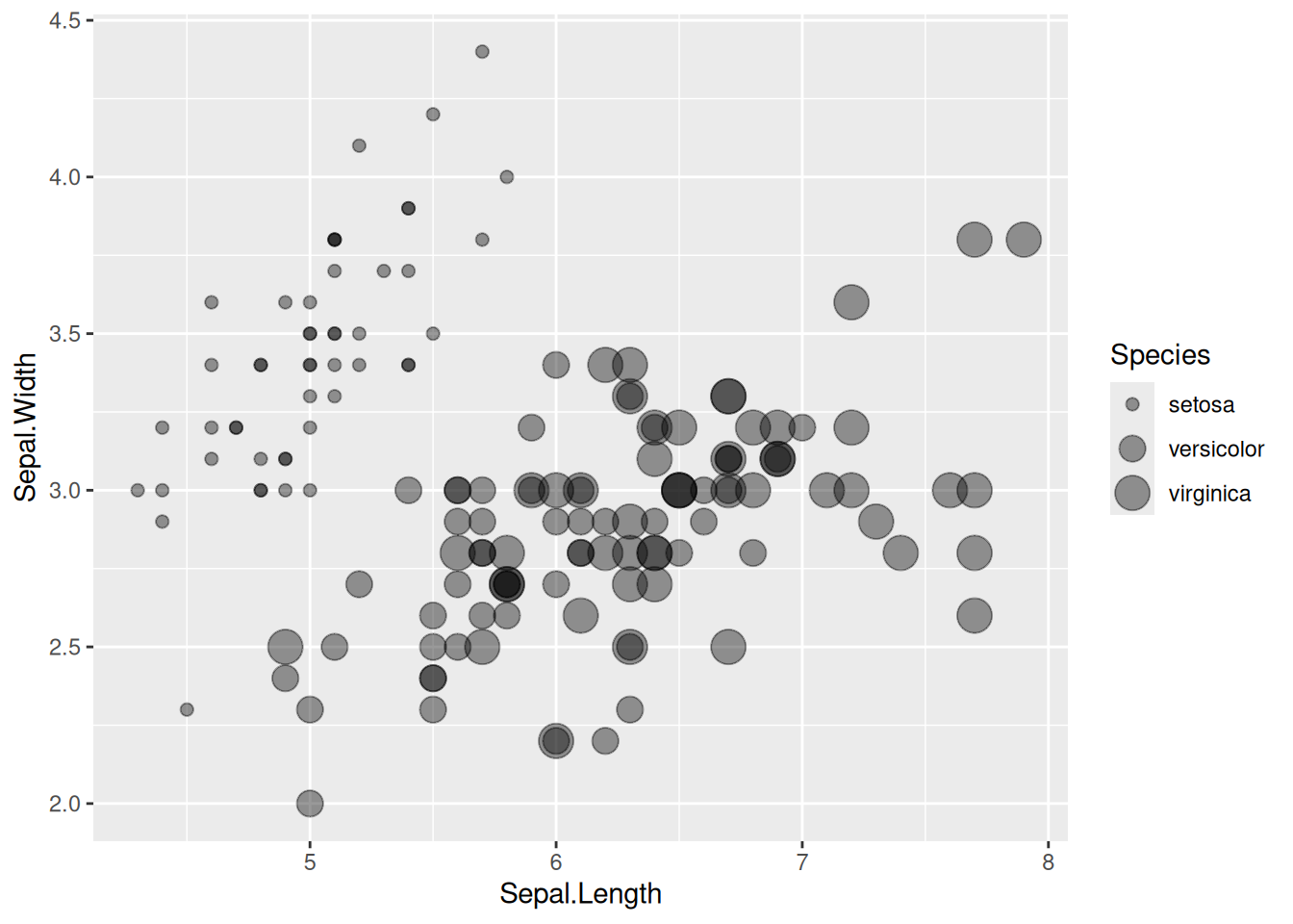
这个气泡图描述了不同物种间Sepal.Length变量与Sepal.Width变量之间的关系。
2. 改变颜色
# 改变颜色
p <- ggplot(iris, aes(x=Sepal.Length, y=Sepal.Width, size=Species,color=Species)) +
  geom_point(alpha=0.3)

p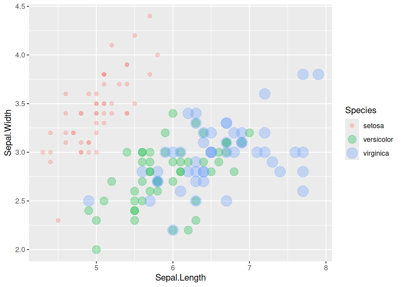
这个气泡图描述了不同物种间Sepal.Length变量与Sepal.Width`变量之间的关系。
3. 改变圆圈大小的范围
# 以TCGA数据为例
p <- TCGA_clinic %>%
  arrange(desc(Age)) %>%
  ggplot(aes(x=T, y=OS.time, size = Age,color=Age)) +
  geom_point(alpha=0.4) +
  scale_size(range = c(.1, 12), name="Age")

p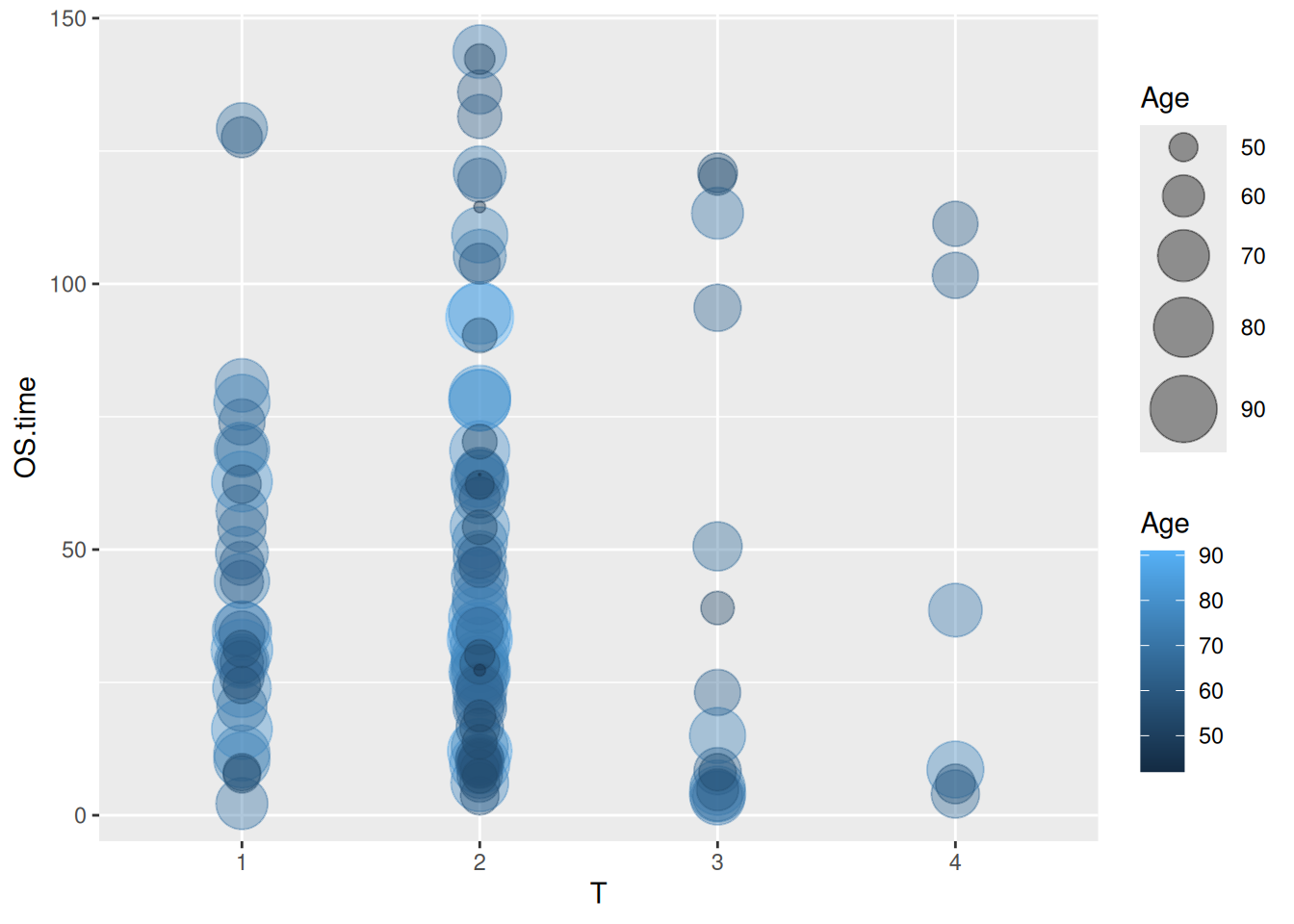
这个气泡图描述了不同肿瘤T分期中年龄与OS.time变量的关系。
4. 精细化图片
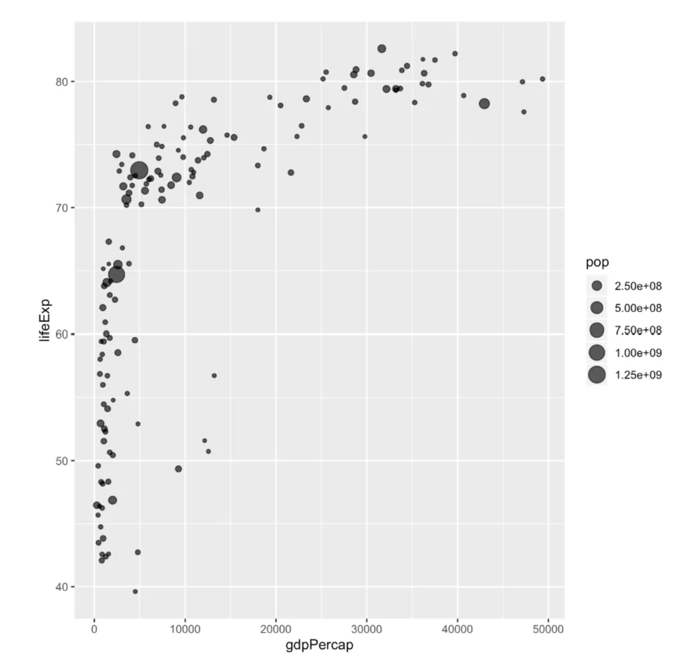
# 以gapminder包里面的数据为例
p <- data %>%
  arrange(desc(pop)) %>%
  mutate(country = factor(country, country)) %>%
  ggplot(aes(x=gdpPercap, y=lifeExp, size=pop, fill=continent)) +
  geom_point(alpha=0.5, shape=21, color="black") +
  scale_size(range = c(.1, 24), name="Population (M)") +
  scale_fill_viridis(discrete=TRUE, guide=FALSE, option="A") +
  theme_ipsum() +
  theme(legend.position="bottom") +
  ylab("Life Expectancy") +
  xlab("Gdp per Capita") +
  theme(legend.position = "none")

p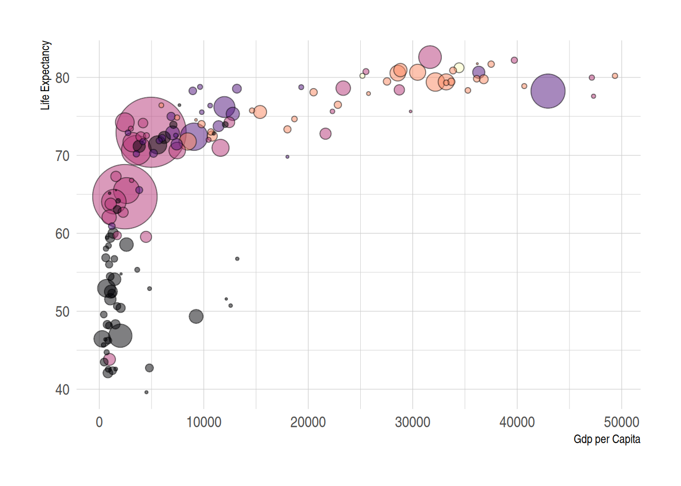
这个气泡图描述了世界各国预期寿命(y)与人均国内生产总值(x)之间的关系。
应用场景
1. 气泡图用于展示KEGG通路富集分析
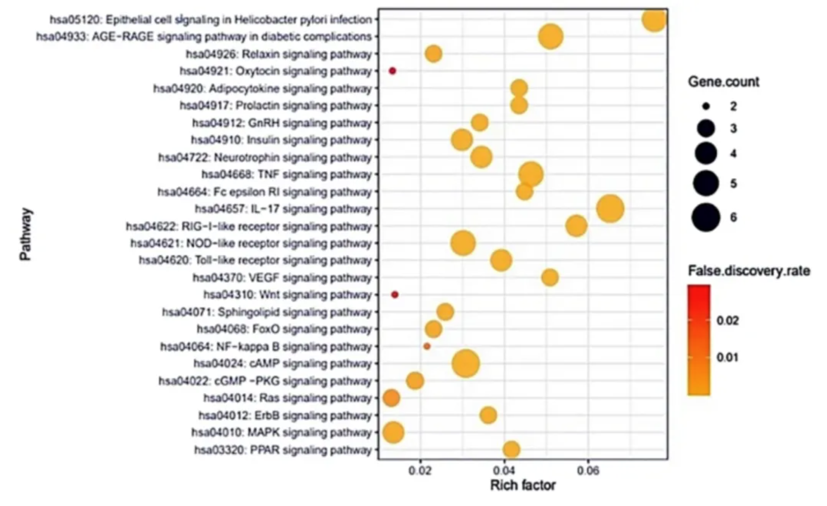
这个气泡图展示了与新冠肺炎发生和进展相关的26种信号通路。[1]
2. 气泡图可用于多变量数据展示
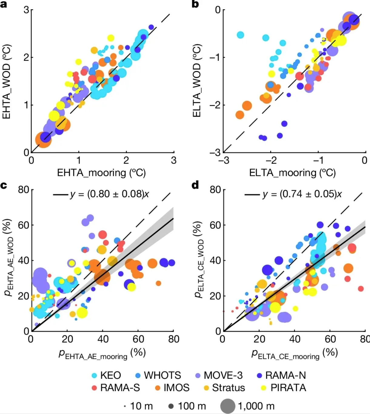
这个气泡图展示了根据系泊观测和历史温度剖面测量估计的极端温度异常之间的一致性。a、 根据系泊点估算的第95百分位EHTA气泡图和以系泊点为中心的5×5°网格框内的相应历史温度分布测量值。颜色表示来自不同地点的观测结果,点的大小表示10至1000米的观测深度。b与a相同,但适用于第5百分位ELTA。请注意,未绘制低于-3°C的ELTA(在KEO现场)。c、 d,与a(c)和b(d)相同,但AE(c)内观察到的EHTA测量值和CE(d)内观察的ELTA测量值的百分比(p)不同。带有灰色阴影的实心黑线表示具有95%置信水平的相应线性回归。[2]
参考文献
[1] Oh KK, Adnan M, Cho DH. Network pharmacology approach to decipher signaling pathways associated with target proteins of NSAIDs against COVID-19. Sci Rep. 2021 May 5;11(1):9606. doi: 10.1038/s41598-021-88313-5. PMID: 33953223; PMCID: PMC8100301.
[2] He Q, Zhan W, Feng M, Gong Y, Cai S, Zhan H. Common occurrences of subsurface heatwaves and cold spells in ocean eddies. Nature. 2024 Oct;634(8036):1111-1117. doi: 10.1038/s41586-024-08051-2. Epub 2024 Oct 16. PMID: 39415017; PMCID: PMC11525169.
[3] Wickham, H. (2016). ggplot2: Elegant Graphics for Data Analysis. Springer-Verlag New York. https://ggplot2.tidyverse.org
[4] Bryan, J. (2023). gapminder: Data from Gapminder (Version 1.0.0). Retrieved from https://CRAN.R-project.org/package=gapminder
[5] Wickham, H. (2017). dplyr: A Grammar of Data Manipulation (Version 0.7.4). Retrieved from https://CRAN.R-project.org/package=dplyr
[6] Rudis, B. (2017). hrbrthemes: Additional Themes, Theme Components and Utilities for ‘ggplot2’ (Version 0.8.7). Retrieved from https://github.com/hrbrmstr/hrbrthemes
[7] Ross, N., & Garnier, S. (2016). viridis: Default Color Maps for ‘ggplot2’. Retrieved from https://cran.r-project.org/web/packages/viridis/index.html