# install packages
if (!requireNamespace("remotes", quietly = TRUE)) {
  install.packages("remotes")
}

if (!requireNamespace("survival", quietly = TRUE)) {
  install.packages("survival")
}

if (!requireNamespace("survminer", quietly = TRUE)) {
  install.packages("survminer")
}

if (!requireNamespace("ggplot2", quietly = TRUE)) {
  remotes::install_github("tidyverse/ggplot2")
}

if (!requireNamespace("dplyr", quietly = TRUE)) {
  install.packages("dplyr")
}

if (!requireNamespace("tidyr", quietly = TRUE)) {
  install.packages("tidyr")
}

if (!requireNamespace("zoo", quietly = TRUE)) {
  install.packages("zoo")
}

if (!requireNamespace("patchwork", quietly = TRUE)) {
  install.packages("patchwork")
}

# load packages
library("remotes")
library("survival")
library("survminer")
## Loading required package: ggplot2
## Loading required package: ggpubr
##
## Attaching package: 'survminer'
## The following object is masked from 'package:survival':
##
##     myeloma
library("ggplot2")
library("dplyr")
##
## Attaching package: 'dplyr'
## The following objects are masked from 'package:stats':
##
##     filter, lag
## The following objects are masked from 'package:base':
##
##     intersect, setdiff, setequal, union
library("tidyr")
library("zoo")
##
## Attaching package: 'zoo'
## The following objects are masked from 'package:base':
##
##     as.Date, as.Date.numeric
library("patchwork")KM 曲线
示例
生存分析研究的是某个事件发生之前过去的时间,在临床研究中最常见的应用就是死亡率的估计(预测患者的生存时间),不过生存分析也可以应用于其他领域如机械故障时间等。
环境配置
系统要求: ## 跨平台(Linux/MacOS/Windows)
编程语言: R
依赖包:
remotes,survival,survminer,ggplot2,dplyr,tidyr,zoo, andpatchwork
sessioninfo::session_info("attached")─ Session info ───────────────────────────────────────────────────────────────
setting value
version R version 4.6.0 (2026-04-24)
os Ubuntu 24.04.4 LTS
system x86_64, linux-gnu
ui X11
language (EN)
collate C.UTF-8
ctype C.UTF-8
tz UTC
date 2026-05-09
pandoc 3.1.3 @ /usr/bin/ (via rmarkdown)
quarto 1.9.37 @ /usr/local/bin/quarto
─ Packages ───────────────────────────────────────────────────────────────────
package * version date (UTC) lib source
dplyr * 1.2.1 2026-04-03 [1] RSPM
ggplot2 * 4.0.3.9000 2026-05-04 [1] Github (tidyverse/ggplot2@6870419)
ggpubr * 0.6.3 2026-02-24 [1] RSPM
patchwork * 1.3.2 2025-08-25 [1] RSPM
remotes * 2.5.0 2024-03-17 [1] RSPM
survival * 3.8-6 2026-01-16 [3] CRAN (R 4.6.0)
survminer * 0.5.2 2026-02-25 [1] RSPM
tidyr * 1.3.2 2025-12-19 [1] RSPM
zoo * 1.8-15 2025-12-15 [1] RSPM
[1] /home/runner/work/_temp/Library
[2] /opt/R/4.6.0/lib/R/site-library
[3] /opt/R/4.6.0/lib/R/library
* ── Packages attached to the search path.
──────────────────────────────────────────────────────────────────────────────数据准备
# 使用内置lung数据集(来自survival包)
data("lung", package = "survival")
# 数据预处理
surv_data <- lung %>%
  mutate(
    status = ifelse(status == 2, 1, 0),  # 转换状态编码(1=事件)
    sex = factor(sex, labels = c("Male", "Female")),
    group = sample(c("Treatment", "Placebo"), n(), replace = TRUE)
  )

# 查看数据结构
glimpse(surv_data)
Rows: 228
Columns: 11
$ inst <dbl> 3, 3, 3, 5, 1, 12, 7, 11, 1, 7, 6, 16, 11, 21, 12, 1, 22, 16…
$ time <dbl> 306, 455, 1010, 210, 883, 1022, 310, 361, 218, 166, 170, 654…
$ status <dbl> 1, 1, 0, 1, 1, 0, 1, 1, 1, 1, 1, 1, 1, 1, 1, 1, 1, 1, 1, 1, …
$ age <dbl> 74, 68, 56, 57, 60, 74, 68, 71, 53, 61, 57, 68, 68, 60, 57, …
$ sex <fct> Male, Male, Male, Male, Male, Male, Female, Female, Male, Ma…
$ ph.ecog <dbl> 1, 0, 0, 1, 0, 1, 2, 2, 1, 2, 1, 2, 1, NA, 1, 1, 1, 2, 2, 1,…
$ ph.karno <dbl> 90, 90, 90, 90, 100, 50, 70, 60, 70, 70, 80, 70, 90, 60, 80,…
$ pat.karno <dbl> 100, 90, 90, 60, 90, 80, 60, 80, 80, 70, 80, 70, 90, 70, 70,…
$ meal.cal <dbl> 1175, 1225, NA, 1150, NA, 513, 384, 538, 825, 271, 1025, NA,…
$ wt.loss <dbl> NA, 15, 15, 11, 0, 0, 10, 1, 16, 34, 27, 23, 5, 32, 60, 15, …
$ group <chr> "Treatment", "Treatment", "Treatment", "Treatment", "Treatme…# 生存时间分布
summary(surv_data$time) Min. 1st Qu. Median Mean 3rd Qu. Max.
5.0 166.8 255.5 305.2 396.5 1022.0 # 拟合生存曲线
fit <- survfit(Surv(time, status) ~ group, data = surv_data)
# 提取曲线数据
surv_curve <- surv_summary(fit)
# 计算log-rank检验P值
diff <- survdiff(Surv(time, status) ~ group, data = surv_data)
p_value <- signif(1 - pchisq(diff$chisq, length(diff$n)-1), 3)可视化
1. 基础绘图
使用基础函数绘制图片的图注和简介。
# 基础生存曲线
p1 <- ggplot(surv_curve, aes(x = time, y = surv, color = strata)) +
  geom_step(linewidth = 1) +
  labs(x = "Time (Months)", y = "Survival Probability") +
  scale_y_continuous(labels = scales::percent)
p1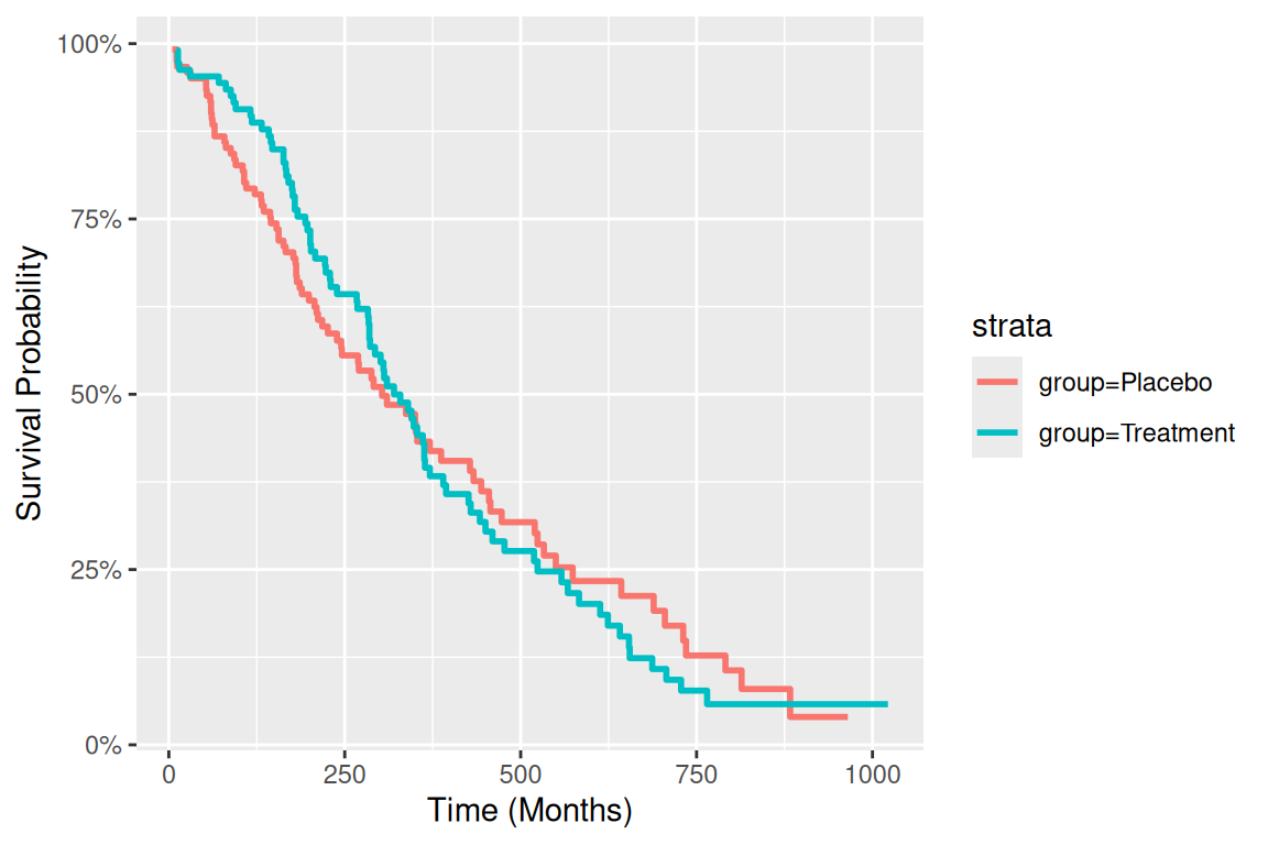
# 代码示例(以补充参数bins为例)-----
## 自定义美学映射
group_colors <- c("Treatment" = "#E64B35", "Placebo" = "#3182BD")
line_types <- c("Treatment" = "solid", "Placebo" = "dashed")

# 完整绘图代码
p_km <- ggplot(surv_curve, aes(x = time, color = group, fill = group)) +
      # 先绘制置信区间
      geom_ribbon(aes(ymin = lower, ymax = upper),
                  alpha = 0.15,
                  colour = NA) +
      # 再绘制生存曲线
      geom_step(aes(y = surv, linetype = group),
                linewidth = 1.2) +
      # 颜色映射
      scale_color_manual(
        values = group_colors,
        name = "Treatment Group",
        labels = c("Placebo", "Treatment")
      ) +
      # 填充色映射
      scale_fill_manual(
        values = group_colors,
        guide = "none"
      ) +
      # 线型映射
      scale_linetype_manual(
        values = line_types,
        guide = "none"  # 与颜色共用图例
      ) +
      # 坐标轴优化
      scale_x_continuous(
        name = "Time (Months)",
        expand = c(0, 0),
        breaks = seq(0, 1000, by = 100)
      ) +
      scale_y_continuous(
        name = "Survival Probability",
        labels = scales::percent,
        limits = c(0, 1)
      ) +
      # 主题设置
      theme_classic(base_size = 12) +
      theme(
        legend.position = c(0.85, 0.85),
        legend.background = element_rect(fill = "white", colour = "grey50"),
        panel.grid.major.y = element_line(colour = "grey90")
      )
p_km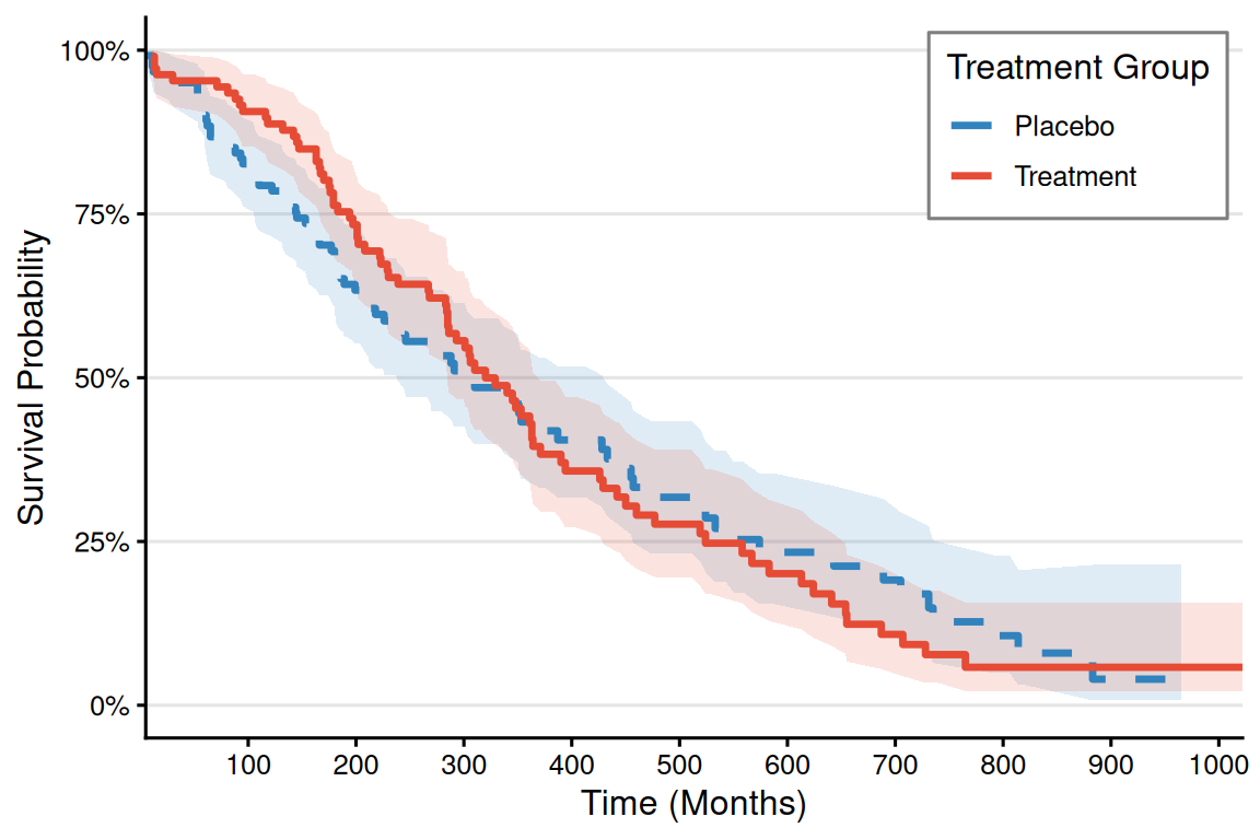
2. 更多进阶图表
# ----------------------------
# 风险表数据生成
# ----------------------------
# 生成分位数断点(自动适应数据分布)
custom_breaks <- quantile(surv_curve$time,
                          probs = seq(0, 1, 0.25),
                          na.rm = TRUE) %>%
  unique()  # 确保断点唯一

# 正确生成区间标签的方法
time_labels <- paste0(
  round(custom_breaks[-length(custom_breaks)]),  # 起始点(排除最后一个)
  "-",
  round(custom_breaks[-1])  # 结束点(排除第一个)
)

# 生成分段式风险表数据 --------------------------------------------------------
risk_table_segmented <- surv_curve %>%
  mutate(
    time_interval = cut(time,
                        breaks = custom_breaks,
                        include.lowest = TRUE,
                        right = FALSE,
                        labels = time_labels)
  ) %>%
  group_by(group, time_interval) %>%
  summarise(
    n_risk = ifelse(all(is.na(n.risk)), 0, max(n.risk, na.rm = TRUE)),  # 取区间内最大风险人数
    .groups = "drop"
  ) %>%
  complete(group, time_interval, fill = list(n_risk = 0)) %>%
  # 4. 添加总计行(修复语法)
  bind_rows(
    group_by(., group) %>%
      summarise(
        time_interval = "Total",
        n_risk = sum(n_risk, na.rm = TRUE),
        .groups = "drop"
      )
  ) %>%
  mutate(
    group = factor(group, levels = c("Treatment", "Placebo")),
    time_interval = factor(time_interval, levels = c(time_labels, "Total") )
  )

# 带边框的分段式风险表绘图 ----------------------------------------------------
risk_table_plot <- ggplot(risk_table_segmented,
                          aes(x = time_interval, y = group)) +
  # # 单元格背景(带边框)
  # geom_tile(color = "gray50", fill = "white", linewidth = 0.5,
  #           width = 0.95, height = 0.95) +
  # 数值标签
  geom_text(aes(label = n_risk), size = 4.5, fontface = "bold", color = "black") +
  # 列标题样式
  scale_x_discrete(
    name = "Time Interval (Months)",
    position = "top",
    expand = expansion(add = 0.5)
  ) +
  scale_y_discrete(
    name = NULL,
    limits = rev,
    labels = c("Treatment\nGroup", "Placebo\nGroup")  # 添加分组标签
  ) +
  # 颜色系统
  scale_fill_manual(values = group_colors, guide = "none") +
  # 主题系统
  theme_minimal(base_size = 12) +
  theme(
    axis.text.x = element_text(angle = 45, hjust = 0, color = "black"),
    axis.text.y = element_text(
      color = group_colors,
      face = "bold",
      margin = margin(r = 15)
    ),
    panel.grid = element_blank(),
    plot.margin = margin(t = 30, b = 5, unit = "pt"),
    axis.title.x = element_text(margin = margin(t = 15))
  ) +
  # 添加外边框
  annotate("rect",
           xmin = -Inf, xmax = Inf, ymin = -Inf, ymax = Inf,
           color = "gray30", fill = NA, linewidth = 0.8)
risk_table_plot

# ----------------------------
# 绘图参数设置
# ----------------------------
group_colors <- c("Treatment" = "#E64B35", "Placebo" = "#3182BD")
theme_set(theme_minimal(base_size = 12))

# ----------------------------
# KM生存曲线绘制
# ----------------------------
p_km <- ggplot(surv_curve, aes(x = time, color = group, fill = group)) +
  # 先绘制置信区间
  geom_ribbon(aes(ymin = lower, ymax = upper),
              alpha = 0.15,
              colour = NA) +
  # 再绘制生存曲线
  geom_step(aes(y = surv, linetype = group),
            linewidth = 1.2) +
  # 颜色映射
  scale_color_manual(
    values = group_colors,
    name = "Treatment Group",
    labels = c("Placebo", "Treatment")
  ) +
  # 填充色映射
  scale_fill_manual(
    values = group_colors,
    guide = "none"
  ) +
  # 线型映射
  scale_linetype_manual(
    values = line_types,
    guide = "none"  # 与颜色共用图例
  ) +
  # 坐标轴优化
  scale_x_continuous(
    name = "Time (Months)",
    expand = c(0, 0),
    breaks = seq(0, 1000, by = 100)
  ) +
  scale_y_continuous(
    name = "Survival Probability",
    labels = scales::percent,
    limits = c(0, 1)
  ) +
  # 主题设置
  theme_classic(base_size = 12) +
  theme(
    legend.position = c(0.85, 0.85),
    legend.background = element_rect(fill = "white", colour = "grey50"),
    panel.grid.major.y = element_line(colour = "grey90")
  )
p_km

# ----------------------------
# 图形组合
# ----------------------------
final_plot <- p_km / risk_table_plot +
  plot_layout(heights = c(3, 0.4))

final_plot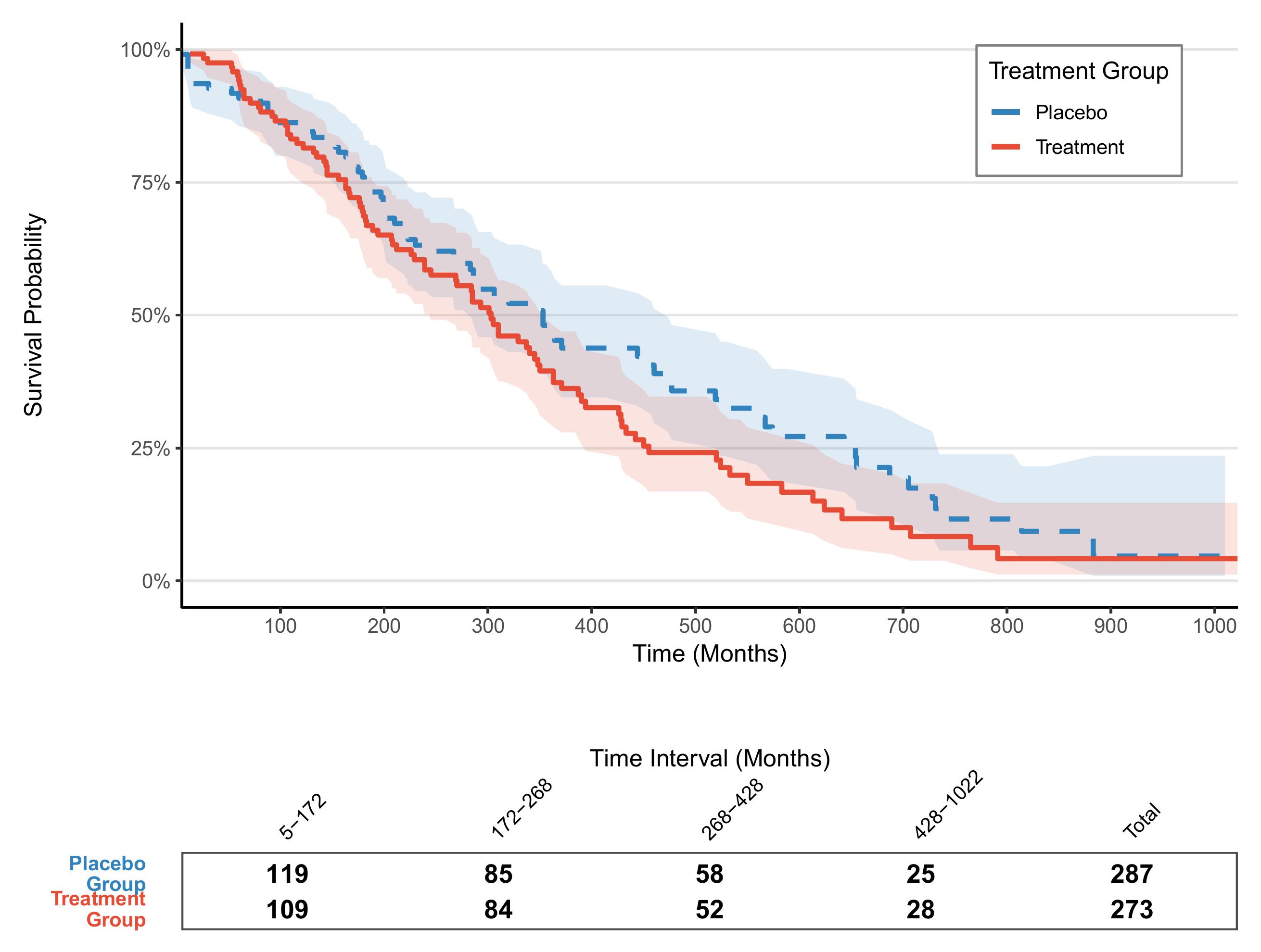
应用场景
1. 疾病分布
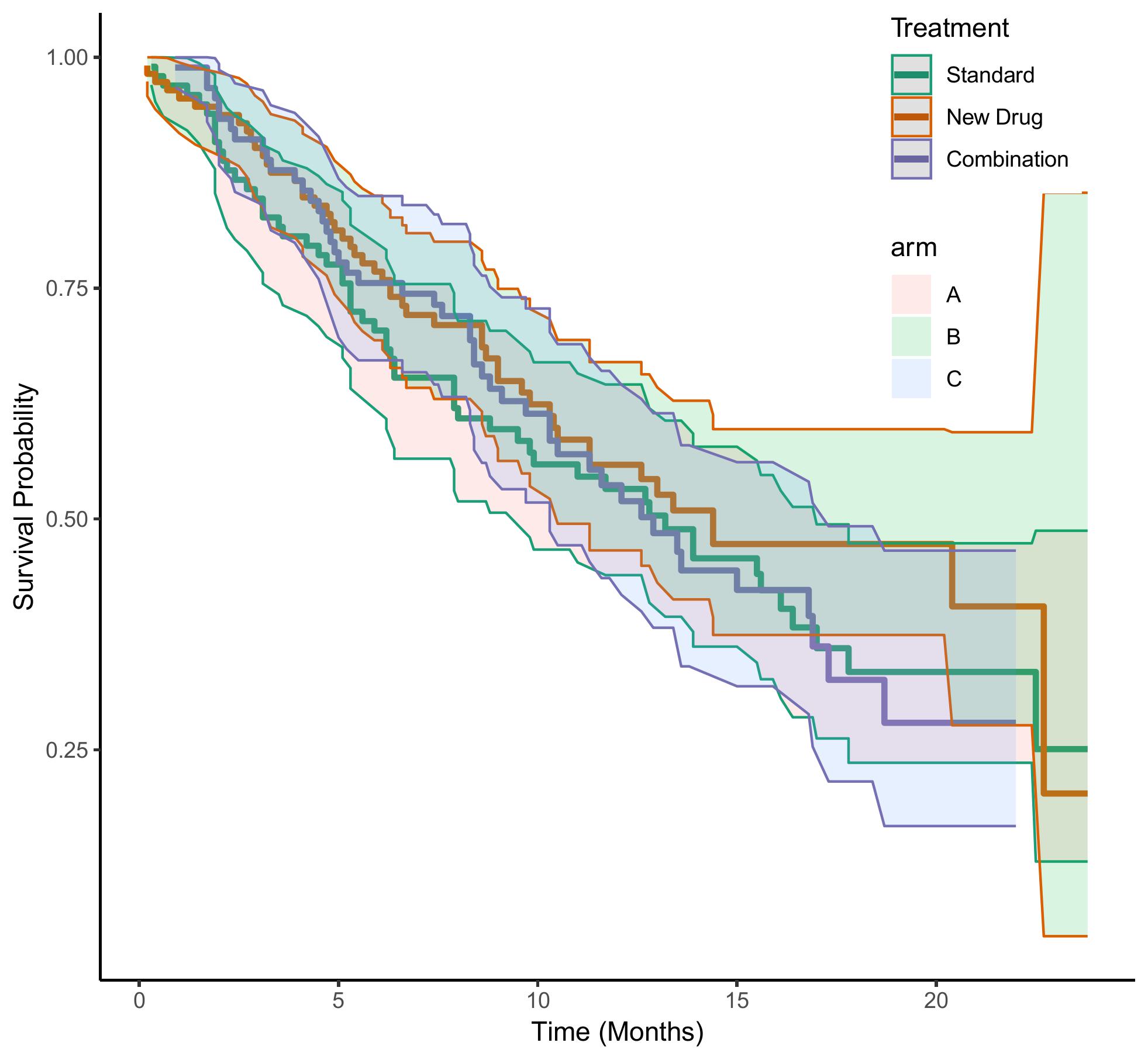
该图展示了 Standard、New Drug、Combination 三组数据之间的生成生存时间比较。
参考文献
[1] Kassambara A, et al. Survminer: Drawing Survival Curves using ggplot2. JOSS 2017
[2] Wickham H. ggplot2: Elegant Graphics for Data Analysis. Springer 2016