# 安装包
if (!requireNamespace("ggplot2", quietly = TRUE)) {
  install.packages("ggplot2")
}
if (!requireNamespace("dplyr", quietly = TRUE)) {
  install.packages("dplyr")
}
if (!requireNamespace("tidyverse", quietly = TRUE)) {
  install.packages("tidyverse")
}
if (!requireNamespace("viridis", quietly = TRUE)) {
  install.packages("viridis")
}
if (!requireNamespace("hrbrthemes", quietly = TRUE)) {
  install.packages("hrbrthemes")
}
if (!requireNamespace("babynames", quietly = TRUE)) {
  install.packages("babynames")
}
if (!requireNamespace("plotly", quietly = TRUE)) {
  install.packages("plotly")
}

# 加载包
library(ggplot2)
library(dplyr)
library(tidyverse)
library(viridis)
library(hrbrthemes)
library(babynames)
library(plotly)堆叠面积图
堆叠面积图和基本面积图一样,唯一区别就是图上每一个数据集的起点是基于前一个数据集的,用于显示每个数值所占大小随时间或类别变化的趋势线,展示的是部分与整体的关系。
示例
环境配置
系统要求: 跨平台(Linux/MacOS/Windows)
编程语言:R
依赖包:
ggplot2;dplyr;tidyverse;viridis;hrbrthemes;babynames;plotly
sessioninfo::session_info("attached")─ Session info ───────────────────────────────────────────────────────────────
setting value
version R version 4.6.0 (2026-04-24)
os Ubuntu 24.04.4 LTS
system x86_64, linux-gnu
ui X11
language (EN)
collate C.UTF-8
ctype C.UTF-8
tz UTC
date 2026-05-09
pandoc 3.1.3 @ /usr/bin/ (via rmarkdown)
quarto 1.9.37 @ /usr/local/bin/quarto
─ Packages ───────────────────────────────────────────────────────────────────
package * version date (UTC) lib source
babynames * 1.0.1 2021-04-12 [1] RSPM
dplyr * 1.2.1 2026-04-03 [1] RSPM
forcats * 1.0.1 2025-09-25 [1] RSPM
ggplot2 * 4.0.3.9000 2026-05-04 [1] Github (tidyverse/ggplot2@6870419)
hrbrthemes * 0.9.2 2026-05-04 [1] Github (hrbrmstr/hrbrthemes@45ac19c)
lubridate * 1.9.5 2026-02-04 [1] RSPM
plotly * 4.12.0 2026-01-24 [1] RSPM
purrr * 1.2.2 2026-04-10 [1] RSPM
readr * 2.2.0 2026-02-19 [1] RSPM
stringr * 1.6.0 2025-11-04 [1] RSPM
tibble * 3.3.1 2026-01-11 [1] RSPM
tidyr * 1.3.2 2025-12-19 [1] RSPM
tidyverse * 2.0.0 2023-02-22 [1] RSPM
viridis * 0.6.5 2024-01-29 [1] RSPM
viridisLite * 0.4.3 2026-02-04 [1] RSPM
[1] /home/runner/work/_temp/Library
[2] /opt/R/4.6.0/lib/R/site-library
[3] /opt/R/4.6.0/lib/R/library
* ── Packages attached to the search path.
──────────────────────────────────────────────────────────────────────────────数据准备
主要利用R包自带数据集和新冠感染数据进行绘图,data_covi19新冠感染数据来自GISAID数据库。
# data_WorldPhones
data_WorldPhones <- as.data.frame(WorldPhones)
data_WorldPhones <- rownames_to_column(data_WorldPhones,"year")
data_WorldPhones <- data_WorldPhones %>%
  gather(key = "area",value = "Phones",-"year" )
data_WorldPhones$year <- as.numeric(data_WorldPhones$year)

# data_USPersonalExpenditure
data_USPersonalExpenditure <- USPersonalExpenditure
data_USPersonalExpenditure <- as.data.frame(data_USPersonalExpenditure)
data_USPersonalExpenditure <- rownames_to_column(data_USPersonalExpenditure,"type")
data_USPersonalExpenditure <- data_USPersonalExpenditure %>%
  gather(key = "year",value = "expense",-"type" )
data_USPersonalExpenditure$year <- as.numeric(data_USPersonalExpenditure$year)

# data_baby
data_baby <- babynames %>%
  filter(name %in% c("Ashley", "Amanda", "Jessica", "Patricia", "Linda", "Deborah",   "Dorothy", "Betty", "Helen")) %>%
  filter(sex=="F")

# data_covi19
data_covi19 <- readr::read_csv("https://bizard-1301043367.cos.ap-guangzhou.myqcloud.com/data_covi19.csv")
data_covi19$date <- c(6:12)
data_covi19 <- gather(data_covi19, key = "area", value = "cases", 2:7)
可视化
1. 基础堆叠面积图
以WorldPhones数据集为例
#基础堆叠面积图----
options(scipen = 20)#不使用科学计数法
p <- ggplot(data_WorldPhones, aes(x=year, y=Phones, fill=area)) +
  geom_area()+
  scale_y_continuous(limits = c(0, 150000),
                     breaks = seq(0, 150000,50000))

p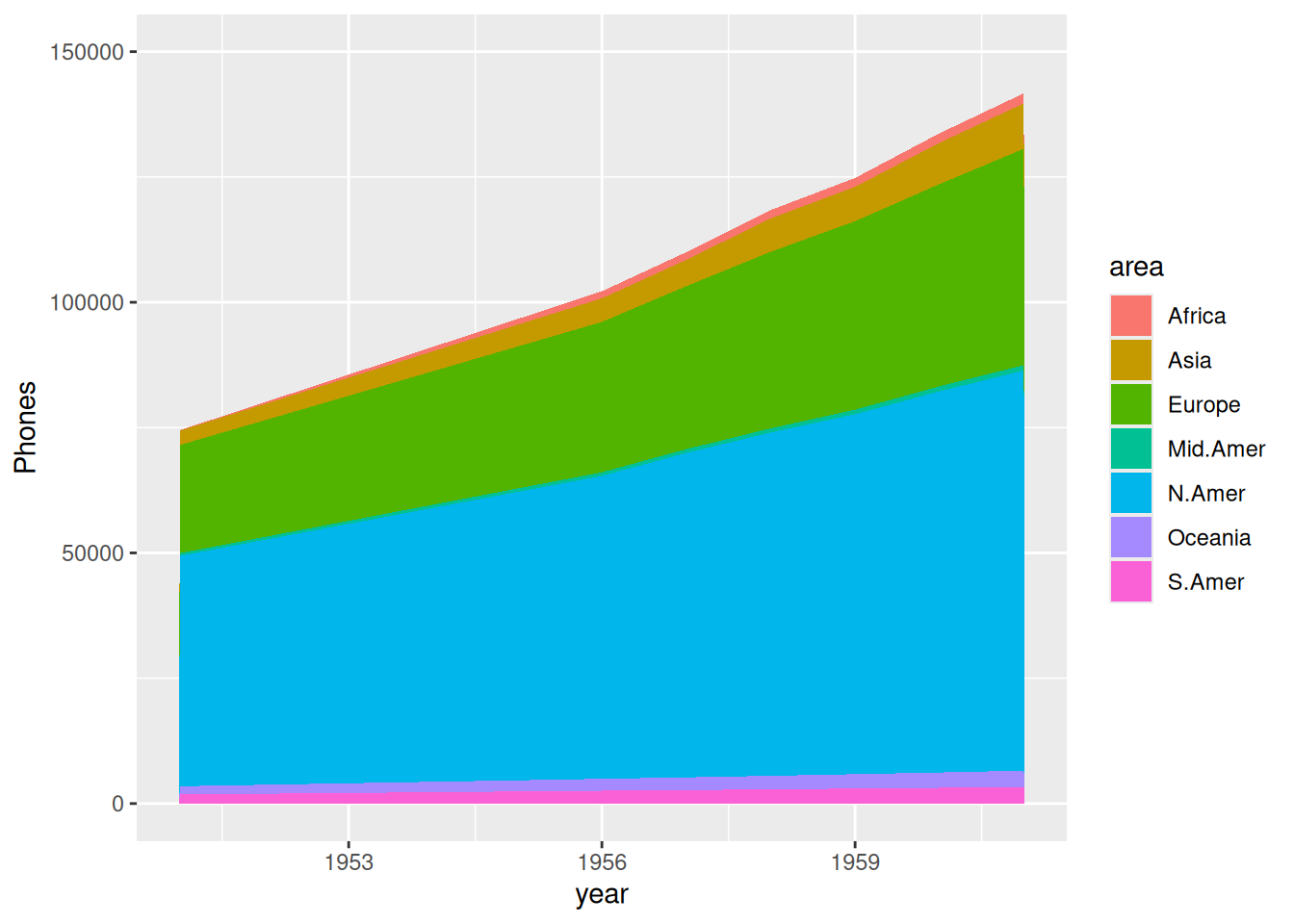
上图展示了各区域随年份变化电话总数的堆积面积图。
以2020年下半年全球各地区新冠新增感染例数数据为例。
p <- ggplot(data_covi19, aes(x=date , y=cases, fill=area)) +
  geom_area() +
  scale_y_continuous() +
  theme(plot.title = element_text(hjust = 0.5)) +
  labs(x="month") +
  ggtitle("2020年下半年各地区新冠新增感染例数")

p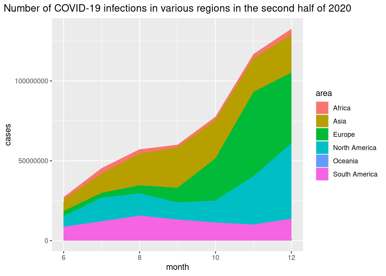
上图横坐标表示月份,纵坐标为新冠感染新增例数。
2. 比例堆叠面积图
以 USPersonalExpenditure 数据集为例。
# 计算数据百分比
data_USPersonalExpenditure1 <- data_USPersonalExpenditure  %>%
  group_by(year, type) %>%
  summarise(n = sum(expense)) %>%
  mutate(percentage = n / sum(n))

# 绘图
p <- ggplot(data_USPersonalExpenditure1, aes(x=year, y=percentage, fill=type)) +
  geom_area(alpha=0.8 , size=0.1, colour="black")

p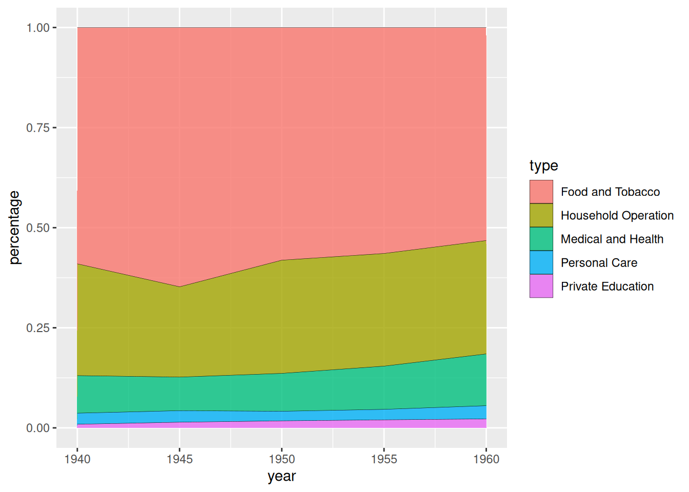
USPersonalExpenditure 数据集为例据上图展示了美国个人支出在不同消费类别占比随年份变化的堆叠面积图。
以2020年下半年全球各地区新冠新增感染例数数据为例。
# 计算数据百分比
data_covi19_percent <- data_covi19  %>%
  group_by(date, area) %>%
  summarise(n = sum(cases)) %>%
  mutate(percentage = n / sum(n))

# 绘图
p <- ggplot(data_covi19_percent, aes(x=date, y=percentage, fill=area)) +
  geom_area(alpha=0.8 , size=0.1, colour="black") +
  theme(plot.title = element_text(hjust = 0.5)) +
  labs(x="month") +
  ggtitle("2020年下半年各地区新冠新增感染例数百分比堆积图")

p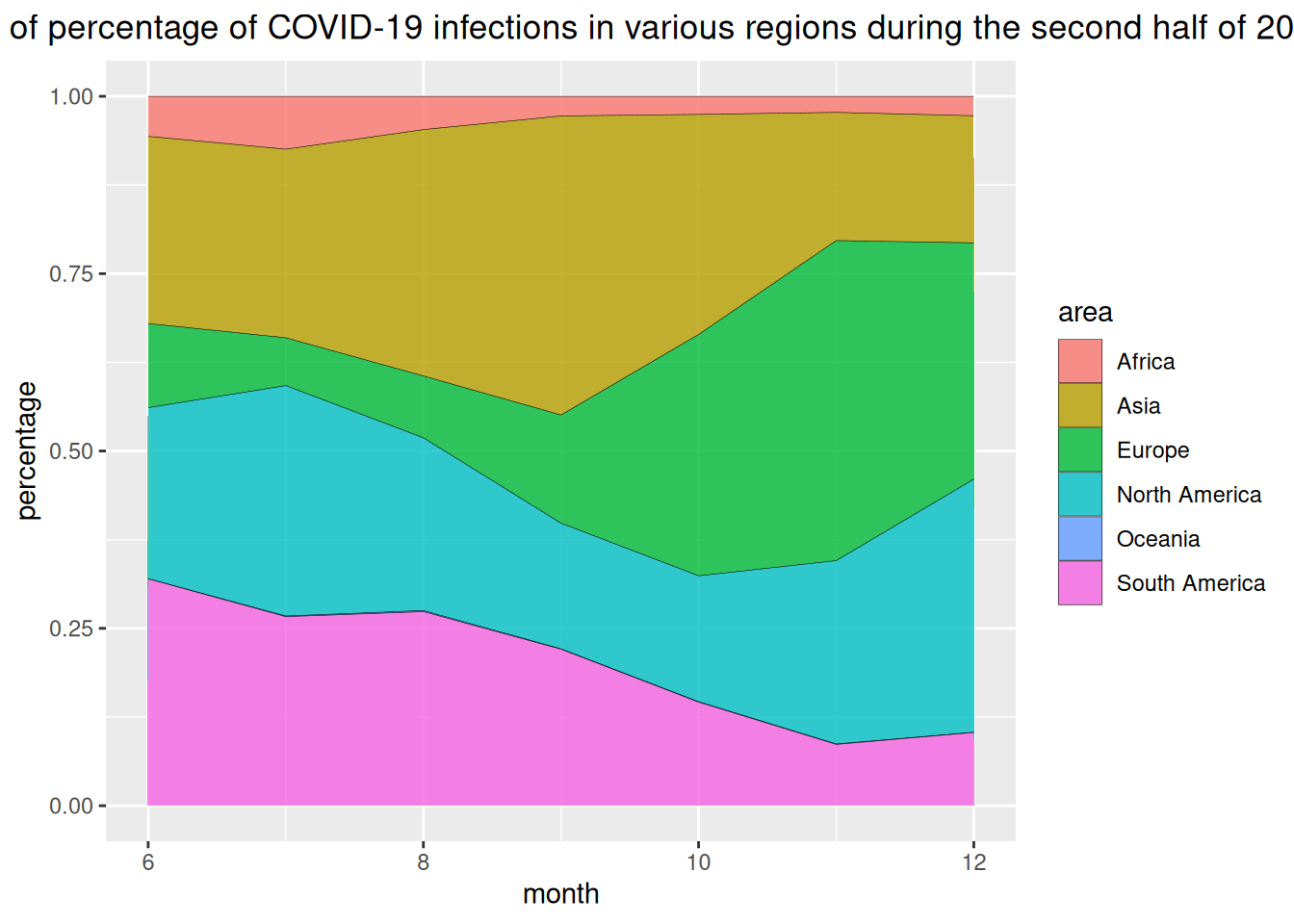
上图横坐标表示月份,纵坐标为各地区新冠感染新增例数百分比。
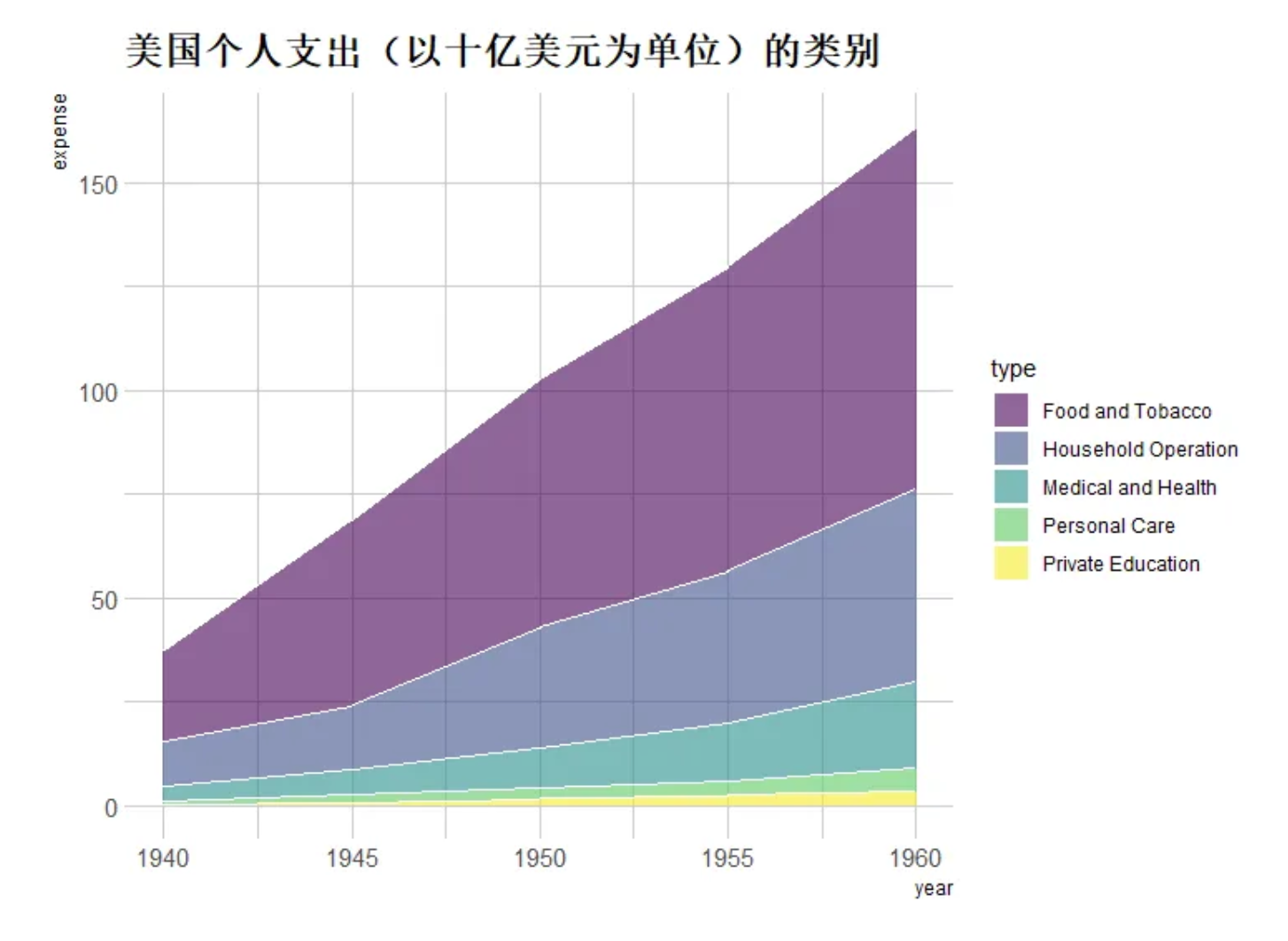
3. 自定义美化
#自定义----
p <- ggplot(data_USPersonalExpenditure, aes(x=year, y=expense, fill=type)) +
  geom_area(alpha=0.6 , size=.5, colour="white") +
  scale_fill_viridis(discrete = T) + #使用色阶
  theme_ipsum() + #使用主体
  ggtitle("美国个人支出(以十亿美元为单位)的类别") #设置标题

p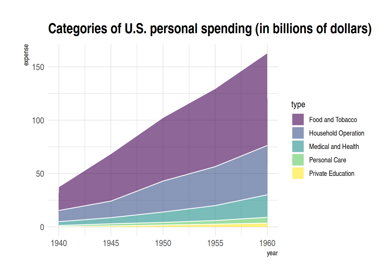
4. 交互堆叠面积图
利用plotly包,我们可以实现交互堆叠面积图的绘制。
以babynames数据集为例
#交互堆叠面积图(plotly)----
#绘图
p1 <- data_baby %>%
  ggplot( aes(x=year, y=n, fill=name, text=name)) +
  geom_area( ) +
  scale_fill_viridis(discrete = TRUE) +
  theme(legend.position="none") +
  ggtitle("过去三十年美国各名字热度") +
  theme_ipsum() +
  theme(legend.position="none")

#转化为可交互图形
p_inter1 <- ggplotly(p1, tooltip="text")
p_inter1
交互堆叠面积图
上图为可交互式堆叠条图,可以实现查看组别、放大缩小等功能。
应用场景

肝脏中CS12至CS23(6个生物学独立胚胎样本和259个细胞)和血液中CS13至CS20(5个生物学独立胚胎样本和131个细胞)的不同骨髓祖细胞群的比例变化。 [1]
参考文献
[1] Bian, Z., Gong, Y., Huang, T. et al. Deciphering human macrophage development at single-cell resolution. Nature 582, 571–576 (2020). https://doi.org/10.1038/s41586-020-2316-7
[2] H. Wickham. ggplot2: Elegant Graphics for Data Analysis. Springer-Verlag New York, 2016.
[3] Wickham H, François R, Henry L, Müller K, Vaughan D (2023). dplyr: A Grammar of Data Manipulation. R package version 1.1.4, https://CRAN.R-project.org/package=dplyr.
[4] Wickham H, Averick M, Bryan J, Chang W, McGowan LD, François R, Grolemund G, Hayes A, Henry L, Hester J, Kuhn M, Pedersen TL, Miller E, Bache SM, Müller K, Ooms J, Robinson D, Seidel DP, Spinu V, Takahashi K, Vaughan D, Wilke C, Woo K, Yutani H (2019). “Welcome to the tidyverse.” Journal of Open Source Software, 4(43), 1686. doi:10.21105/joss.01686 https://doi.org/10.21105/joss.01686.
[5] Simon Garnier, Noam Ross, Robert Rudis, Antônio P. Camargo, Marco Sciaini, and Cédric Scherer (2024). viridis(Lite) - Colorblind-Friendly Color Maps for R. viridis package version 0.6.5.
[6] C. Sievert. Interactive Web-Based Data Visualization with R, plotly, and shiny. Chapman and Hall/CRC Florida, 2020.
[7] Wickham H (2021). babynames: US Baby Names 1880-2017. R package version 1.0.1, https://CRAN.R-project.org/package=babynames.
[8] Rudis B (2024). hrbrthemes: Additional Themes, Theme Components and Utilities for ‘ggplot2’. R package version 0.8.7, https://CRAN.R-project.org/package=hrbrthemes.