# 安装包
if (!requireNamespace("data.table", quietly = TRUE)) {
  install.packages("data.table")
}
if (!requireNamespace("jsonlite", quietly = TRUE)) {
  install.packages("jsonlite")
}
if (!requireNamespace("Mfuzz", quietly = TRUE)) {
  remotes::install_github("MatthiasFutschik/Mfuzz")
}
if (!requireNamespace("ggplotify", quietly = TRUE)) {
  install.packages("ggplotify")
}
if (!requireNamespace("RColorBrewer", quietly = TRUE)) {
  install.packages("RColorBrewer")
}

# 加载包
library(data.table)
library(jsonlite)
library(Mfuzz)
library(ggplotify)
library(RColorBrewer)基因聚类趋势图
注记
Hiplot 网站
本页面为 Hiplot Gene Cluster Trend 插件的源码版本教程,您也可以使用 Hiplot 网站实现无代码绘图,更多信息请查看以下链接:
基因聚类趋势图用于显示不同的基因表达趋势,多条线显示了每个类群中相似的表达模式。
环境配置
系统: Cross-platform (Linux/MacOS/Windows)
编程语言: R
依赖包:
data.table;jsonlite;Mfuzz;ggplotify;RColorBrewer
sessioninfo::session_info("attached")─ Session info ───────────────────────────────────────────────────────────────
setting value
version R version 4.6.0 (2026-04-24)
os Ubuntu 24.04.4 LTS
system x86_64, linux-gnu
ui X11
language (EN)
collate C.UTF-8
ctype C.UTF-8
tz UTC
date 2026-05-09
pandoc 3.1.3 @ /usr/bin/ (via rmarkdown)
quarto 1.9.37 @ /usr/local/bin/quarto
─ Packages ───────────────────────────────────────────────────────────────────
package * version date (UTC) lib source
Biobase * 2.72.0 2026-04-28 [1] Bioconduc~
BiocGenerics * 0.58.0 2026-04-28 [1] Bioconduc~
data.table * 1.18.4 2026-05-06 [1] RSPM
DynDoc * 1.90.0 2026-04-28 [1] Bioconduc~
e1071 * 1.7-17 2025-12-18 [1] RSPM
generics * 0.1.4 2025-05-09 [1] RSPM
ggplotify * 0.1.3 2025-09-20 [1] RSPM
jsonlite * 2.0.0 2025-03-27 [1] RSPM
Mfuzz * 2.65.0 2026-05-04 [1] Github (MatthiasFutschik/Mfuzz@2f02e7f)
RColorBrewer * 1.1-3 2022-04-03 [1] RSPM
widgetTools * 1.90.0 2026-04-28 [1] Bioconduc~
[1] /home/runner/work/_temp/Library
[2] /opt/R/4.6.0/lib/R/site-library
[3] /opt/R/4.6.0/lib/R/library
* ── Packages attached to the search path.
──────────────────────────────────────────────────────────────────────────────数据准备
加载的数据是行为基因列为时间点样本的基因表达矩阵。
# 加载数据
data <- data.table::fread(jsonlite::read_json("https://hiplot.cn/ui/basic/gene-trend/data.json")$exampleData$textarea[[1]])
data <- as.data.frame(data)

# 整理数据格式
## 将基因表达矩阵转换为 ExpressionSet 对象
row.names(data) <- data[,1]
data <- data[,-1]
data <- as.matrix(data)
eset <- new("ExpressionSet", exprs = data)
## 过滤缺失值超过 25% 的基因
eset <- filter.NA(eset, thres=0.25)
0 genes excluded.## 根据标准差去除样本间差异太小的基因
eset <- filter.std(eset, min.std=0, visu = F)0 genes excluded.## 数据标准化
eset <- standardise(eset)
## 设定聚类数目
c <- 6
## 评估出最佳的m值
m <- mestimate(eset)
## 进行mfuzz聚类
cl <- mfuzz(eset, c = c, m = m)
# 查看数据
head(data) Time1 Time2 Time3
Gene1 0.1774993 1.6563226 -1.15259948
Gene2 -0.5037254 -0.5207024 0.46416071
Gene3 0.1050310 0.6079246 0.72893247
Gene4 -1.1791537 0.4340085 0.41061745
Gene5 0.8368975 -0.7047414 -1.46114720
Gene6 0.2611762 0.1351524 -0.01890809可视化
# 基因聚类趋势图
p <- as.ggplot(function(){
  mfuzz.plot2(
  eset,
  cl,
  xlab = "Time",
  ylab = "Expression changes",
  mfrow = c(2,(c/2+0.5)),
  colo = "fancy",
  centre = T,
  centre.col = "red",
  time.labels = colnames(eset),
  x11=F)
  })

p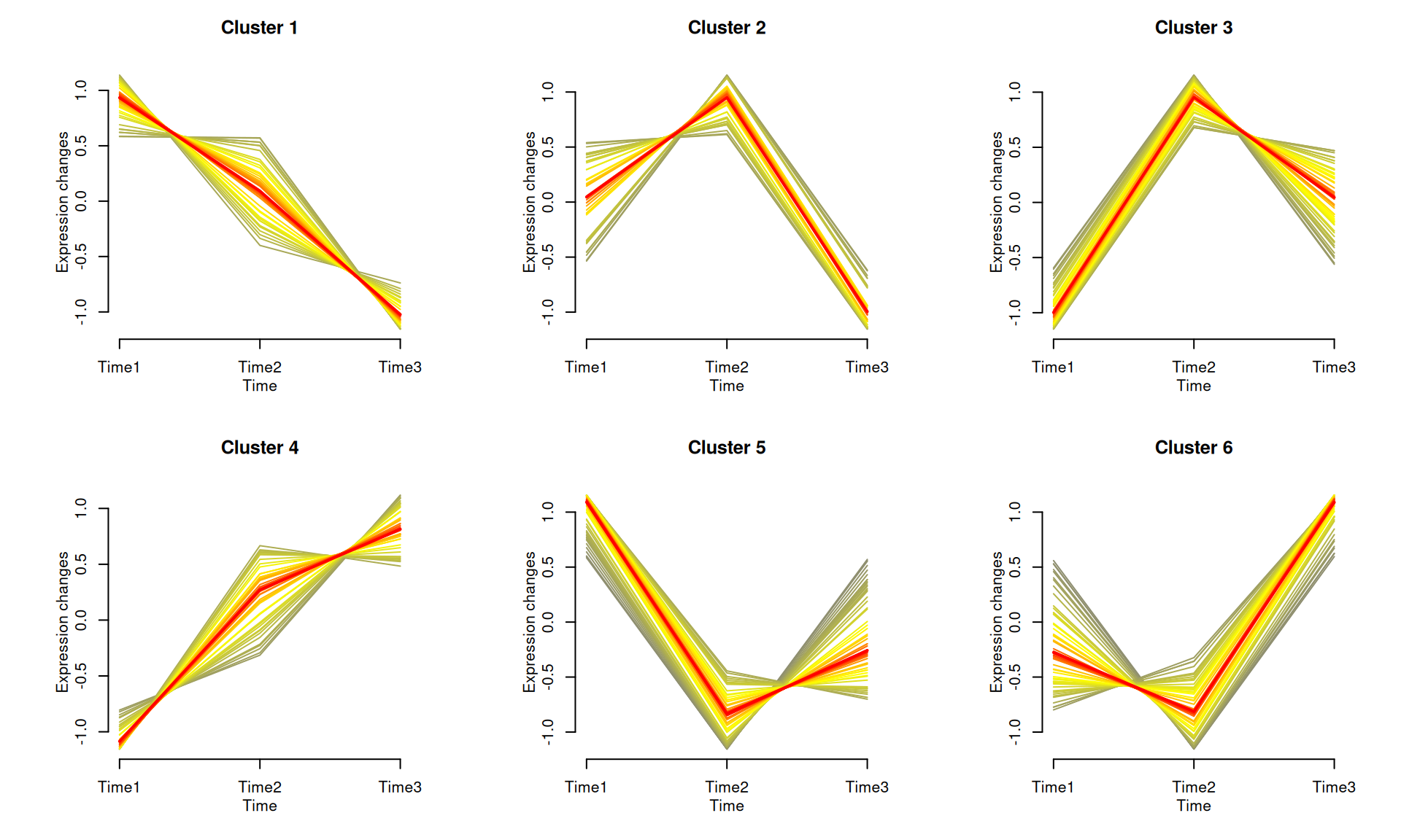
如示例图所示,将基因聚集到不同的组中,每个组在不同时间点上显示出相似的表达模式。每个类群中突出显示了平均表达趋势。