# 安装包
if (!requireNamespace("tidyverse", quietly = TRUE)) {
  install.packages("tidyverse")
}

# 加载包
library(tidyverse)圆形条形图
圆形条形图是著名的条形图的一种变体,其中条形沿着圆周而不是直线显示。请注意,尽管视觉上吸引人,但圆形条形图必须谨慎使用,因为各组并不共享相同的 Y 轴。不过,它非常适合周期性数据。
示例
环境配置
系统要求: 跨平台(Linux/MacOS/Windows)
编程语言:R
依赖包:
tidyverse
sessioninfo::session_info("attached")─ Session info ───────────────────────────────────────────────────────────────
setting value
version R version 4.6.0 (2026-04-24)
os Ubuntu 24.04.4 LTS
system x86_64, linux-gnu
ui X11
language (EN)
collate C.UTF-8
ctype C.UTF-8
tz UTC
date 2026-05-09
pandoc 3.1.3 @ /usr/bin/ (via rmarkdown)
quarto 1.9.37 @ /usr/local/bin/quarto
─ Packages ───────────────────────────────────────────────────────────────────
package * version date (UTC) lib source
dplyr * 1.2.1 2026-04-03 [1] RSPM
forcats * 1.0.1 2025-09-25 [1] RSPM
ggplot2 * 4.0.3.9000 2026-05-04 [1] Github (tidyverse/ggplot2@6870419)
lubridate * 1.9.5 2026-02-04 [1] RSPM
purrr * 1.2.2 2026-04-10 [1] RSPM
readr * 2.2.0 2026-02-19 [1] RSPM
stringr * 1.6.0 2025-11-04 [1] RSPM
tibble * 3.3.1 2026-01-11 [1] RSPM
tidyr * 1.3.2 2025-12-19 [1] RSPM
tidyverse * 2.0.0 2023-02-22 [1] RSPM
[1] /home/runner/work/_temp/Library
[2] /opt/R/4.6.0/lib/R/site-library
[3] /opt/R/4.6.0/lib/R/library
* ── Packages attached to the search path.
──────────────────────────────────────────────────────────────────────────────数据准备
主要运用R内置的iris数据集,自建数据集和TCGA数据库
# 1.R内置的data——iris
head(iris)
Sepal.Length Sepal.Width Petal.Length Petal.Width Species
1 5.1 3.5 1.4 0.2 setosa
2 4.9 3.0 1.4 0.2 setosa
3 4.7 3.2 1.3 0.2 setosa
4 4.6 3.1 1.5 0.2 setosa
5 5.0 3.6 1.4 0.2 setosa
6 5.4 3.9 1.7 0.4 setosa# 2.自建数据集
data_customize <- data.frame(
individual=paste( "Mister ", seq(1,60), sep=""),
group=c( rep('A', 10), rep('B', 30), rep('C', 14), rep('D', 6)) ,
value=sample( seq(10,100), 60, replace=T)
)
# 3.TCGA数据库(肝癌的基因表达数据)
tcga_circle <- readr::read_csv(
"https://bizard-1301043367.cos.ap-guangzhou.myqcloud.com/tcga_circle.csv")可视化
1. 基本绘图
1.1 iris 数据
基本上,这种方法与制作经典的条形图相同。最后,我们调用 coord_polar() 来使图表呈圆形。需要注意的是ylim()参数非常重要。如果它从0开始,条形将从圆心开始。如果你提供一个负值,就会出现一个白色的圆圈空间!
iris_id <- iris[order(iris$Species),]
iris_id$new_column <- 1:nrow(iris_id)
p <- ggplot(iris_id, aes(x = new_column, y = Sepal.Length, fill = Species)) +
  geom_bar(stat = "identity", width = 1) +
  coord_polar(start = 0) +
  theme_void() +
  labs(fill = "Species", y = "Sepal.Length", x = NULL) +
  theme(legend.title = element_blank())

p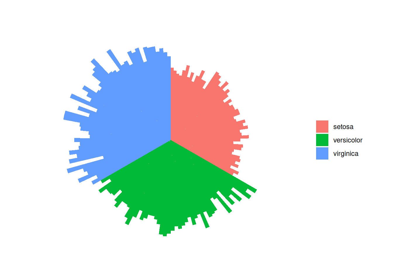
这个圆形条形图描述了不同物种间Sepal.Length变量的数量关系。
1.2 TCGA 数据
(1)添加标签
# 获取每个标签的名称和y位置
label_data <- tcga_circle
# 计算标签的角度
number_of_bar <- nrow(label_data)
angle <-  90 - 360 * (label_data$id-0.5) /number_of_bar
# 计算标签的对齐方式:右对齐还是左对齐
label_data$hjust <- ifelse(angle < -90, 1, 0)
# 将翻转角度BY调整为可读
label_data$angle <- ifelse(angle < -90, angle+180, angle)
#画图
tcga_circle_id <- tcga_circle
tcga_circle_id$id <- as.factor(tcga_circle_id$id)
p <- ggplot(tcga_circle_id, aes(x = id, y = tcga_circle)) +
  geom_bar(stat = "identity", fill=alpha("skyblue", 0.7)) +
  ylim(-10,20) +
  coord_polar(start = 0) +
  theme_minimal() +
  theme(
    axis.text = element_blank (),
    axis.title = element_blank(),
    panel.grid = element_blank (),
    plot.margin = unit(rep(-1,4), "cm")  )+
  labs(fill = "RowNames", y = "tcga_circle", x = NULL) +
  theme(legend.title = element_blank()) +
  geom_text(data=label_data,
            aes(x=id, y=tcga_circle+10, label=RowNames, hjust=hjust),
            color="black", fontface="bold",alpha=0.6, size=2.5,
            angle= label_data$angle, inherit.aes = FALSE )

p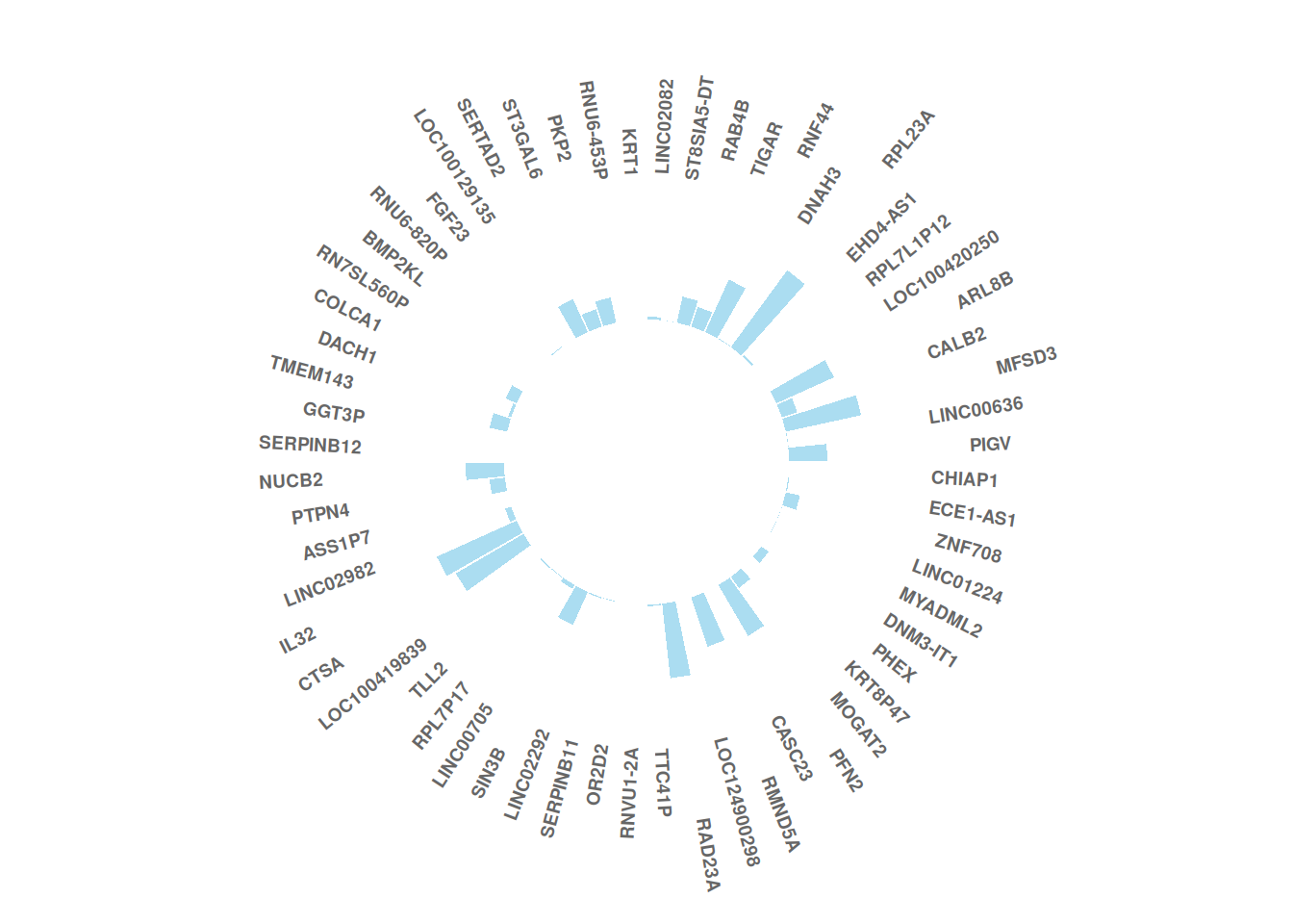
这个圆形条形图描述了肝癌某一样本中不同基因的表达数值。
(2)增加一段间隙
# 增加一段间隙
empty_bar <- 20
to_add <- matrix(NA, empty_bar, ncol(tcga_circle))
colnames(to_add) <- colnames(tcga_circle)
tcga_circle_id <- rbind(tcga_circle, to_add)
tcga_circle_id$id <- seq(1, nrow(tcga_circle_id))
# 获取每个标签的名称和y位置
label_data <- tcga_circle_id
# 计算标签的角度
number_of_bar <- nrow(label_data)
angle <-  90 - 360 * (label_data$id-0.5) /number_of_bar
# 计算标签的对齐方式:右对齐还是左对齐
label_data$hjust <- ifelse( angle < -90, 1, 0)
# 将翻转角度BY调整为可读
label_data$angle <- ifelse(angle < -90, angle+180, angle)

p <- ggplot(tcga_circle_id, aes(x = id, y = tcga_circle)) +
  geom_bar(stat = "identity", fill=alpha("skyblue", 0.7)) +
  ylim(-10,20) +
  coord_polar(start = 0) +
  theme_minimal() +
  theme(
    axis.text = element_blank (),
    axis.title = element_blank(),
    panel.grid = element_blank (),
    plot.margin = unit(rep(-1,4), "cm")  )+
  labs(fill = "RowNames", y = "tcga_circle", x = NULL) +
  theme(legend.title = element_blank()) +
  geom_text(data=label_data,
            aes(x=id, y=tcga_circle+10, label=RowNames, hjust=hjust),
            color="black", fontface="bold",alpha=0.6, size=2.5,
            angle= label_data$angle, inherit.aes = FALSE )

p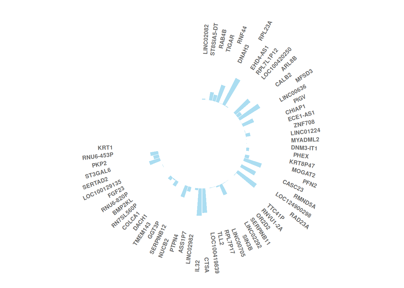
这个圆形条形图描述了肝癌某一样本中不同基因的表达数值。
2. 分组
2.1 组间添加间隙
以iris数据为例
iris_id <- iris[order(iris$Species),]
iris_id$new_column <- 1:nrow(iris_id)
#添加间隙
empty_bar <- 4
to_add <- data.frame( matrix(NA, empty_bar*nlevels(iris_id$Species), ncol(iris_id)) )

colnames(to_add) <- colnames(iris_id)
to_add$Species <- rep(levels(iris_id$Species), each=empty_bar)
iris_id <- rbind(iris_id, to_add)
iris_id <- iris_id %>% arrange(Species)
iris_id$new_column <- seq(1, nrow(iris_id))
#画图
iris_id$new_column<-as.factor(iris_id$new_column)
p <- ggplot(iris_id, aes(x = new_column, y = Sepal.Length,fill = Species)) +
  geom_bar(stat = "identity") +
  ylim(-20,10) +
  coord_polar(start = 0) +
  theme_minimal() +
  theme(
    axis.text = element_blank (),
    axis.title = element_blank(),
    panel.grid = element_blank (),
    plot.margin = unit(rep(-1,4), "cm")  )+
  labs(fill = "Species", y = "Sepal.Length", x = NULL) +
  theme(legend.title = element_blank())

p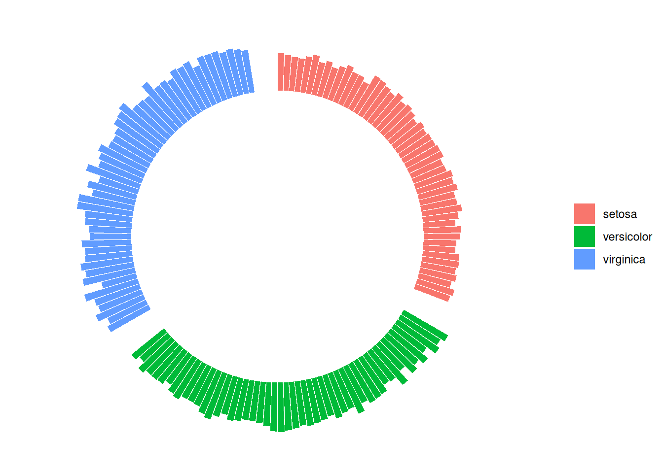
这个圆形条形图描述了不同物种间Sepal.Length变量的数量关系。
2.2 按组间大小排列
以自建数据为例
# 创建每组间的间隙
empty_bar <- 4
to_add <- data.frame( matrix(NA, empty_bar*nlevels(data_customize$group), ncol(data_customize)) )
colnames(to_add) <- colnames(data_customize)
to_add$group <- rep(levels(data_customize$group), each=empty_bar)
data_customize_id <- rbind(data_customize, to_add)
data_customize_id <- data_customize_id %>% arrange(group,value)
data_customize_id$id <- seq(1, nrow(data_customize_id))

# 添加标签
label_data2 <- data_customize_id
number_of_bar <- nrow(label_data2)
angle <- 90 - 360 * (label_data2$id-0.5) /number_of_bar
label_data2$hjust <- ifelse( angle < -90, 1, 0)
label_data2$angle <- ifelse(angle < -90, angle+180, angle)

# 画图
data_customize_id$id <- as.factor(data_customize_id$id)
p <- ggplot(data_customize_id, aes(x=id, y=value, fill=group)) +
  geom_bar(stat="identity", alpha=0.5) +
  ylim(-100,120) +
  theme_minimal() +
  theme(
    legend.position = "none",
    axis.text = element_blank(),
    axis.title = element_blank(),
    panel.grid = element_blank(),
    plot.margin = unit(rep(-1,4), "cm")
  ) +
  coord_polar() +
  geom_text(data=label_data2,
            aes(x=id, y=value+10, label=individual, hjust=hjust),
            color="black", fontface="bold",alpha=0.6, size=2.5,
            angle= label_data2$angle, inherit.aes = FALSE )

p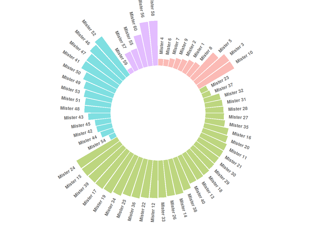
这个圆形条形图描述了不同id的数值大小。
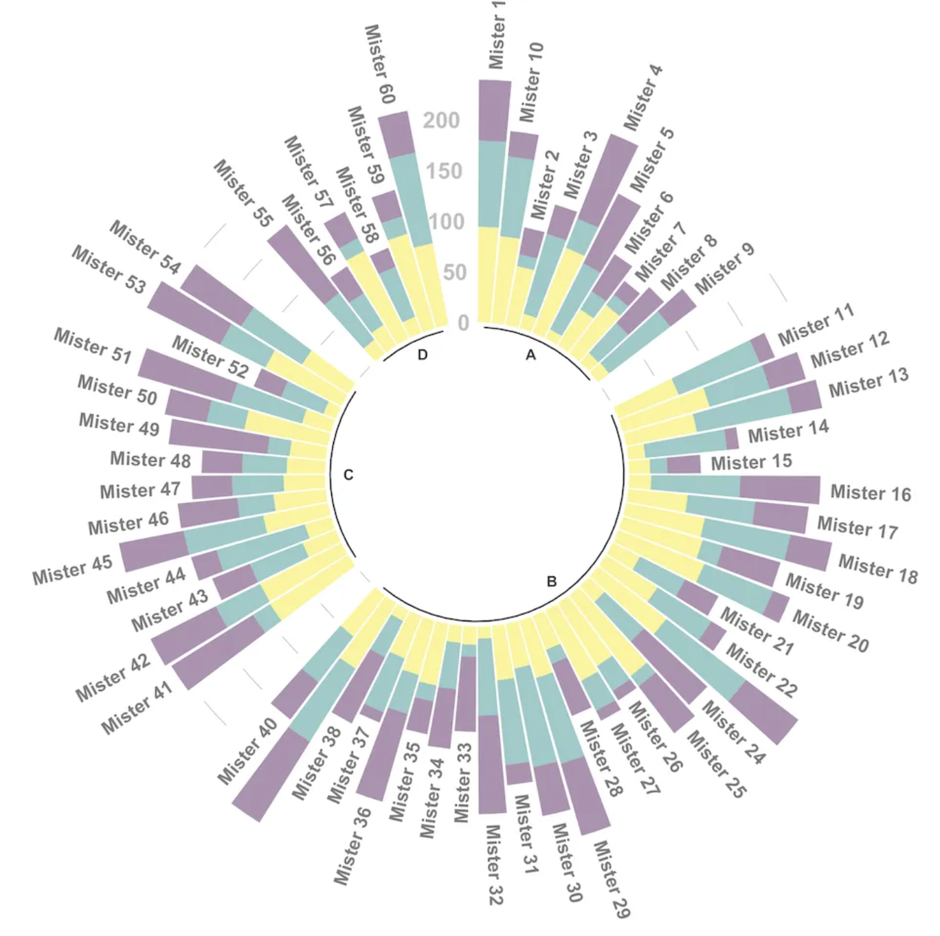
3. 美化图形
# 设置要在每组末尾添加的“空栏”数量
data_customize_id <- data_customize
empty_bar <- 3
to_add <- data.frame(matrix(NA, empty_bar*nlevels(data_customize$group),
                            ncol(data_customize)))
colnames(to_add) <- colnames(data_customize)
to_add$group <- rep(levels(data_customize_id$group), each=empty_bar)
data_customize_id <- rbind(data_customize, to_add)
data_customize_id <- data_customize_id %>% arrange(group)
data_customize_id$id <- seq(1, nrow(data_customize_id))

# 获取每个标签的名称和 y 位置
label_data <- data_customize_id
number_of_bar <- nrow(label_data)
angle <- 90 - 360 * (label_data2$id-0.5) /number_of_bar
label_data$hjust <- ifelse( angle < -90, 1, 0)
label_data$angle <- ifelse(angle < -90, angle+180, angle)

# 准备基线数据框
base_data <- data_customize_id %>%
  group_by(group) %>%
  summarize(start=min(id), end=max(id) - empty_bar) %>%
  rowwise() %>%
  mutate(title=mean(c(start, end)))

# 准备网格数据框(比例尺)
grid_data <- base_data
grid_data$end <- grid_data$end[ c( nrow(grid_data), 1:nrow(grid_data)-1)] + 1
grid_data$start <- grid_data$start - 1
grid_data <- grid_data[-1,]

# 画图
p <- ggplot(data_customize_id, aes(x=as.factor(id), y=value, fill=group)) +
  geom_bar(aes(x=as.factor(id), y=value, fill=group), stat="identity", alpha=0.5) +
  geom_segment(data=grid_data, aes(x = end, y = 80, xend = start, yend = 80), colour = "grey", alpha=1, size=0.3 , inherit.aes = FALSE ) +
  geom_segment(data=grid_data, aes(x = end, y = 60, xend = start, yend = 60), colour = "grey", alpha=1, size=0.3 , inherit.aes = FALSE ) +
  geom_segment(data=grid_data, aes(x = end, y = 40, xend = start, yend = 40), colour = "grey", alpha=1, size=0.3 , inherit.aes = FALSE ) +
  geom_segment(data=grid_data, aes(x = end, y = 20, xend = start, yend = 20), colour = "grey", alpha=1, size=0.3 , inherit.aes = FALSE ) +
  annotate("text", x = rep(max(data$id),4), y = c(20, 40, 60, 80), label = c("20", "40", "60", "80") , color="grey", size=3 , angle=0, fontface="bold", hjust=1) +
  geom_bar(aes(x=as.factor(id), y=value, fill=group), stat="identity", alpha=0.5) +
  ylim(-100,120) +
  theme_minimal() +
  theme(
    legend.position = "none",
    axis.text = element_blank(),
    axis.title = element_blank(),
    panel.grid = element_blank(),
    plot.margin = unit(rep(-1,4), "cm")
  ) +
  coord_polar() +
  geom_text(data=label_data, aes(x=id, y=value+10, label=individual, hjust=hjust), color="black", fontface="bold",alpha=0.6, size=2.5, angle= label_data$angle, inherit.aes = FALSE ) +

# 添加基线信息
  geom_segment(data=base_data, aes(x = start, y = -5, xend = end, yend = -5), colour = "black", alpha=0.8, size=0.6 , inherit.aes = FALSE )  +
  geom_text(data=base_data, aes(x = title, y = -18, label=group), hjust=c(1,1,0,0), colour = "black", alpha=0.8, size=4, fontface="bold", inherit.aes = FALSE)

p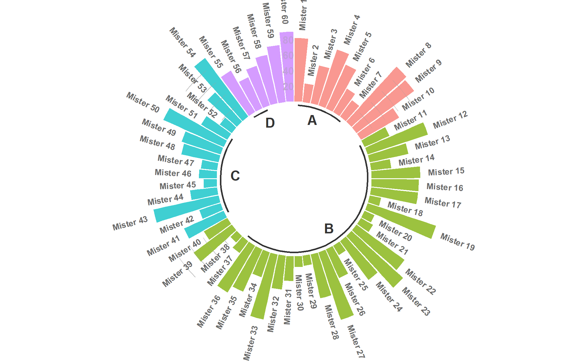
这个圆形条形图描述了不同id的数值大小。
应用场景
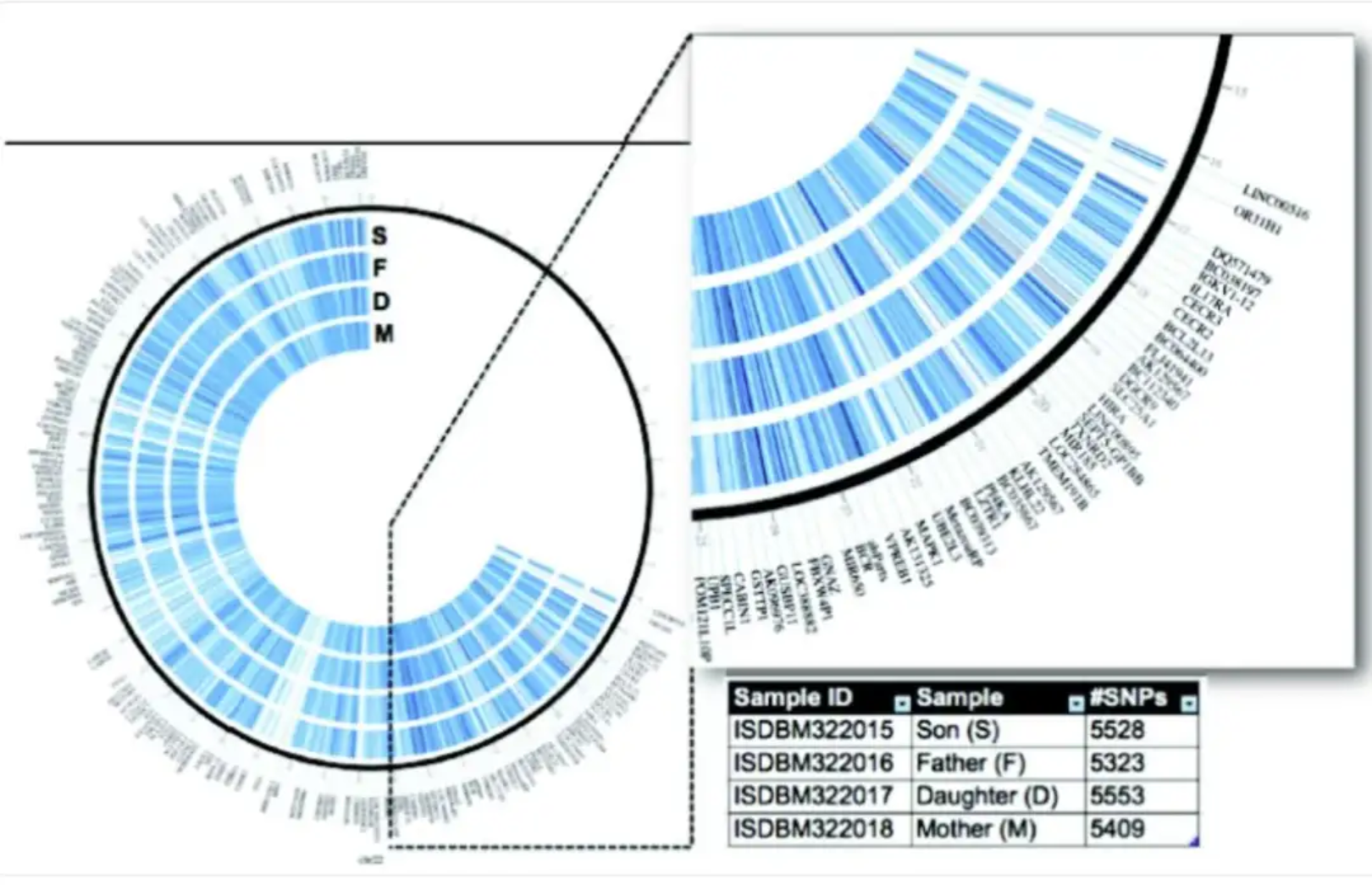
该圆形条形图基于Corpas等人的家族全基因组数据,对人类第21号染色体的所有基因变异进行了可视化。[1]
参考文献
[1] Parveen A, Khurana S, Kumar A. Overview of Genomic Tools for Circular Visualization in the Next-generation Genomic Sequencing Era. Curr Genomics. 2019 Feb;20(2):90-99.