# 安装包
if (!requireNamespace("readr", quietly = TRUE)) {
  install.packages("readr")
}
if (!requireNamespace("beeswarm", quietly = TRUE)) {
  install.packages("beeswarm")
}
if (!requireNamespace("ggbeeswarm", quietly = TRUE)) {
  install.packages("ggbeeswarm")
}
if (!requireNamespace("ggsignif", quietly = TRUE)) {
  install.packages("ggsignif")
}
if (!requireNamespace("plyr", quietly = TRUE)) {
  install.packages("plyr")
}
if (!requireNamespace("tidyverse", quietly = TRUE)) {
  install.packages("tidyverse")
}


# 加载包
library(readr)
library(beeswarm) # 这个简单易用的包只需一两行代码就可以在 R 中构建蜂群图。
library(ggbeeswarm) # 该包是ggplot2的扩展,允许直接从ggplot2包构建蜜蜂群图,具有更多可调选项和更大的灵活性,便于进行统计差异分析。
library(ggsignif)
library(plyr)
library(tidyverse)蜂群图
蜂群图是一种数据可视化图表,它通过轻微地分散数据点来避免重叠,从而更清晰地展示数据的分布密度和趋势。这种图表特别适合用于展示较小数据集的分类数据分布。在本节中,我们将介绍使用R以及beeswarm和ggbeeswarm包实现的各种示例。
示例
环境配置
系统要求: 跨平台(Linux/MacOS/Windows)
编程语言:R
依赖包:
readr,beeswarm,ggbeeswarm,ggsignif,plyr,tidyverse
sessioninfo::session_info("attached")─ Session info ───────────────────────────────────────────────────────────────
setting value
version R version 4.6.0 (2026-04-24)
os Ubuntu 24.04.4 LTS
system x86_64, linux-gnu
ui X11
language (EN)
collate C.UTF-8
ctype C.UTF-8
tz UTC
date 2026-05-09
pandoc 3.1.3 @ /usr/bin/ (via rmarkdown)
quarto 1.9.37 @ /usr/local/bin/quarto
─ Packages ───────────────────────────────────────────────────────────────────
package * version date (UTC) lib source
beeswarm * 0.4.0 2021-06-01 [1] RSPM
dplyr * 1.2.1 2026-04-03 [1] RSPM
forcats * 1.0.1 2025-09-25 [1] RSPM
ggbeeswarm * 0.7.3 2025-11-29 [1] RSPM
ggplot2 * 4.0.3.9000 2026-05-04 [1] Github (tidyverse/ggplot2@6870419)
ggsignif * 0.6.4 2022-10-13 [1] RSPM
lubridate * 1.9.5 2026-02-04 [1] RSPM
plyr * 1.8.9 2023-10-02 [1] RSPM
purrr * 1.2.2 2026-04-10 [1] RSPM
readr * 2.2.0 2026-02-19 [1] RSPM
stringr * 1.6.0 2025-11-04 [1] RSPM
tibble * 3.3.1 2026-01-11 [1] RSPM
tidyr * 1.3.2 2025-12-19 [1] RSPM
tidyverse * 2.0.0 2023-02-22 [1] RSPM
[1] /home/runner/work/_temp/Library
[2] /opt/R/4.6.0/lib/R/site-library
[3] /opt/R/4.6.0/lib/R/library
* ── Packages attached to the search path.
──────────────────────────────────────────────────────────────────────────────数据准备
我们使用了内置的 R 数据集(iris),以及来自 UCSC Xena DATASETS 的TCGA.LIHC.clinicalMatrix和TCGA-LIHC.star_fpkm数据集。部分基因仅供演示之用。
# 加载 iris 数据集
data("iris")

# 从处理过的 CSV 文件加载 TCGA-LIHC 基因表达数据集
TCGA_gene_expression <- read.csv("https://bizard-1301043367.cos.ap-guangzhou.myqcloud.com/TCGA-LIHC.star_fpkm_processed.csv")

# 加载 TCGA-LIHC 临床信息数据集
TCGA_clinic <- read.csv("https://bizard-1301043367.cos.ap-guangzhou.myqcloud.com/TCGA.LIHC.clinicalMatrix.csv") %>%
  mutate(T = as.factor(T))

# 准备统计数据
data_summary <- function(data, varname, groupnames) {
  summary_func <- function(x, col) {
    c(mean = mean(x[[col]], na.rm = TRUE),
      sd = sd(x[[col]], na.rm = TRUE))
  }
  data_sum <- ddply(data, groupnames, .fun = summary_func, varname)

  data_sum <- rename_with(data_sum, ~ varname, "mean")

  return(data_sum)
}
iris_sum <- data_summary(iris, varname="Sepal.Length", groupnames="Species")
TCGA_gene_sum <- data_summary(TCGA_gene_expression, varname="gene_expression", groupnames="sample")
可视化
1. 基础蜂群图(beeswarm包)
图 1 描述了Sepal.Length变量在iris上的分布。
p1 <- beeswarm(iris$Sepal.Length)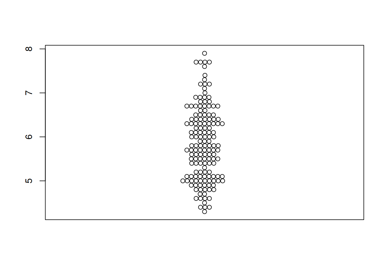
图 2 描述了 LIHC 数据集里面 RAB4B 基因的表达量。
TCGA_gene_expression_RAB4B <- subset(TCGA_gene_expression, sample == "RAB4B")
p1_2 <- beeswarm(TCGA_gene_expression_RAB4B$gene_expression)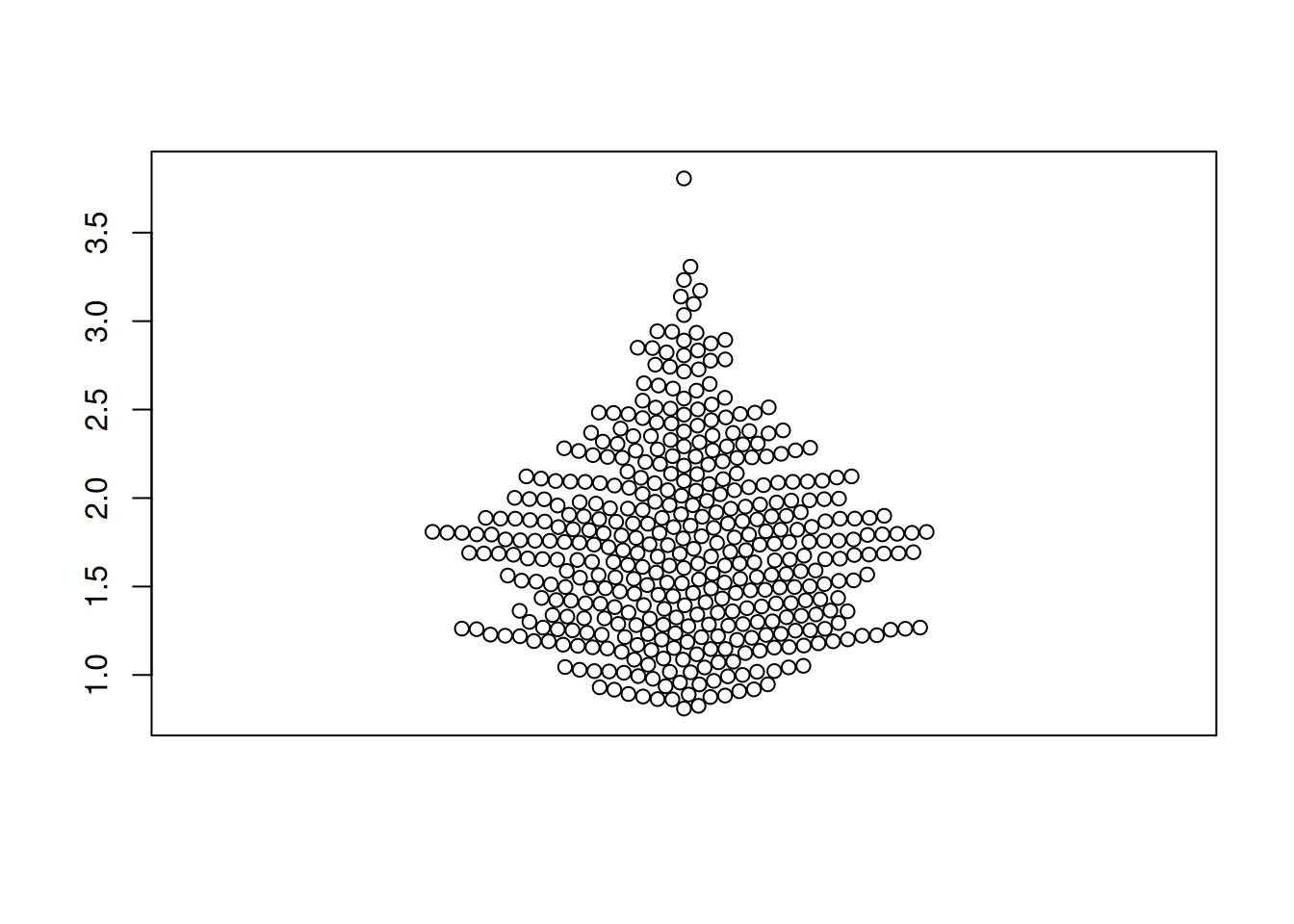
2. 蜂群图翻转(beeswarm包)
图 3 描述了 TCGA 数据集中 OS.time 变量的数量分布。
p2 <- beeswarm(TCGA_clinic$OS.time, horizontal=TRUE)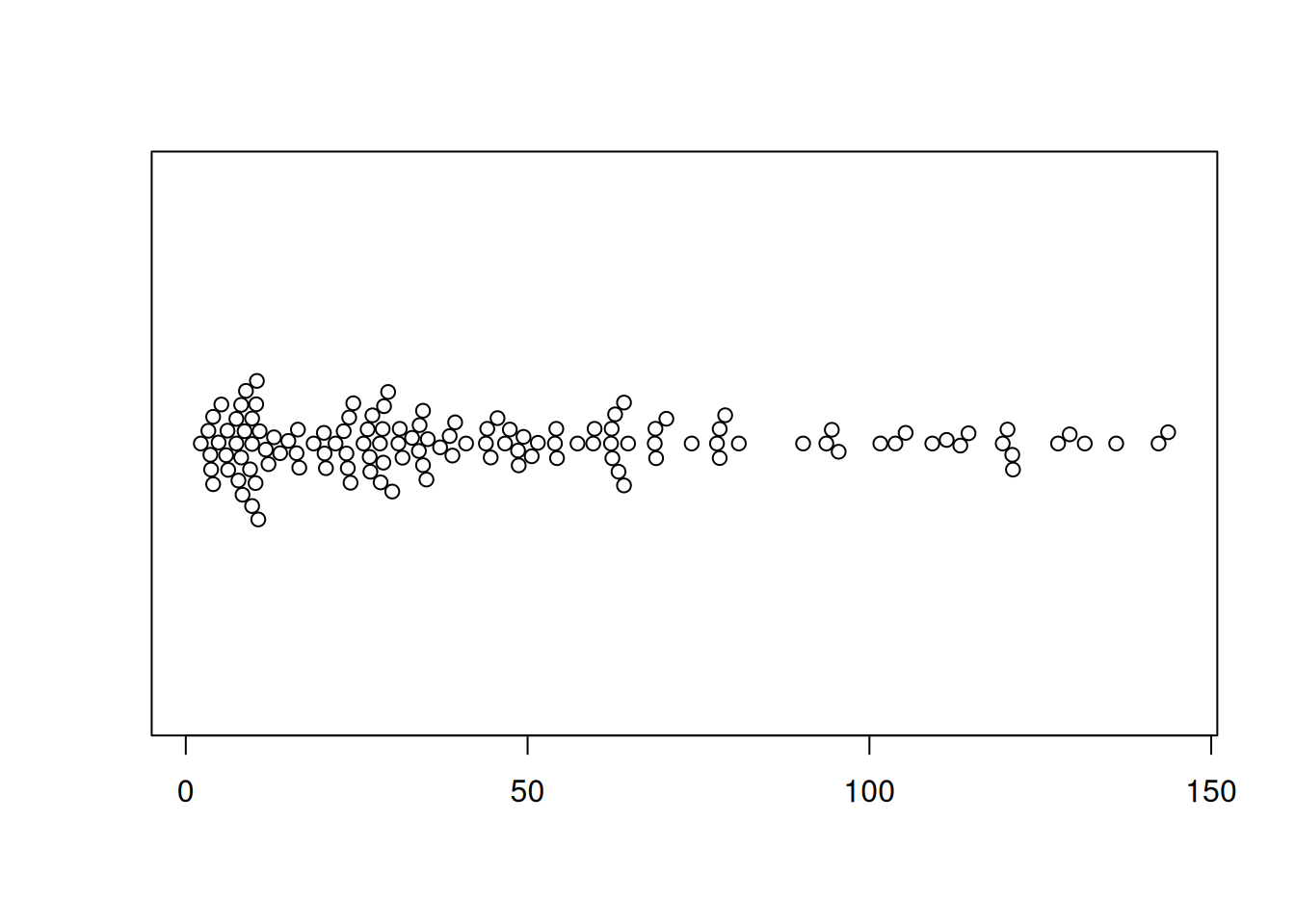
3. 蜂群图基本特征改变(beeswarm包)
提示
关键参数:
(1) 改变颜色
通过改变col参数,我们可以改变点的颜色
(2) 改变点的符号
pch参数允许更改点的符号。
(3) 改变点的大小
cex参数允许更改点的尺寸。
(4) 改变点的位置
method参数允许更改点的位置。以下是可用的选项:
swarm(default): 点随机放置,但不会重叠。center: 点对称地分布在图表的中心周围。hex: 点被放置在六角形网格上。square: 点位于一个正方形网格上。
图 4 描述了iris数据集中Sepal.Length变量的分布。
p3_1 <- beeswarm(iris$Sepal.Length,col= "blue",pch=16,
         cex=1.5,method="center" )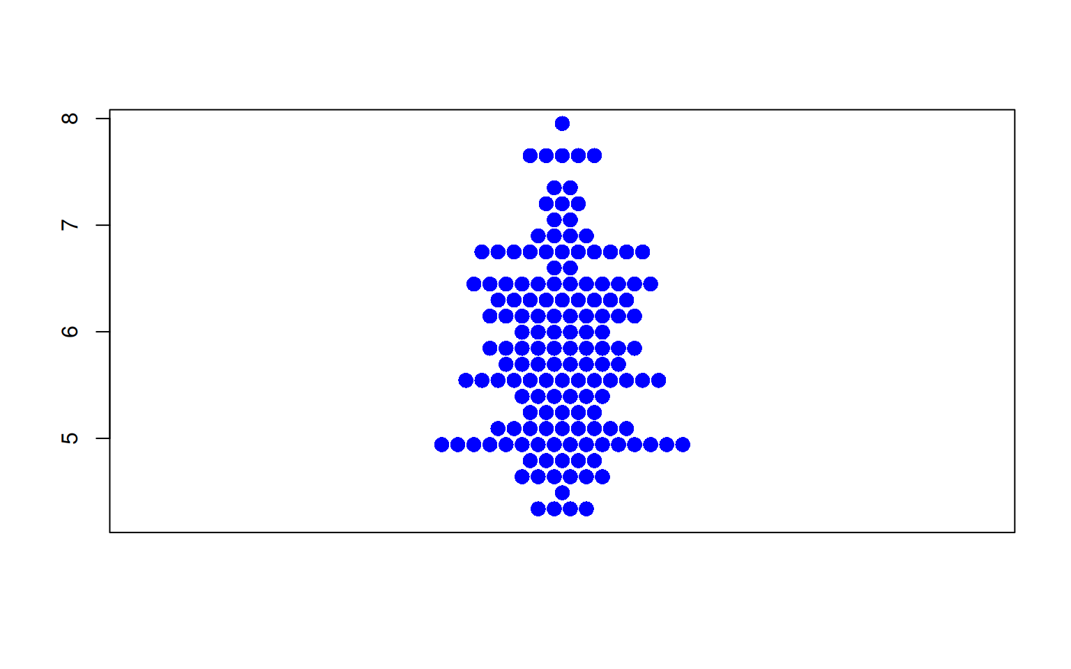
图 5 描述了 TCGA 数据集中 OS.time 变量的数量分布。
p3_2 <- beeswarm(TCGA_clinic$OS.time,col= "blue",pch=16,
         cex=1.5,method="center" )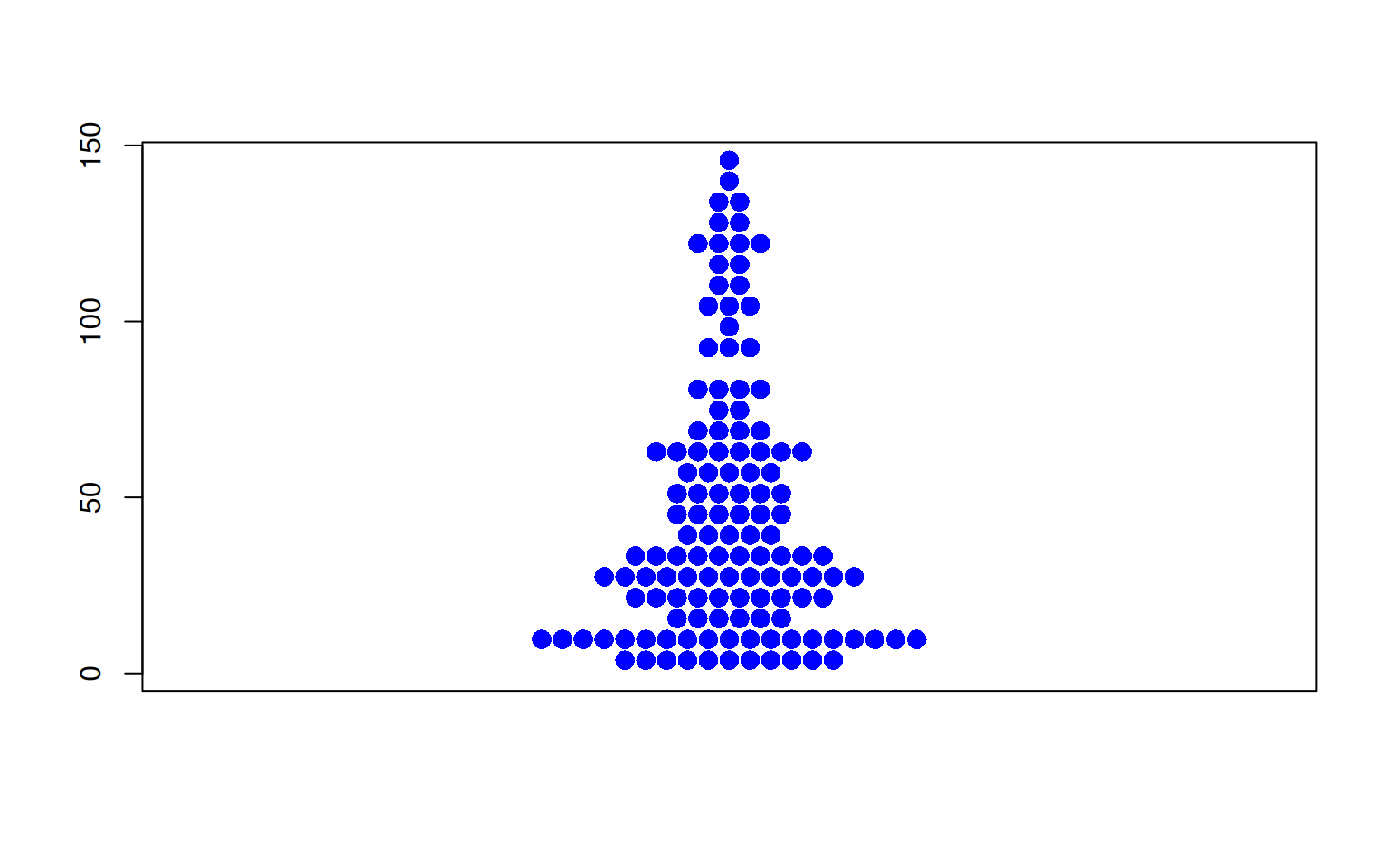
4. 蜂群图分组(beeswarm包)
运用 ~ 运算符,我们可以轻松创建一个分组蜜蜂图。
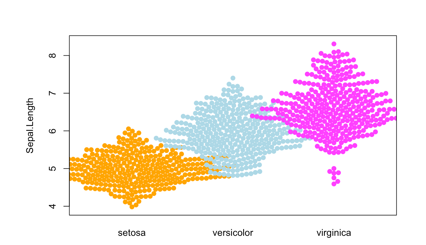
图 6 描述了Sepal.Length变量在不同Species上的分布
p4_1 <- beeswarm( Sepal.Length ~ Species, data=iris,
         col=c("orange", "lightblue", "magenta"), pch =19)
图 7 描述了OS.time变量的不同肿瘤分期中的分布。
p4_2 <- beeswarm(OS.time ~ T, data=TCGA_clinic,
         col=c("orange", "lightblue", "magenta"), pch =19)
5. 自定义位置行为(beeswarm包)
提示
当有很多数据点时,改变点的位置行为可以避免组间重叠。
可用的选项是:
none(default): 不进行校正。gutter: 为每个组设定一个更高和更低的限制。wrap: 与gutter类似,但在点的位置添加随机噪声。random: 随机定位点。omit: 省略重叠的点。
图 8 描述了Sepal.Length变量在不同Species上的分布。
p5_1 <- beeswarm( Sepal.Length ~ Species, data=iris,
         col=c("orange", "lightblue", "magenta"), pch =19,corral ="gutter")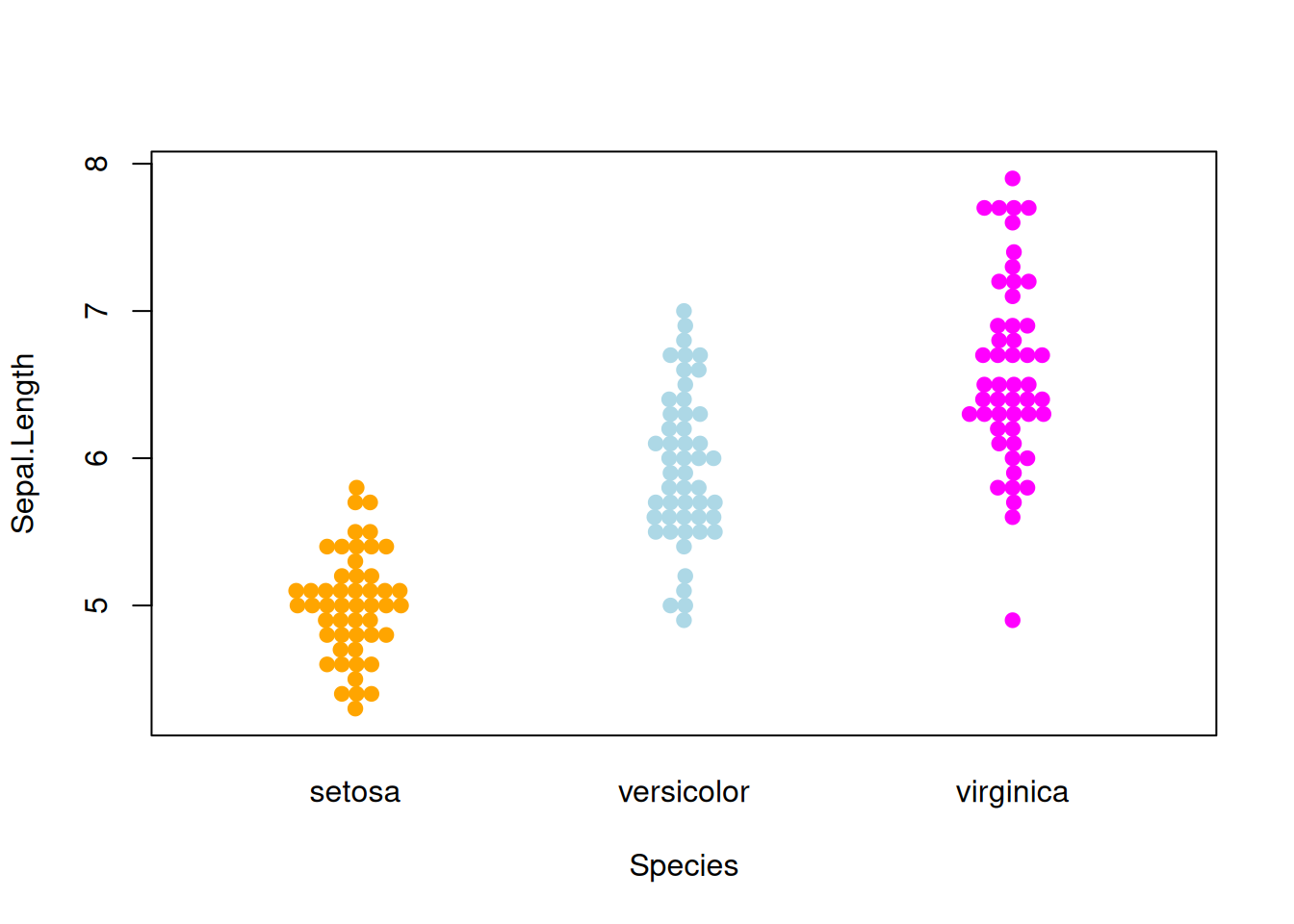
图 9 描述了OS.time变量的不同肿瘤分期中的分布。
p5_2 <- beeswarm( OS.time ~ T, data=TCGA_clinic,
         col=c("orange", "lightblue", "magenta"), pch =15,corral = "gutter")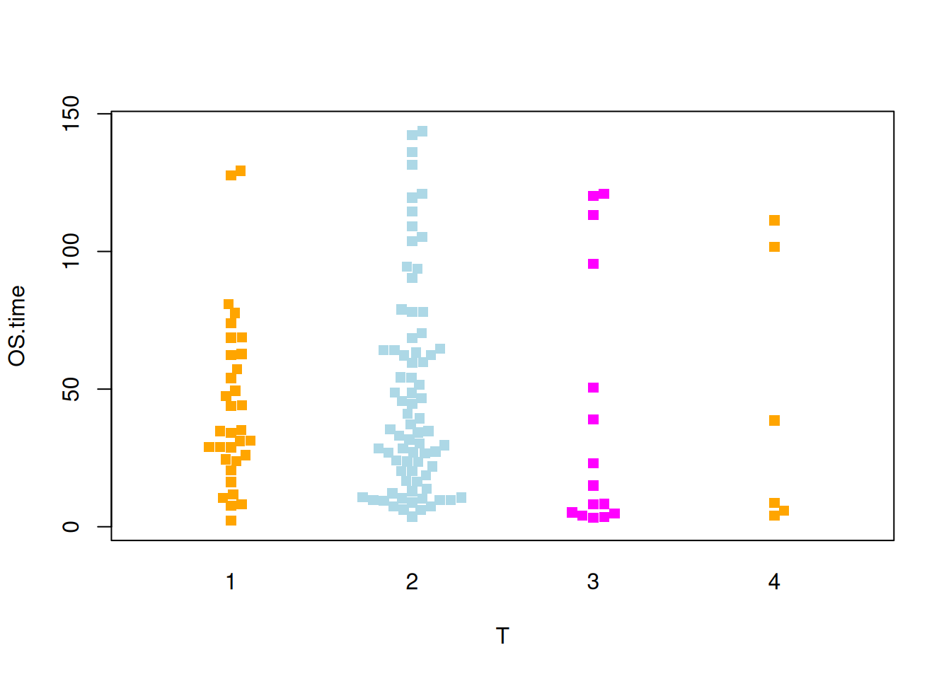
6. 基础蜂群图(ggbeeswarm包)
图 10 描述了 iris 数据集中 Sepal.Length 变量的分布。
p6_1 <- ggplot(iris,aes(y=Sepal.Length,x='')) +
  geom_beeswarm()
p6_1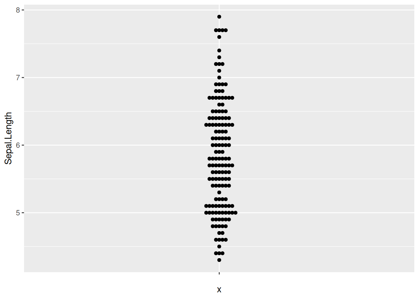
图 11 描述了 TCGA 数据集中 OS.time 变量的数量分布
p6_2 <- ggplot(TCGA_clinic,aes(y=OS.time,x='')) +
  geom_beeswarm()
p6_2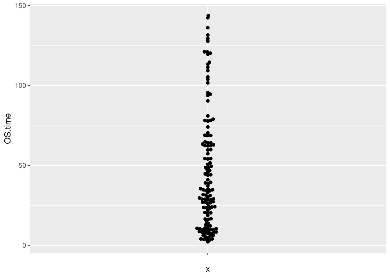
7. 蜂群图翻转(ggbeeswarm包)
图 12 描述了 iris 数据集中 Sepal.Length 变量的分布。
p7_1 <- ggplot(iris,aes(x=Sepal.Length,y='')) +
  geom_beeswarm()
p7_1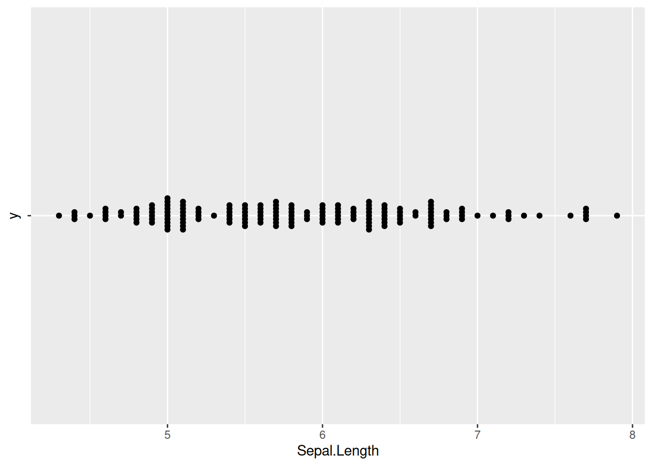
图 13 描述了 TCGA 数据集中 OS.time 变量的数量分布。
p7_2 <- ggplot(TCGA_clinic,aes(x=OS.time,y='')) +
  geom_beeswarm()
p7_2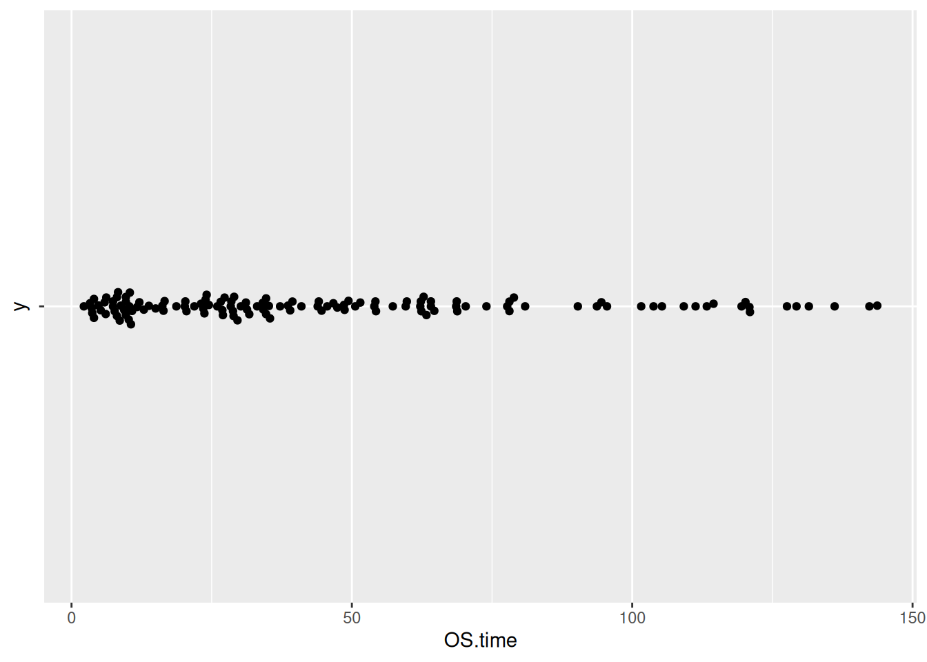
8. 自定义蜂群图(ggbeeswarm包)
提示
关键参数:
我们可以使用theme()函数改变点的颜色和整个图形的主题。
图 14 描述了 iris 数据集中 Sepal.Length 变量的分布。
p8_1 <- ggplot(iris,aes(y=Sepal.Length,x='')) +
  geom_beeswarm(color='blue') +
  theme_minimal()
p8_1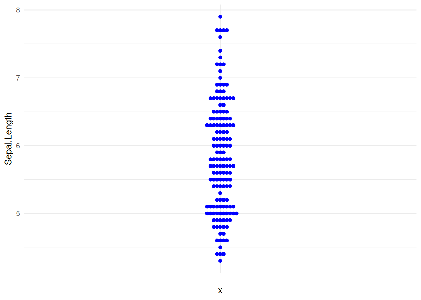
图 15 描述了 TCGA 数据集中 OS.time 变量的数量分布。
p8_2 <- ggplot(TCGA_clinic,aes(y=OS.time,x='')) +
  geom_beeswarm(color='blue') +
  theme_minimal()
p8_2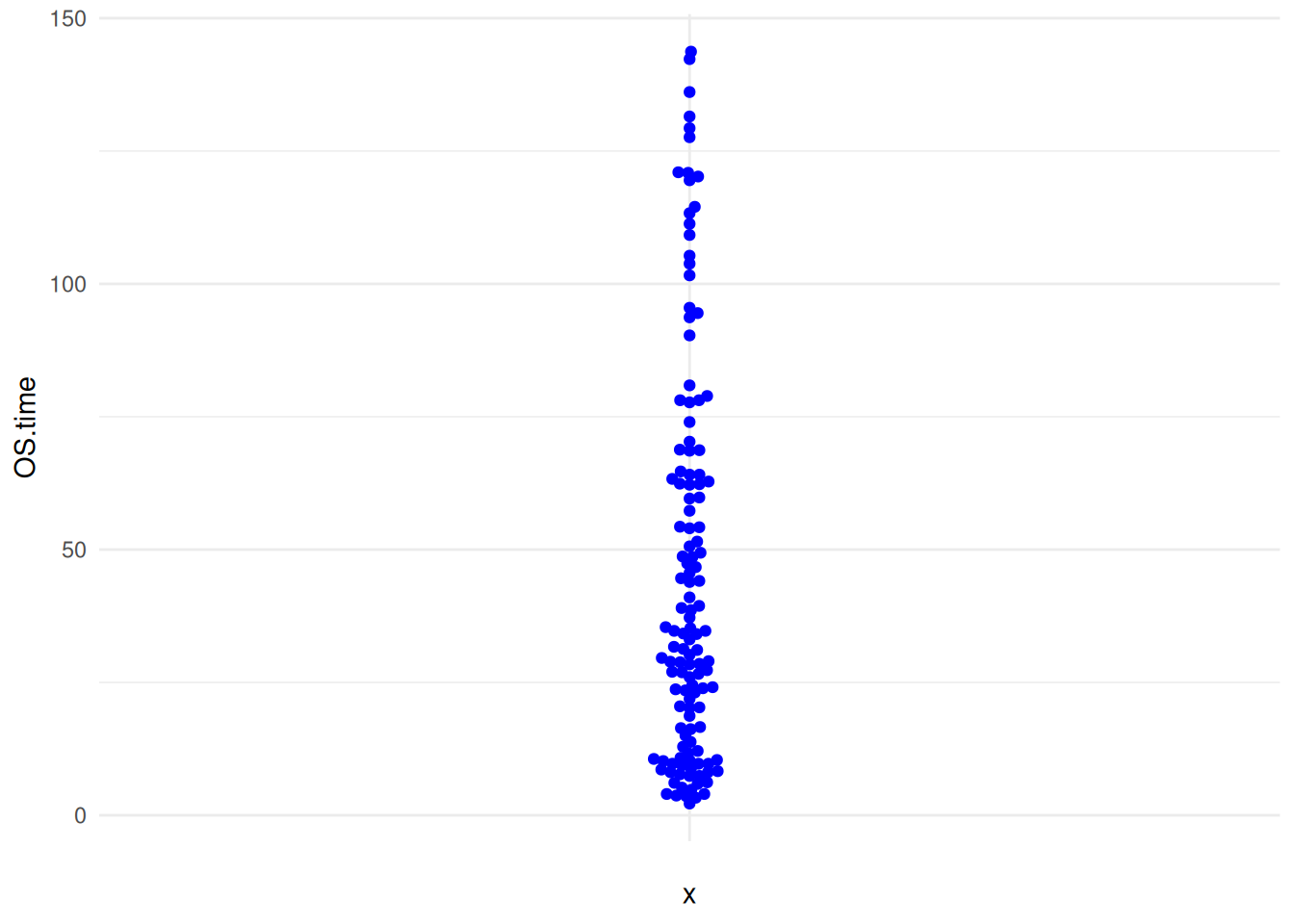
9. 改变蜂群图点的位置(ggbeeswarm包)
默认情况下,geom_beeswarm()函数将使用swarm方法来定位点。我们可以通过使用method参数来改变这种行为。以下是可用的选项:
swarm: 默认方法。compactswarm: 类似于群集,但点更加紧凑。center: 点在x轴上居中。hex: 点位于六边形中。square: 点位于正方形中。
图 16 描述了 iris 数据集中 Sepal.Length 变量的分布。
p9_1 <- ggplot(iris,aes(y=Sepal.Length,x='')) +
   geom_beeswarm(method='center')
p9_1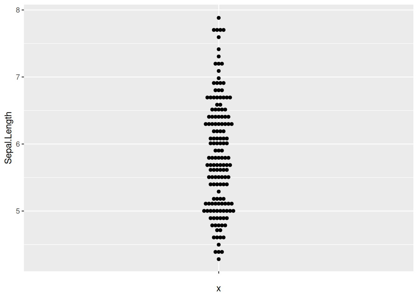
10. 自定义蜂群图点的颜色(ggbeeswarm包)
我们还可以使用scale_color_manual()函数自定义颜色。并且由于theme_minimal()函数,我们可以让图表看起来更加优雅。
图 17 描述了 Sepal.Length 变量在不同 Species 上的分布。
p10_1 <- ggplot(TCGA_clinic,aes(x=T, y=OS.time, colour=T)) +
  geom_beeswarm() +
  scale_color_manual(values=c("#999999", "#E69F00", "#56B4E9","blue")) +
  theme_minimal()
p10_1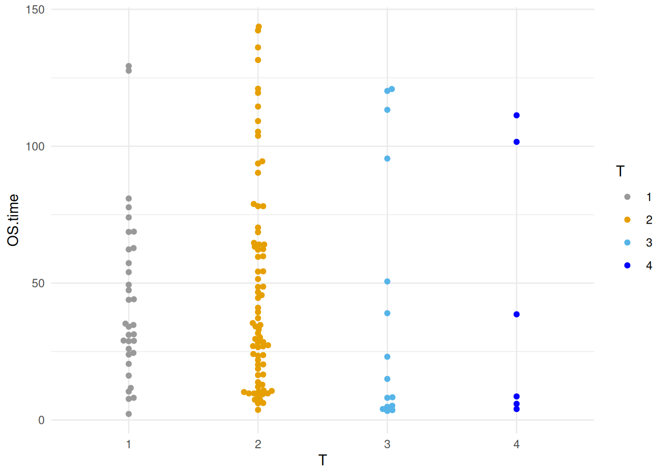
11. 分组和添加统计分析(ggbeeswarm包)
图 18 描述了 iris 数据集中 Sepal.Length 变量的分布。
p11_1 <- ggplot()+
  geom_bar(iris_sum,
           mapping=aes(x=Species,y=Sepal.Length,fill=Species),
           stat="identity",width=.6,
           alpha=0.5,position=position_dodge())+
  geom_errorbar(iris_sum,
                mapping=aes(x=Species,y=Sepal.Length,
                            ymin=Sepal.Length-sd,
                            ymax=Sepal.Length+sd),
                width=.4,position=position_dodge(.8))+
  geom_beeswarm(iris,
                mapping=aes(x=Species,y=Sepal.Length,fill=Species),
                shape=21,color='black',size=3.5,cex=1.2,stroke=0.6)+
  geom_signif(iris,
              mapping=aes(x=Species,y=Sepal.Length),
              comparisons=list(c("setosa","versicolor"),c("setosa","virginica")),
              test="t.test",step_increase=0.2,tip_length=0,textsize=6,size=1,
              map_signif_level=T)
p11_1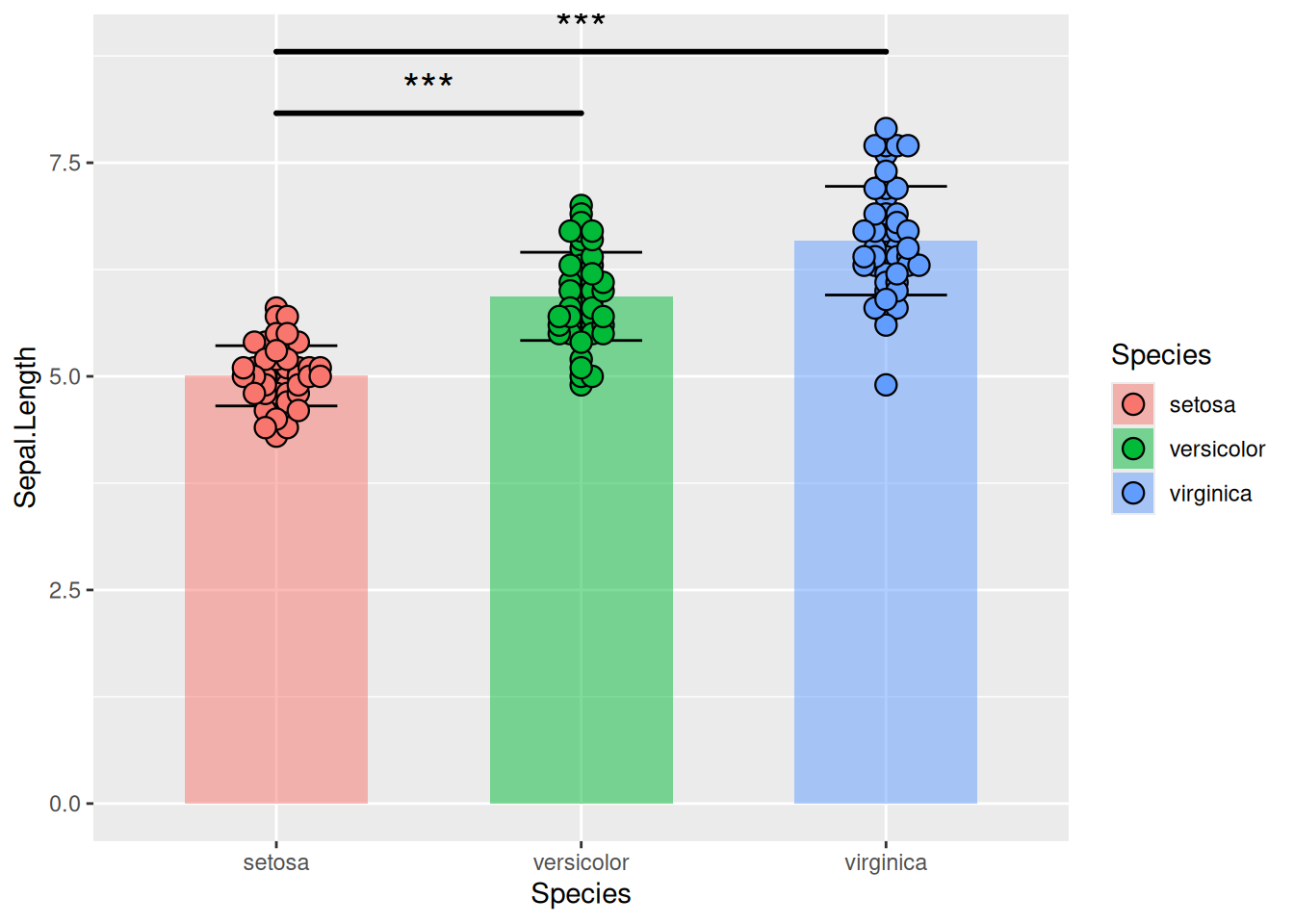
图 19 描述了肝癌中三个基因的基因表达数据。
p11_2 <- ggplot()+
  geom_bar(TCGA_gene_sum,
           mapping=aes(x=sample,y=gene_expression,fill=sample),
           stat="identity",width=.6,alpha=0.5,position=position_dodge())+
 geom_errorbar(TCGA_gene_sum,
               mapping=aes(x=sample,y=gene_expression,
                           ymin=gene_expression-sd,ymax=gene_expression+sd),
                          width=.4,position=position_dodge(.8))+
 geom_beeswarm(TCGA_gene_expression,
               mapping=aes(x=sample,y=gene_expression,fill=sample),
               shape=21,color='black',size=3.5,cex=1.2,stroke=0.6)+
  geom_signif(TCGA_gene_expression,
              mapping=aes(x=sample,y=gene_expression),
              comparisons=list(c("RAB4B","TIGAR"),c("RAB4B","RNF44"),c("TIGAR","RNF44")),
              test="t.test",step_increase=0.2, tip_length=0,textsize=6,
              size=1,map_signif_level=T)
p11_2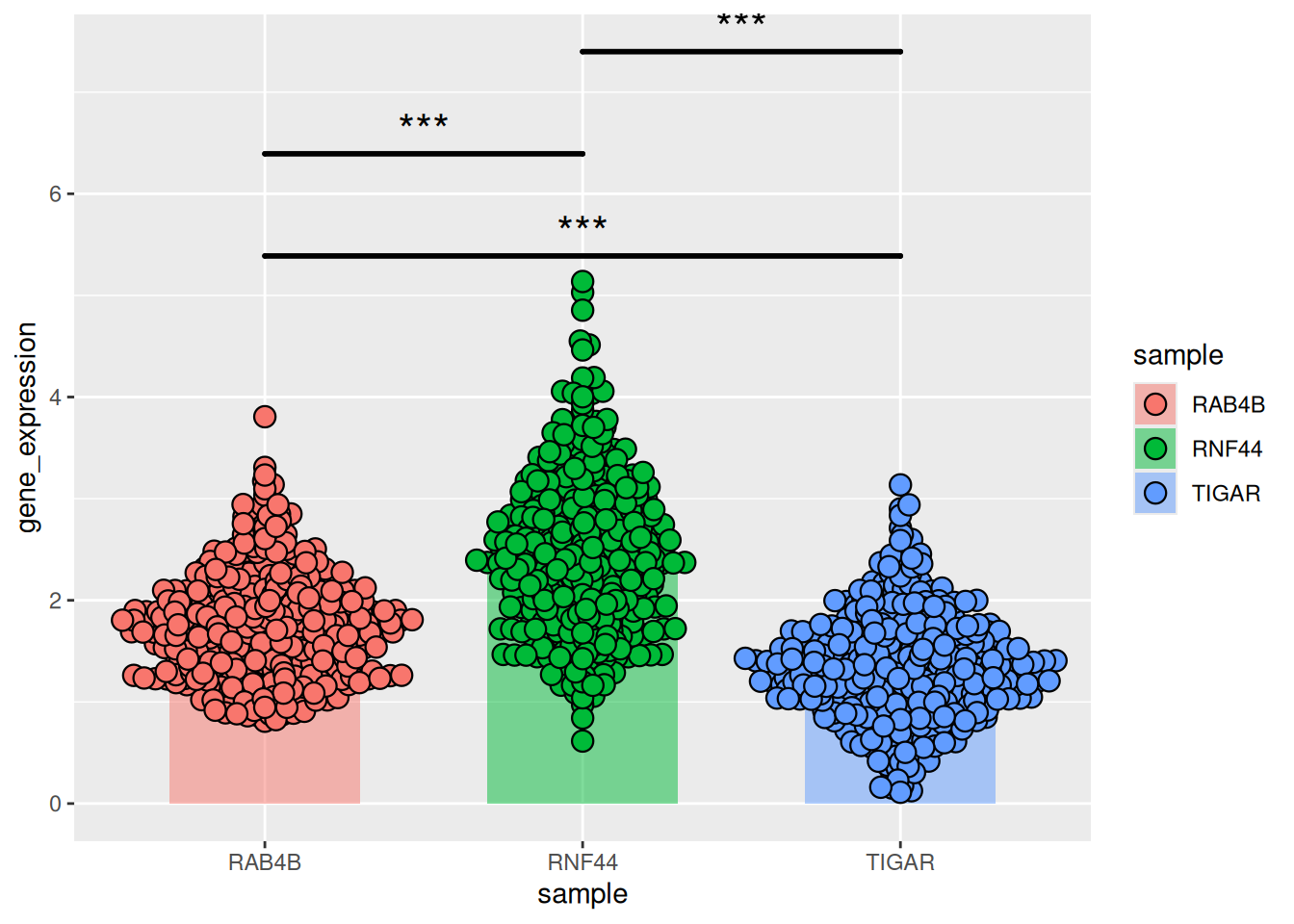
应用场景
1. 展示细胞密度
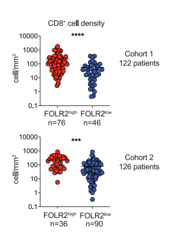
蜂群图显示了高或低FOLR2+细胞密度的肿瘤中CD8+ T细胞的密度。[1]
2.用蜂群图展示不同样本间基因表达数据的分布情况
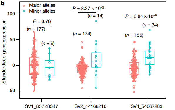
蜂群图展示了不同结构变异(SV)位点的基因表达水平的分布情况。[2]
参考文献
1.Nalio Ramos R,Missolo-Koussou Y,Gerber-Ferder Y, et al. Tissue-resident FOLR2 + macrophages associate with CD8 + T cell infiltration in human breast cancer. Cell. 2022;185 (7):1189-1207.e25. doi:10.1016/j.cell.2022.02.021
2.Zhou Y,Zhang Z,Bao Z, et al. Graph pangenome captures missing heritability and empowers tomato breeding. Nature. 2022;606 (7914):527-534. doi:10.1038/s41586-022-04808-9
3.Wickham, H. (2009). ggplot2: Elegant Graphics for Data Analysis. Springer-Verlag New York. ISBN 978-0-387-98140-6 (Print) 978-0-387-98141-3 (E-Book). [DOI: 10.1007/978-0-387-98141-3] (https://doi.org/10.1007/978-0-387-98141-3)
4.Erik Clarke, Scott Sherrill-Mix, Charlotte Dawson (2023). ggbeeswarm: Categorical Scatter (Violin Point) Plots. R package version 0.7.2. https://CRAN.R-project.org/package=ggbeeswarm
5.Aron Eklund, James Trimble (2021). beeswarm: The Bee Swarm Plot, an Alternative to Stripchart. R package version 0.4.0. https://CRAN.R-project.org/package=beeswarm
6.Wickham, H. (2017). dplyr: A Grammar of Data Manipulation (Version 0.7.4). Retrieved from https://CRAN.R-project.org/package=dplyr
7.Huber, W., Carey, V. J., Gentleman, R., Anders, S., & Carlson, M. (2015). Bioconductor: Support for the analysis and comprehension of high-throughput genomic data. R package version 3.2. F1000Research, 4, 1-22. Retrieved from https://www.bioconductor.org/ 54^
8.The R Graph Gallery – Help and inspiration for R charts (r-graph-gallery.com)