# 安装包
if (!requireNamespace("ggplot2", quietly = TRUE)) {
  install.packages("ggplot2")
}
if (!requireNamespace("ggbreak", quietly = TRUE)) {
  install.packages("ggbreak")
}
if (!requireNamespace("dplyr", quietly = TRUE)) {
  install.packages("dplyr")
}
if (!requireNamespace("ggpubr", quietly = TRUE)) {
  install.packages("ggpubr")
}
if (!requireNamespace("RColorBrewer", quietly = TRUE)) {
  install.packages("RColorBrewer")
}
if (!requireNamespace("rstatix", quietly = TRUE)) {
  install.packages("rstatix")
}

# 加载包
library(ggplot2)
library(ggbreak)
library(dplyr)
library(ggpubr)
library(RColorBrewer)
library(rstatix)断点图
示例
带断点的组合图表示例。
环境配置
系统要求: 跨平台(Linux/MacOS/Windows)
编程语言:R
依赖包:
ggplot2;ggbreak;dplyr;ggpubr;RColorBrewer;rstatix
sessioninfo::session_info("attached")─ Session info ───────────────────────────────────────────────────────────────
setting value
version R version 4.6.0 (2026-04-24)
os Ubuntu 24.04.4 LTS
system x86_64, linux-gnu
ui X11
language (EN)
collate C.UTF-8
ctype C.UTF-8
tz UTC
date 2026-05-09
pandoc 3.1.3 @ /usr/bin/ (via rmarkdown)
quarto 1.9.37 @ /usr/local/bin/quarto
─ Packages ───────────────────────────────────────────────────────────────────
package * version date (UTC) lib source
dplyr * 1.2.1 2026-04-03 [1] RSPM
ggbreak * 0.1.7 2026-03-18 [1] RSPM
ggplot2 * 4.0.3.9000 2026-05-04 [1] Github (tidyverse/ggplot2@6870419)
ggpubr * 0.6.3 2026-02-24 [1] RSPM
RColorBrewer * 1.1-3 2022-04-03 [1] RSPM
rstatix * 0.7.3 2025-10-18 [1] RSPM
[1] /home/runner/work/_temp/Library
[2] /opt/R/4.6.0/lib/R/site-library
[3] /opt/R/4.6.0/lib/R/library
* ── Packages attached to the search path.
──────────────────────────────────────────────────────────────────────────────数据准备
# 数据准备
df <- ToothGrowth %>%
  group_by(supp, dose) %>%
  summarise(
    mean_len = mean(len),
    sd_len = sd(len),
    n = n(),
    se_len = sd_len/sqrt(n),
    .groups = 'drop')


# 统计检验(关键修复点)
stat.test <- ToothGrowth %>%
  group_by(dose) %>%
  t_test(len ~ supp) %>%
  add_xy_position(x = "dose", dodge = 0.8)

head(df)
# A tibble: 6 × 6
supp dose mean_len sd_len n se_len
<fct> <dbl> <dbl> <dbl> <int> <dbl>
1 OJ 0.5 13.2 4.46 10 1.41
2 OJ 1 22.7 3.91 10 1.24
3 OJ 2 26.1 2.66 10 0.840
4 VC 0.5 7.98 2.75 10 0.869
5 VC 1 16.8 2.52 10 0.795
6 VC 2 26.1 4.80 10 1.52 可视化
1. 基础柱状图
使用基础函数绘制图片的图注和简介。
# 基础柱状图
p1 <- ggplot(df, aes(x=dose, y=mean_len, fill=supp)) +
  geom_col(position=position_dodge(0.4), width=0.2) +
  geom_errorbar(aes(ymin=mean_len-sd_len, ymax=mean_len+sd_len),
                width=0.1, position=position_dodge(0.4)) +
  scale_y_continuous(breaks = seq(0, 30, 5)) +
  scale_y_cut(breaks=c(15), which=1, scales=1.5) +
  labs(x="Dose (mg/day)", y="Tooth Length (mm)") +
  theme_classic()

p1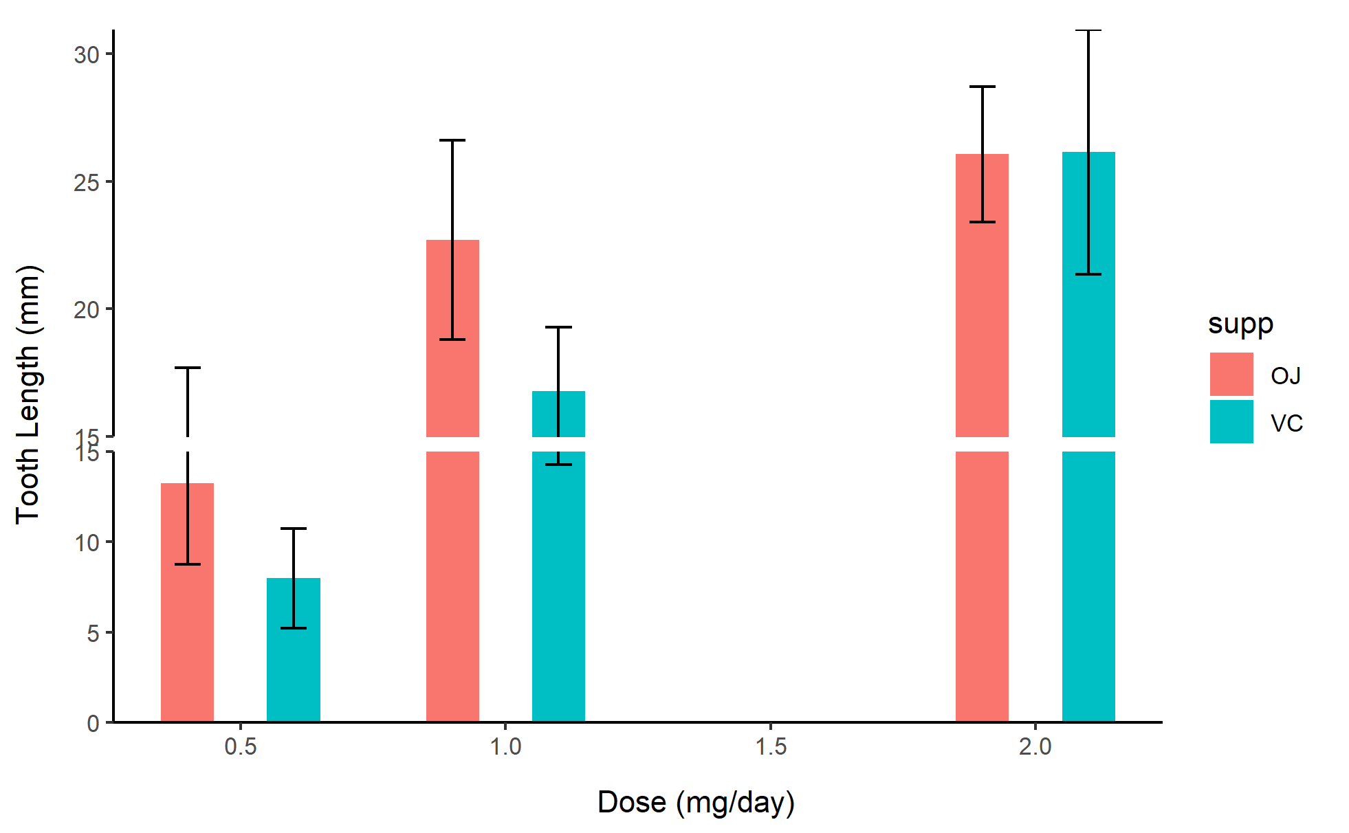
2. 分组散点图
# 分组散点图
p2 <- ggplot(ToothGrowth, aes(x=dose, y=len, color=supp)) +
  geom_point(position=position_jitterdodge(jitter.width=0.2)) +
  scale_y_continuous(breaks = seq(0, 40, 5)) +
  scale_y_cut(breaks=c(15, 25), which=c(1,2), scales=c(1.5, 1)) +
  labs(x="Dose (mg/day)", y="Tooth Length (mm)") +
  theme_bw()

p2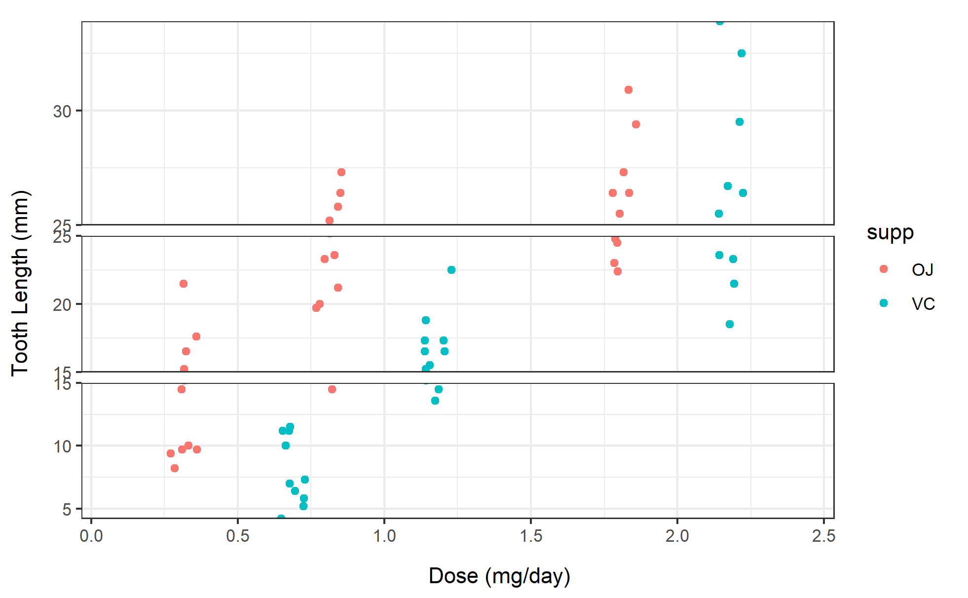
3. 折线图
# 折线图
p3 <- ggplot(df, aes(x=dose, y=mean_len, color=supp)) +
  geom_line(linewidth=1) +
  geom_point(size=3) +
  scale_y_continuous(breaks = seq(0, 30, 5)) +
  scale_y_cut(breaks=c(15), which=1, scales=1.5) +
  labs(x="Dose (mg/day)", y="Mean Tooth Length (mm)") +
  theme_minimal()

p3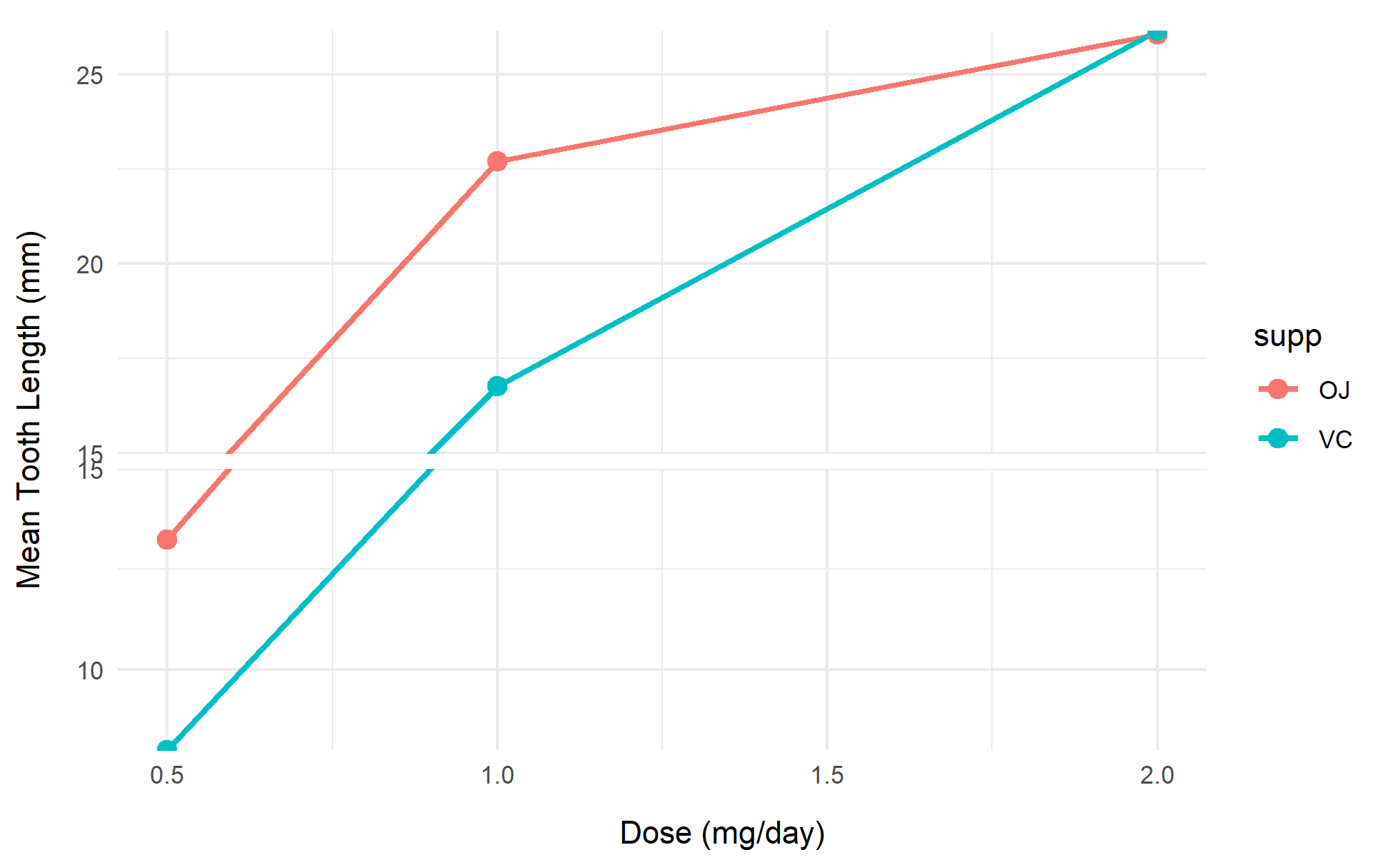
提示
关键参数解析:
breaks: 设置断点位置
which: 指定断点区间(从下往上计数)
scales: 设置各区间比例尺缩放系数
space: 断点间距(默认0.1)
position_dodge(): 控制分组条形的位置间隔
width 参数建议与 geom_col 的 width 参数保持一致
4. 更多进阶图表
# 更多进阶图表
my_colors <- c("#1B9E77", "#D95F02")  # 来自RColorBrewer的Set2调色板
p4 <- ggplot(df, aes(x = factor(dose), y = mean_len, fill = supp)) +
  geom_col(position = position_dodge(0.8), width = 0.7, alpha = 0.9) +
  geom_errorbar(
    aes(ymin = mean_len - se_len, ymax = mean_len + se_len),
    width = 0.2, position = position_dodge(0.8)
  ) +
  geom_text(
    aes(group = supp, label = sprintf("%.1f±%.1f", mean_len, se_len)),
    position = position_dodge(0.8), vjust = -1, size = 4
  ) +
  scale_y_continuous(
    breaks = seq(0, 35, 5) # 增加上方扩展空间
  ) +
  scale_y_break(c(8,12)
  ) +
  scale_fill_manual(values = my_colors) +
  labs(x = "Dose (mg/day)", y = "Tooth Length (mm)", fill = "Supplement") +
  theme_minimal(base_size = 12) +
  theme(
    legend.position = "top",
    panel.grid.major.x = element_blank()
  )

p4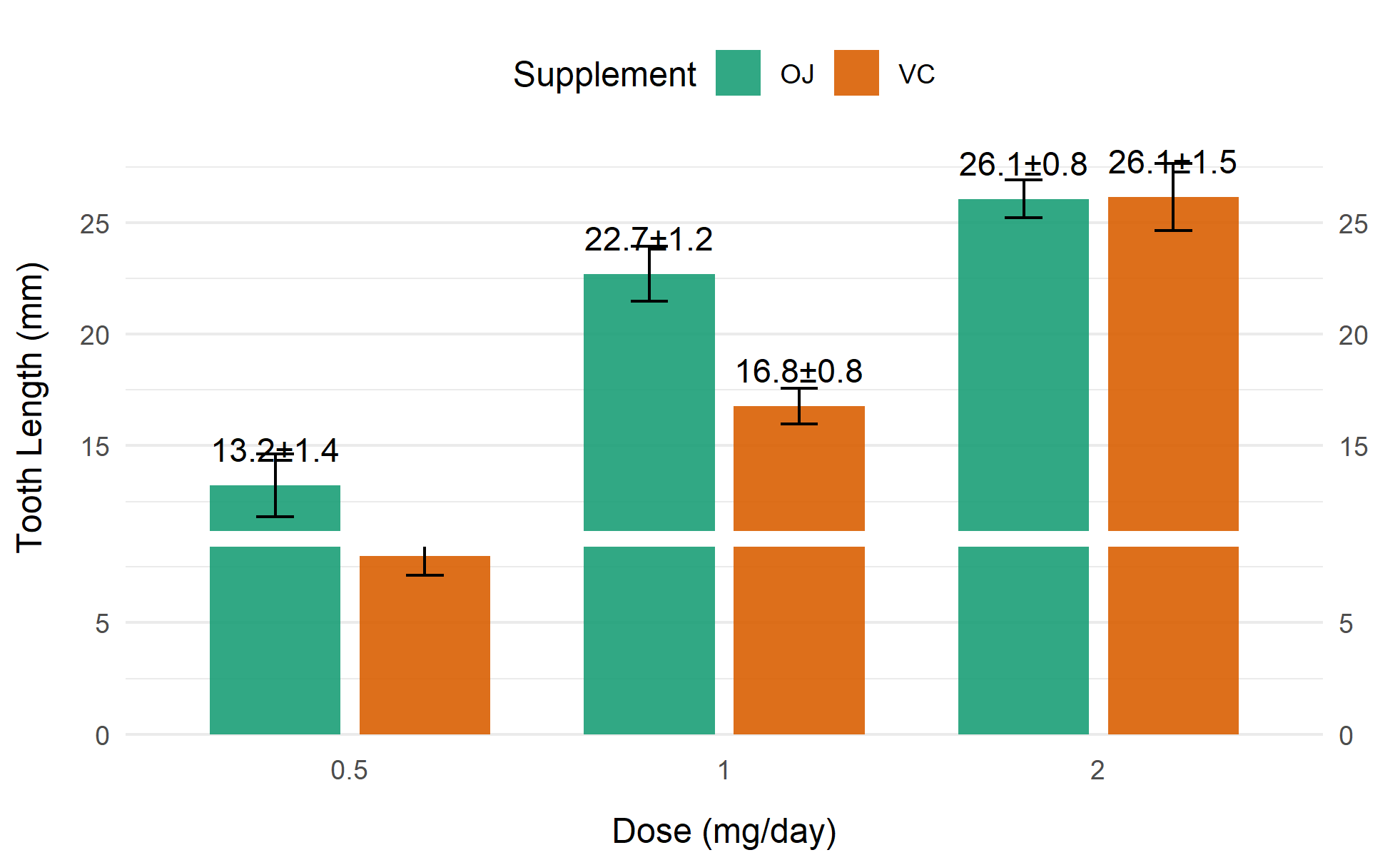
应用场景
展示可视化图表在生物医学文献中的实际应用,如果基础图表/进阶图表被广泛应用在各类生物医学文献,则可以选择分别展示。
1. 基因表达量可视化(处理极端离群值)
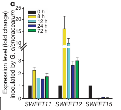
显示了基因表达的变化。 [1]
2. 临床指标分布展示(处理不同量纲数据)
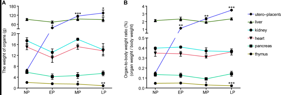
图显示了不同妊娠时期母体子宫胎盘、肝脏、肾脏、心脏、胰腺和胸腺的 (A) [器官重量]和(B) 器官体重比的变化 。 [2]
参考文献
[1] Xu S, et al. (2022) ggbreak: Effective Axis Break Creation in ggplot2. Journal of Open Source Software 7(74), 4301
[2] Yu D, Wang H, Shyh-Chang N. A multi-tissue metabolome atlas of primate pregnancy. Cell. 2024 Feb 1;187(3):764-781.e14. doi: 10.1016/j.cell.2023.11.043.
[3] Chen LQ, Hou BH, Mudgett MB, Frommer WB. Sugar transporters for intercellular exchange and nutrition of pathogens. Nature. 2010 Nov 25;468(7323):527-32. doi: 10.1038/nature09606.