# 安装包
if (!requireNamespace("ggplot2", quietly = TRUE)) {
  install.packages("ggplot2")
}
if (!requireNamespace("patchwork", quietly = TRUE)) {
  install.packages("patchwork")
}
if (!requireNamespace("dplyr", quietly = TRUE)) {
  install.packages("dplyr")
}

# 加载包
library(ggplot2)
library(patchwork)
library(dplyr)时间序列图
时间序列图是以时间为横轴,观察变量为纵轴的统计图,反映观察变量随着时间的变化趋势。
示例
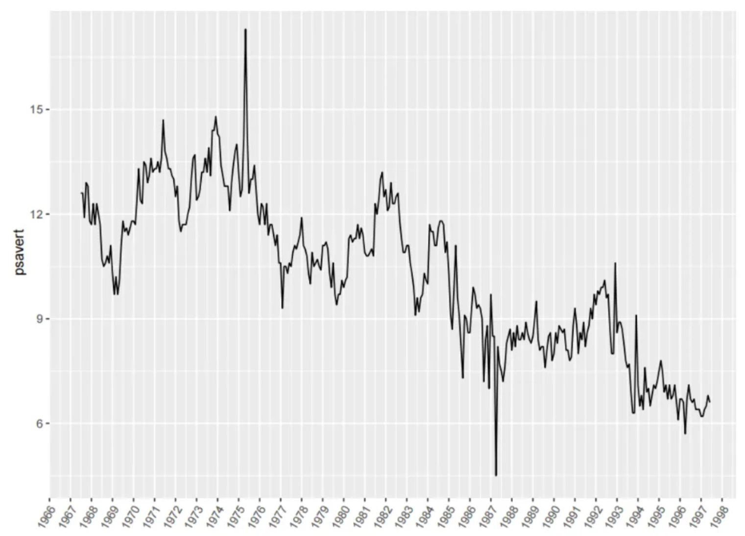
如图是一个时间序列图,图中的横坐标是日期,纵坐标的psavert是观测变量,可以看出psavert随着时间总体上有着下降的趋势。
环境配置
系统要求: 跨平台(Linux/MacOS/Windows)
编程语言:R
依赖包:
ggplot2,patchwork,dplyr
sessioninfo::session_info("attached")─ Session info ───────────────────────────────────────────────────────────────
setting value
version R version 4.6.0 (2026-04-24)
os Ubuntu 24.04.4 LTS
system x86_64, linux-gnu
ui X11
language (EN)
collate C.UTF-8
ctype C.UTF-8
tz UTC
date 2026-05-09
pandoc 3.1.3 @ /usr/bin/ (via rmarkdown)
quarto 1.9.37 @ /usr/local/bin/quarto
─ Packages ───────────────────────────────────────────────────────────────────
package * version date (UTC) lib source
dplyr * 1.2.1 2026-04-03 [1] RSPM
ggplot2 * 4.0.3.9000 2026-05-04 [1] Github (tidyverse/ggplot2@6870419)
patchwork * 1.3.2 2025-08-25 [1] RSPM
[1] /home/runner/work/_temp/Library
[2] /opt/R/4.6.0/lib/R/site-library
[3] /opt/R/4.6.0/lib/R/library
* ── Packages attached to the search path.
──────────────────────────────────────────────────────────────────────────────数据准备
使用R自带的economics数据集和PhysioNet数据库中的受试者定量脱水估计数据 [1]。
# 1.economics数据集
data <- economics[1:60, c(1, 4)]

head(data)
# A tibble: 6 × 2
date psavert
<date> <dbl>
1 1967-07-01 12.6
2 1967-08-01 12.6
3 1967-09-01 11.9
4 1967-10-01 12.9
5 1967-11-01 12.8
6 1967-12-01 11.8data_double <- economics[1:60, c(1, 4, 5)] #此数据用于子图合并和双y轴
head(data_double)# A tibble: 6 × 3
date psavert uempmed
<date> <dbl> <dbl>
1 1967-07-01 12.6 4.5
2 1967-08-01 12.6 4.7
3 1967-09-01 11.9 4.6
4 1967-10-01 12.9 4.9
5 1967-11-01 12.8 4.7
6 1967-12-01 11.8 4.8# 2.定量脱水估计数据
data_water <- read.csv("https://bizard-1301043367.cos.ap-guangzhou.myqcloud.com/dehydration_estimation.csv", header = T)
axis_name <- colnames(data_water)[c(5, 8)] # 记录列名
data_water <- data_water %>% # 选取2组数据
slice(c(19:27, 46:54)) %>%
select(c(1, 5, 8)) %>%
setNames(c("V1", "V2", "V3")) %>% # 更改列名
mutate(V4 = case_when(V1 == 3 ~ "people1", # V4列作为分类标签
V1 == 6 ~ "people2"))
head(data_water) V1 V2 V3 V4
1 3 0 53.0 people1
2 3 1 53.2 people1
3 3 2 53.6 people1
4 3 3 53.2 people1
5 3 4 53.3 people1
6 3 5 53.1 people1可视化
1. 基本绘图
# 基本绘图
p <- ggplot(data, aes(x = date, y = psavert)) +
  geom_line() +
  xlab("")

p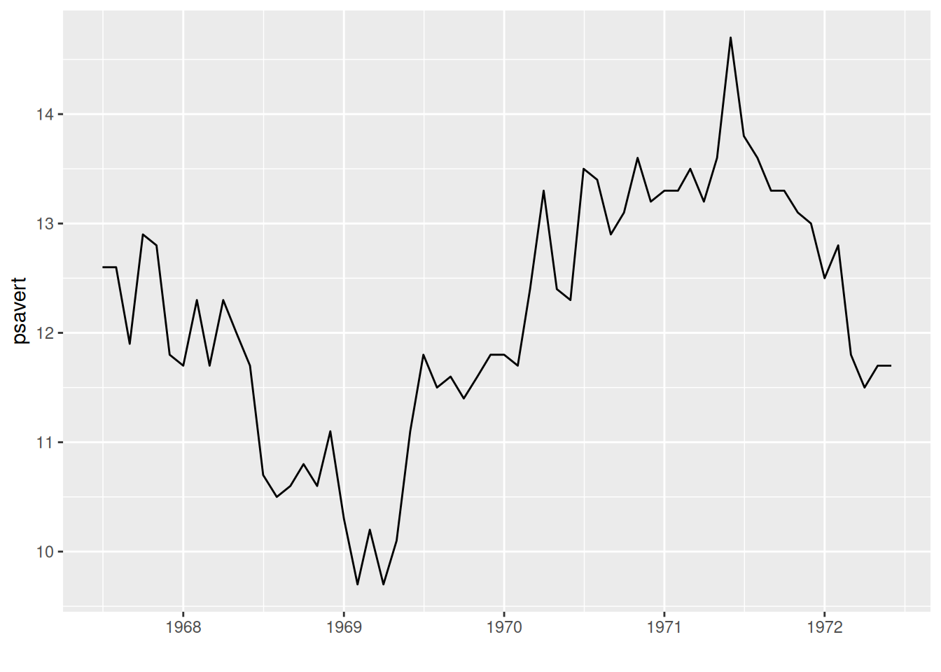
上图以日期为x轴,观测变量为y轴,geom_line()绘制线段就可以得到基本的时间序列图。
2. 显示观测点
# geom_point()显示观测点
p <- ggplot(data, aes(x = date, y = psavert)) +
  geom_line() +
  xlab("") +
  geom_point()

p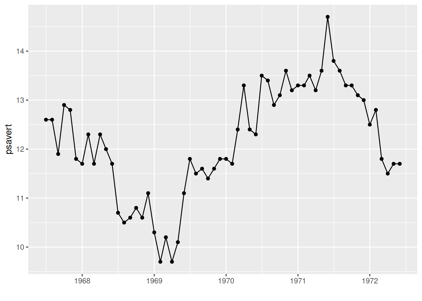
图中使用geom_point()显示观测点。
3. 多类数据绘图
# 多类数据绘图
p <- ggplot(data_water, aes(x = V2, y = V3, group = V4)) +     #V4分类标签映射到分组和颜色特征
  geom_line(aes(color = V4)) +
  geom_point(aes(color = V4)) +
  ylab(axis_name[2]) +                      #添加坐标轴标签
  xlab(axis_name[1]) +
  #更改图例位置
  theme(legend.position = "inside", legend.position.inside = c(0.85, 0.85))

p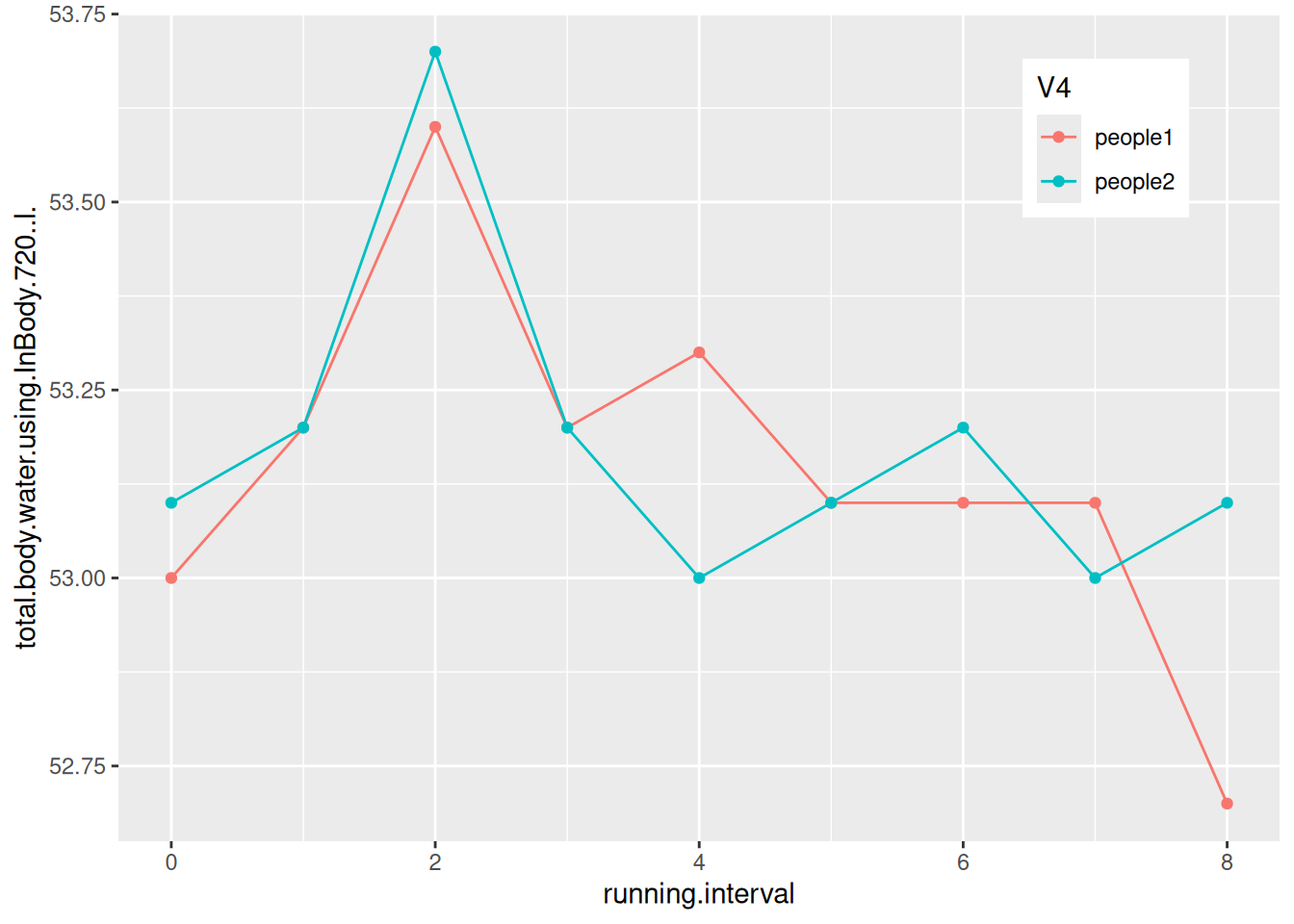
图中绘制了两个受试者跑步期间的体内水分变化。
4. 更改x轴日期标签
4.1 设置日期标签的格式
# 使用scale_x_date()设置日期
p <- ggplot(data, aes(x = date, y = psavert)) +
  geom_line() +
  xlab("") +
  geom_point() +
  scale_x_date(date_labels = "%Y-%m")

p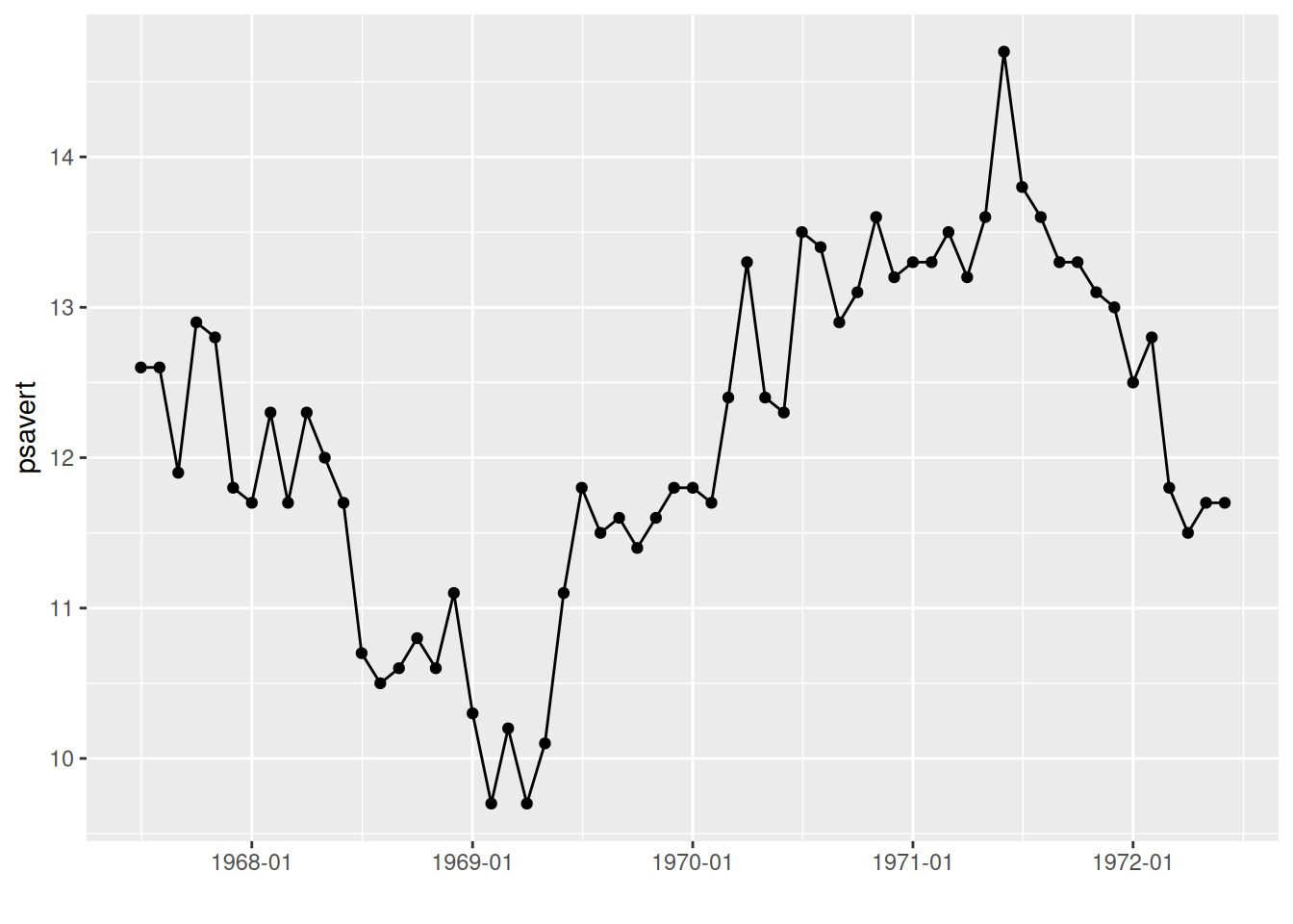
图中的x轴标签被更改成了年-月的形式。
提示
关键参数: date_labels
scale_x_date中的参数date_labels决定x轴日期文本的格式,其中
- “%Y”:带有世纪的年(如2024)
- “%y”:不带世纪的年(如24)
- “%m”:月份(范围00-12)
- “%d”:某月的第几天(范围01-31)
这些可以单独和随意组合,更多的详细内容在R语言的help栏的strftime中了解。
4.2 设置日期标签的显示间隔
# 使用scale_x_date()设置日期标签的显示间隔
p <- ggplot(data, aes(x = date, y = psavert)) +
  geom_line() +
  xlab("") +
  geom_point() +
  scale_x_date(date_labels = "%Y/%m",date_breaks = "9 month")

p
图中使用scale_x_date中的参数date_breaks更改日期标签的显示间隔。
提示
关键参数: date_breaks
shape 为点的形状,可选值为0-25,具体形状见下图:
scale_x_date中的参数date_breaks决定日期的标签间隔,形如
“2 year”、“1 month”、“2 weeks”,单位有’sec’(秒), ‘min’(分), ‘hour’(时), ‘day’(天), ‘week’(周), ‘month’ (月)或 ‘year’(年)。’s’复数形式可加可不加。
5. 调整标签角度
# 通过theme()调整标签角度
p <- ggplot(data, aes(x = date, y = psavert)) +
  geom_line() +
  xlab("") +
  geom_point() +
  scale_x_date(date_labels = "%Y/%m",date_breaks = "3 month")+
  theme(axis.text.x = element_text(angle = 60, hjust = 1))     # angle参数调整标签角度,hjust=1是标签名称水平最右端与标签刻度对齐

p
图中调整标签角度有效避免了标签重叠。
6. 限制时间范围
# 通过scale_x_date()的limit参数截取时间段图像
p <- ggplot(data, aes(x = date, y = psavert)) +
  geom_line() +
  xlab("") +
  geom_point() +
  scale_x_date(date_labels = "%Y/%m",date_breaks = "3 month",
               limit = c(as.Date("1968-01-01"), as.Date("1969-12-01")))+
  theme(axis.text.x = element_text(angle = 60, hjust = 1))

p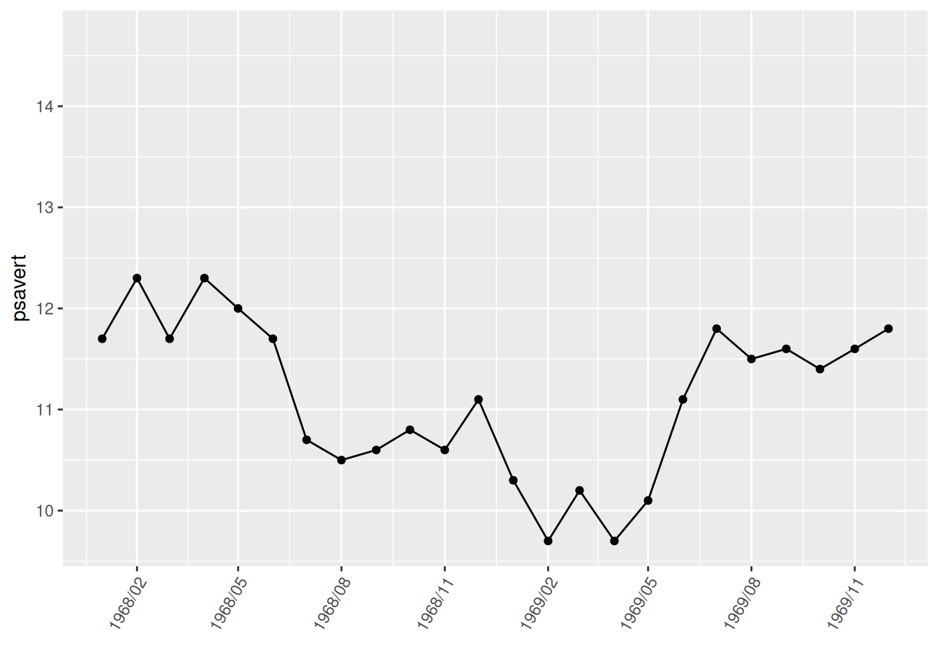
图中使用了scale_x_date中的limit参数只截取了1968-01-01到1969-12-01的数据。
7. 注释和分割线
# 注释和分割线
p <- ggplot(data, aes(x = date, y = psavert)) +
  geom_line() +
  xlab("") +
  geom_point() +
  scale_x_date(date_labels = "%Y/%m",date_breaks = "3 month")+
  theme(axis.text.x = element_text(angle = 60, hjust = 1))+
# 注释文本
  annotate(geom="text",x=as.Date("1971-06-01"),y=14.7,label="MAX of pasavert")+
# 注释点
  annotate(geom="point",x=as.Date("1971-06-01"),y=14.7,color="red")+
# 添加水平线
  geom_hline(yintercept=13.5,color="blue")

p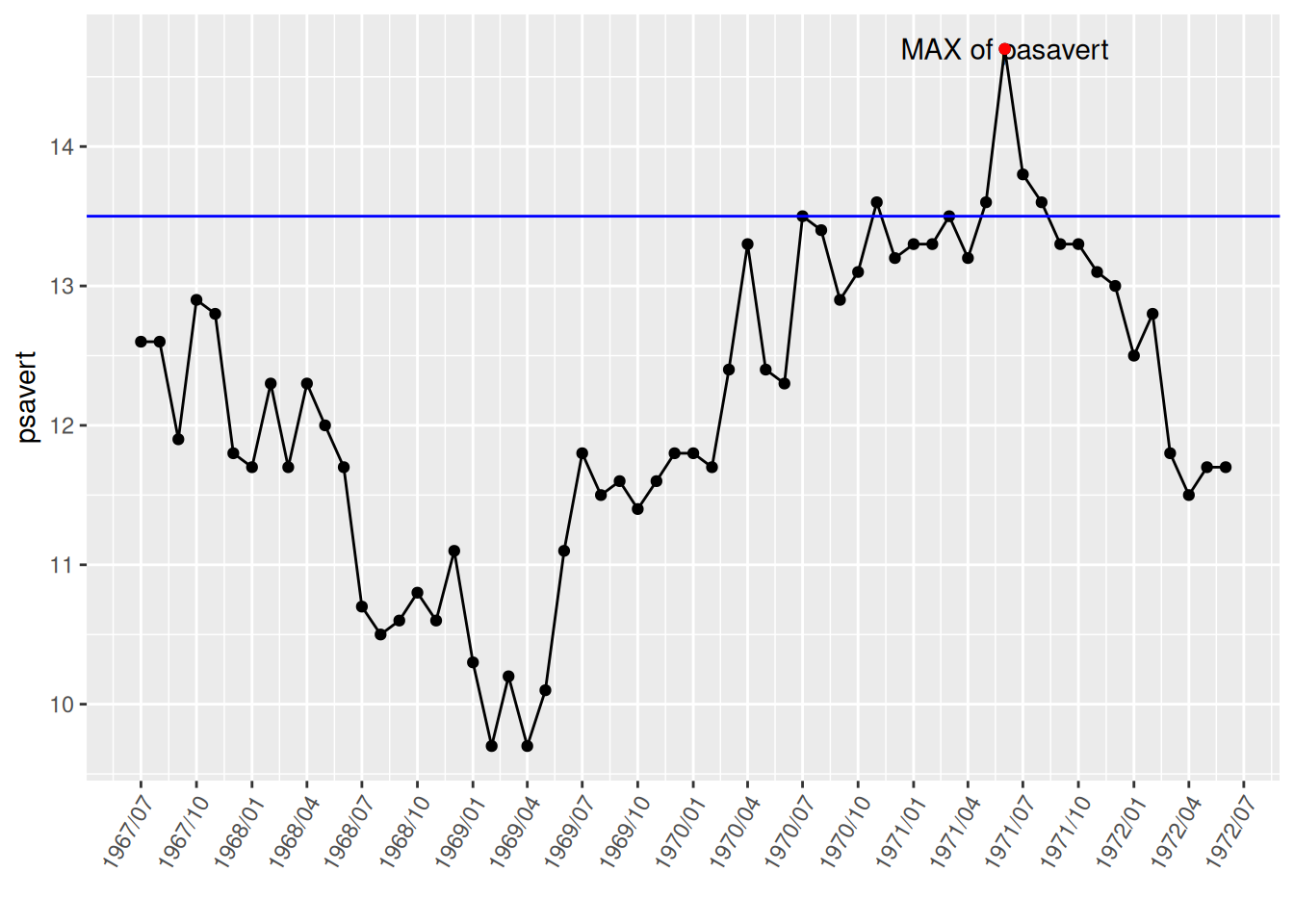
图中使用annotate()标记了最高点并注明标签,又使用geom_hline()绘制水平分割线。
8. 子图合并
# 子图显示在一张图上,需要载入patchwork
p <- ggplot(data_double, aes(x = date, y = psavert)) +
  geom_line() +
  xlab("")

p1 <- ggplot(data_double, aes(x = date, y = uempmed)) +
  geom_line() +
  xlab("")

p + p1          #子图合并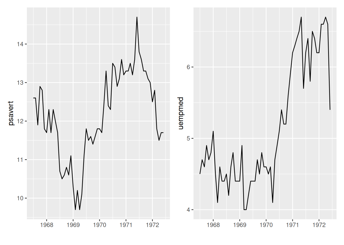
图中使用patchwork包可以将子图放在一个图上。
9. 双y轴
#双y轴,使用sec.axis设置第二个y轴
p <- ggplot(data_double, aes(x = date)) +
  geom_line(aes(y = psavert),color = "red") +
  geom_line(aes(y = uempmed * 3),color = "blue") +      #刻度不一致因此要乘倍数
  xlab("")+
  scale_y_continuous(
    name = "psavert",
# transform将左边y轴坐标除以上面倍数,name设置名称
    sec.axis = sec_axis(transform = ~ . / 3, name = "uempmed")
  ) +
# 设置双y轴的标题,与相应线段同色,便于区分
  theme(
    axis.title.y = element_text(color = "red", size = 13),
    axis.title.y.right = element_text(color = "blue", size = 13),
    legend.position = "none"
  )

p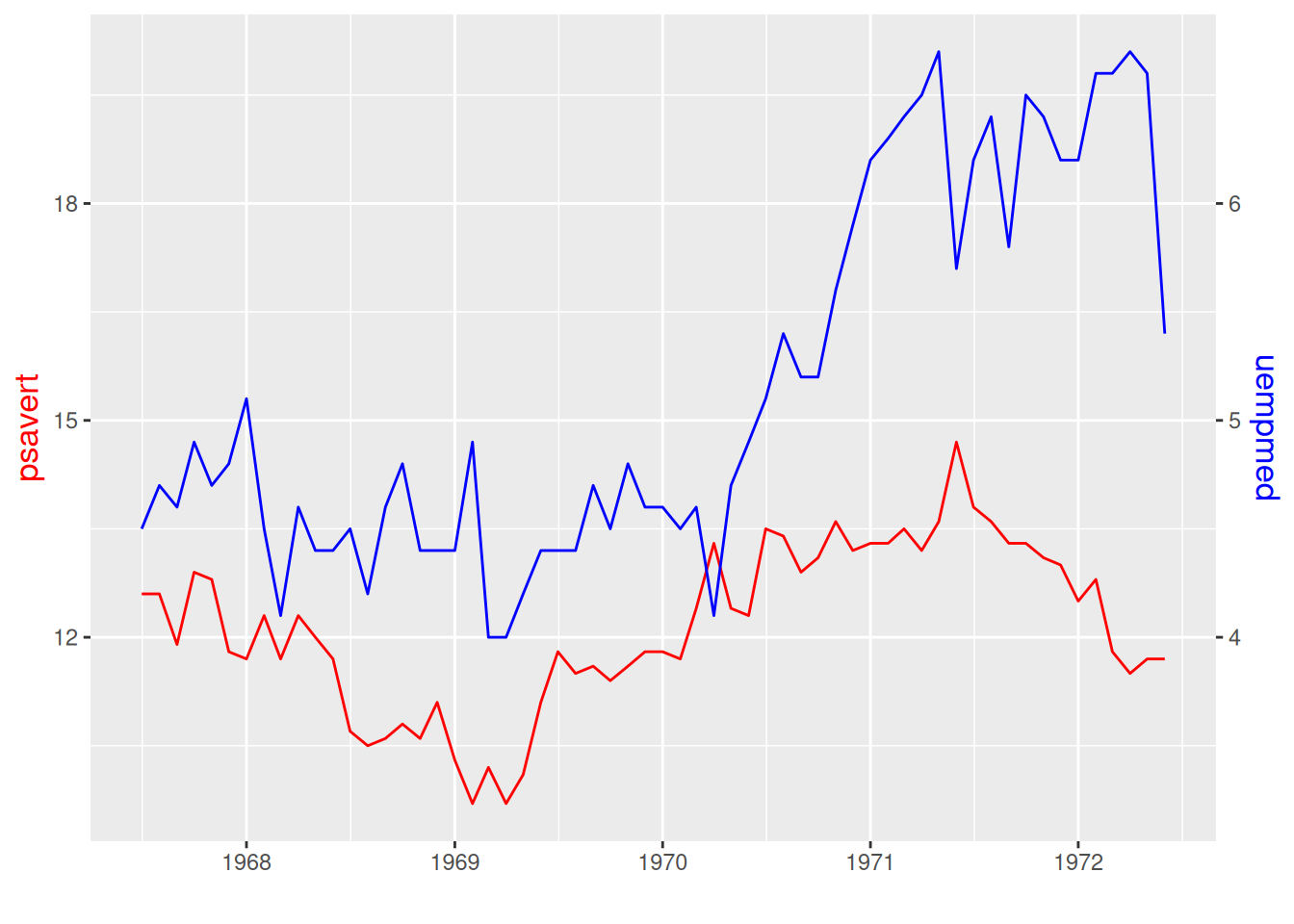
图中的双y轴有着不同的刻度,线颜色对应y标签颜色。
应用场景
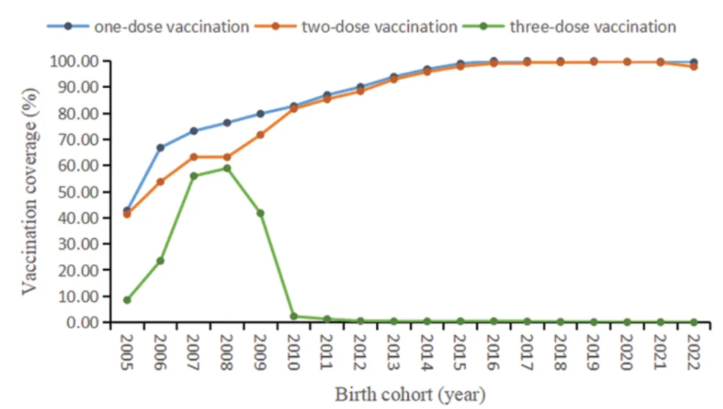
图中显示了2005年至2022年出生队列中不同剂量含腮腺炎疫苗的覆盖率。 [1]
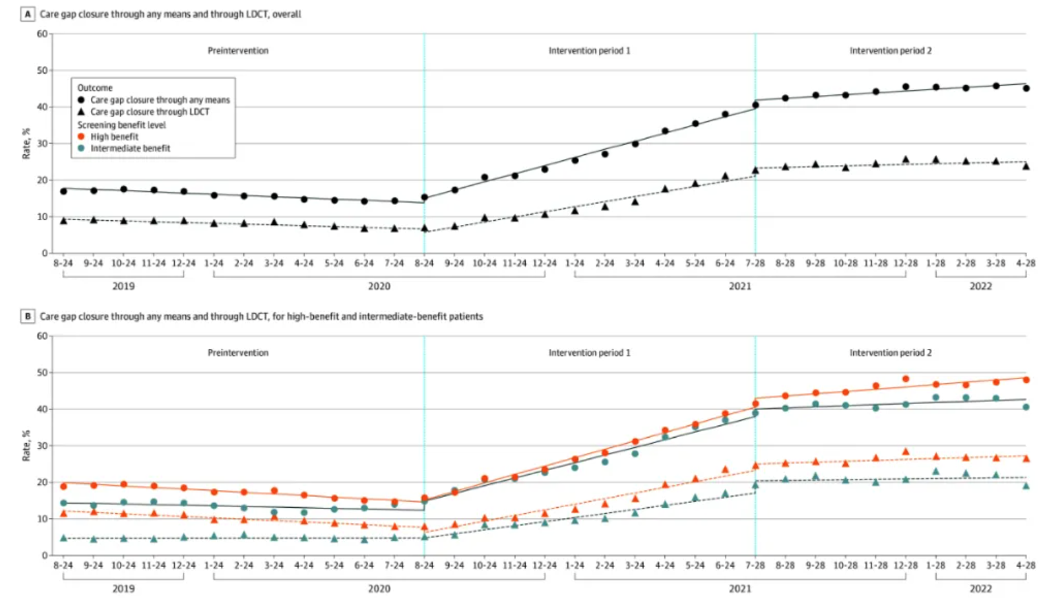
任何方式和低剂量计算机断层扫描(LDCT)的肺癌癌症筛查医疗差距的总体受益水平(图A)和患者受益水平(图B)。 [2]
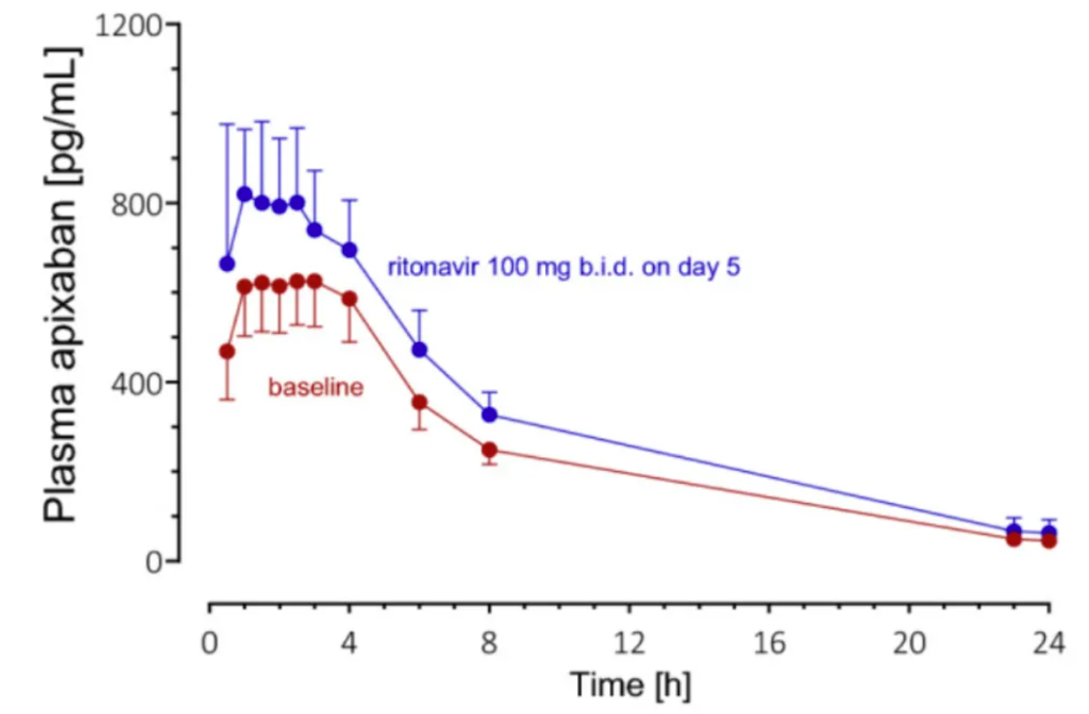
8名健康志愿者口服阿哌沙班25µg单独给药后(基线;红色符号和线)和利托那韦治疗第5天(蓝色标记和线)的几何平均血浆浓度-时间曲线(±95%置信区间)。 [3]
参考文献
[1] FU C, XU W, ZHENG W, et al. Epidemiological characteristics and interrupted time series analysis of mumps in Quzhou City, 2005-2023[J]. Hum Vaccin Immunother, 2024,20(1): 2411828.
[2] KUKHAREVA P V, LI H, CAVERLY T J, et al. Lung Cancer Screening Before and After a Multifaceted Electronic Health Record Intervention: A Nonrandomized Controlled Trial[J]. JAMA Netw Open, 2024,7(6): e2415383.
[3] ROHR B S, KROHMER E, FOERSTER K I, et al. Time Course of the Interaction Between Oral Short-Term Ritonavir Therapy with Three Factor Xa Inhibitors and the Activity of CYP2D6, CYP2C19, and CYP3A4 in Healthy Volunteers[J]. Clin Pharmacokinet, 2024,63(4): 469-481.