# 安装包
if (!requireNamespace("data.table", quietly = TRUE)) {
  install.packages("data.table")
}
if (!requireNamespace("jsonlite", quietly = TRUE)) {
  install.packages("jsonlite")
}
if (!requireNamespace("ggplot2", quietly = TRUE)) {
  install.packages("ggplot2")
}

# 加载包
library(data.table)
library(jsonlite)
library(ggplot2)双Y轴图
注记
Hiplot 网站
本页面为 Hiplot Dual Y Axis Chart 插件的源码版本教程,您也可以使用 Hiplot 网站实现无代码绘图,更多信息请查看以下链接:
双Y轴图可以将两组数量级较大的数据放在同一个图中进行展示。
环境配置
系统: Cross-platform (Linux/MacOS/Windows)
编程语言: R
依赖包:
data.table;jsonlite;ggplot2
sessioninfo::session_info("attached")─ Session info ───────────────────────────────────────────────────────────────
setting value
version R version 4.6.0 (2026-04-24)
os Ubuntu 24.04.4 LTS
system x86_64, linux-gnu
ui X11
language (EN)
collate C.UTF-8
ctype C.UTF-8
tz UTC
date 2026-05-09
pandoc 3.1.3 @ /usr/bin/ (via rmarkdown)
quarto 1.9.37 @ /usr/local/bin/quarto
─ Packages ───────────────────────────────────────────────────────────────────
package * version date (UTC) lib source
data.table * 1.18.4 2026-05-06 [1] RSPM
ggplot2 * 4.0.3.9000 2026-05-04 [1] Github (tidyverse/ggplot2@6870419)
jsonlite * 2.0.0 2025-03-27 [1] RSPM
[1] /home/runner/work/_temp/Library
[2] /opt/R/4.6.0/lib/R/site-library
[3] /opt/R/4.6.0/lib/R/library
* ── Packages attached to the search path.
──────────────────────────────────────────────────────────────────────────────数据准备
载入数据为分为三列,第一列是x轴的数值,第二列为左侧Y轴的数值,第三列为右侧Y轴的数值。
# 加载数据
data <- data.table::fread(jsonlite::read_json("https://hiplot.cn/ui/basic/dual-y-axis/data.json")$exampleData$textarea[[1]])
data <- as.data.frame(data)

# 查看数据
head(data)
x data1 data2
1 1 0.6105444 1000.5383
2 2 0.9961953 981.0398
3 3 0.6314076 961.0601
4 4 0.8651855 941.2540
5 5 0.8169382 922.3971
6 6 0.1877025 903.3067可视化
# 双Y轴图
p <- ggplot(data, aes(x = x)) +
  geom_line(aes(y = data[, 2]), size = 1, color = "#D72C15") +
  geom_line(aes(y = data[, 3] / as.numeric(10)), size = 1, color = "#02657B") +
  scale_y_continuous(
    name = colnames(data)[2],
    sec.axis = sec_axis(~ . * as.numeric(10), name = colnames(data)[3])) +
  ggtitle("Dual Y Axis Chart") + xlab("x") +
  theme_bw() +
  theme(text = element_text(family = "Arial"),
        plot.title = element_text(size = 12,hjust = 0.5),
        axis.title = element_text(size = 12),
        axis.text = element_text(size = 10),
        axis.text.x = element_text(angle = 0, hjust = 0.5,vjust = 1),
        legend.position = "right",
        legend.direction = "vertical",
        legend.title = element_text(size = 10),
        legend.text = element_text(size = 10))

p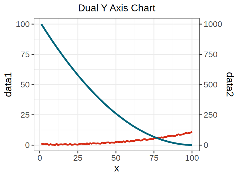
案例数据中左侧Y轴比例尺量级在0-100的范围,而右侧Y轴比例尺则在0-1000。