# 安装包
if (!requireNamespace("plotly", quietly = TRUE)) {
  install.packages("plotly")
}
if (!requireNamespace("gapminder", quietly = TRUE)) {
  install.packages("gapminder")
}
if (!requireNamespace("ggiraph", quietly = TRUE)) {
  install.packages("ggiraph")
}
if (!requireNamespace("webshot", quietly = TRUE)) {
  install.packages("webshot")
}
if (!requireNamespace("tidyverse", quietly = TRUE)) {
  install.packages("tidyverse")
}
if (!requireNamespace("chorddiag", quietly = TRUE)) {
  remotes::install_github("mattflor/chorddiag")
}
if (!requireNamespace("streamgraph", quietly = TRUE)) {
  remotes::install_github("hrbrmstr/streamgraph")
}
if (!requireNamespace("htmlwidgets", quietly = TRUE)) {
  install.packages("htmlwidgets")
}
if (!requireNamespace("dygraphs", quietly = TRUE)) {
  install.packages("dygraphs")
}
if (!requireNamespace("xts", quietly = TRUE)) {
  install.packages("xts")
}
if (!requireNamespace("d3heatmap", quietly = TRUE)) {
  install.packages("d3heatmap")
}
if (!requireNamespace("patchwork", quietly = TRUE)) {
  install.packages("patchwork")
}

# 加载包
library(plotly)
library(gapminder)
library(ggiraph)
library(webshot)
library(tidyverse)
library(chorddiag)
library(streamgraph)
library(htmlwidgets)
library(dygraphs)
library(xts)
library(d3heatmap)
library(patchwork)交互式图表
交互式图表允许用户执行操作:缩放、将鼠标悬停在标记上以获得工具提示、选择要显示的变量等等。R提供了一组称为 的软件包html widgets:它们允许直接从 构建交互式数据可视化R。
示例

以上基础散点图可以直观地表示因变量y随着自变量x变化的一个大致趋势,可以看出,y大致随着x的增加而增大。
环境配置
系统要求: 跨平台(Linux/MacOS/Windows)
编程语言:R
依赖包:
plotly,gapminder,ggiraph,webshot,tidyverse,chorddiag,streamgraph,htmlwidgets,dygraphs,xts,d3heatmap,patchwork
sessioninfo::session_info("attached")─ Session info ───────────────────────────────────────────────────────────────
setting value
version R version 4.6.0 (2026-04-24)
os Ubuntu 24.04.4 LTS
system x86_64, linux-gnu
ui X11
language (EN)
collate C.UTF-8
ctype C.UTF-8
tz UTC
date 2026-05-09
pandoc 3.1.3 @ /usr/bin/ (via rmarkdown)
quarto 1.9.37 @ /usr/local/bin/quarto
─ Packages ───────────────────────────────────────────────────────────────────
package * version date (UTC) lib source
chorddiag * 0.1.3 2026-05-04 [1] Github (mattflor/chorddiag@1688d72)
d3heatmap * 0.9.0 2026-05-04 [1] Github (talgalili/d3heatmap@0ff4b83)
dplyr * 1.2.1 2026-04-03 [1] RSPM
dygraphs * 1.1.1.6 2018-07-11 [1] RSPM
forcats * 1.0.1 2025-09-25 [1] RSPM
gapminder * 1.0.1 2025-06-12 [1] RSPM
ggiraph * 0.9.6 2026-02-21 [1] RSPM
ggplot2 * 4.0.3.9000 2026-05-04 [1] Github (tidyverse/ggplot2@6870419)
htmlwidgets * 1.6.4 2023-12-06 [1] RSPM
lubridate * 1.9.5 2026-02-04 [1] RSPM
patchwork * 1.3.2 2025-08-25 [1] RSPM
plotly * 4.12.0 2026-01-24 [1] RSPM
purrr * 1.2.2 2026-04-10 [1] RSPM
readr * 2.2.0 2026-02-19 [1] RSPM
streamgraph * 0.9.0 2026-05-04 [1] Github (hrbrmstr/streamgraph@76f7173)
stringr * 1.6.0 2025-11-04 [1] RSPM
tibble * 3.3.1 2026-01-11 [1] RSPM
tidyr * 1.3.2 2025-12-19 [1] RSPM
tidyverse * 2.0.0 2023-02-22 [1] RSPM
webshot * 0.5.5 2023-06-26 [1] RSPM
xts * 0.14.2 2026-02-28 [1] RSPM
zoo * 1.8-15 2025-12-15 [1] RSPM
[1] /home/runner/work/_temp/Library
[2] /opt/R/4.6.0/lib/R/site-library
[3] /opt/R/4.6.0/lib/R/library
* ── Packages attached to the search path.
──────────────────────────────────────────────────────────────────────────────数据准备
主要运用gapminder、TCGA数据集、GISAID数据库、R内置数据集。
1. gapminder数据集
gapminder包是一个R语言的数据包,它提供了来自Gapminder.org网站的一个数据集的摘录。这个数据集包含了142个国家从1952年到2007年每五年一次的人口、寿命和GDP等数据。
head(gapminder)# A tibble: 6 × 6
country continent year lifeExp pop gdpPercap
<fct> <fct> <int> <dbl> <int> <dbl>
1 Afghanistan Asia 1952 28.8 8425333 779.
2 Afghanistan Asia 1957 30.3 9240934 821.
3 Afghanistan Asia 1962 32.0 10267083 853.
4 Afghanistan Asia 1967 34.0 11537966 836.
5 Afghanistan Asia 1972 36.1 13079460 740.
6 Afghanistan Asia 1977 38.4 14880372 786.2. TCGA数据集
选用TCGA Bile Duct Cancer (CHOL)这个数据集里面的DNA methylation数据。
data <- readr::read_csv(
"https://bizard-1301043367.cos.ap-guangzhou.myqcloud.com/data.csv")
head(data)
# A tibble: 6 × 5
...1 Composite Sample Methylation_Level Standardized_Level
<dbl> <dbl> <chr> <dbl> <dbl>
1 1 1 AA30 0.0276 -0.450
2 2 1 AA0S 0.654 2.32
3 3 1 AAV9 0.0356 -0.415
4 4 1 AA2X 0.0198 -0.485
5 5 1 AA2U 0.0182 -0.492
6 6 1 A8Y8 0.0323 -0.4293. 2020年新冠病毒感染的数据(数据来源于GISAID数据库)
covid_all <- readr::read_csv(
"https://bizard-1301043367.cos.ap-guangzhou.myqcloud.com/covid_all.csv")
covid_China <- readr::read_csv(
"https://bizard-1301043367.cos.ap-guangzhou.myqcloud.com/covid_China.csv")
head(covid_all)
# A tibble: 6 × 6
...1 X.1 X location time count
<dbl> <dbl> <dbl> <chr> <date> <dbl>
1 1 1 1 Africa 2020-01-01 17
2 2 2 2 Asia 2020-01-01 787
3 3 3 3 Europe 2020-01-01 119
4 4 4 4 North America 2020-01-01 78
5 5 5 5 South America 2020-01-01 2
6 6 6 6 Africa 2020-02-01 14head(covid_China)# A tibble: 6 × 3
...1 time count
<dbl> <date> <dbl>
1 1 2020-01-01 34
2 2 2020-01-02 2
3 3 2020-01-03 1
4 4 2020-01-05 1
5 5 2020-01-08 2
6 6 2020-01-10 24. R内置数据集——mtcars
mtcars_db <- rownames_to_column(mtcars, var = "carname")
head(mtcars_db)
carname mpg cyl disp hp drat wt qsec vs am gear carb
1 Mazda RX4 21.0 6 160 110 3.90 2.620 16.46 0 1 4 4
2 Mazda RX4 Wag 21.0 6 160 110 3.90 2.875 17.02 0 1 4 4
3 Datsun 710 22.8 4 108 93 3.85 2.320 18.61 1 1 4 1
4 Hornet 4 Drive 21.4 6 258 110 3.08 3.215 19.44 1 0 3 1
5 Hornet Sportabout 18.7 8 360 175 3.15 3.440 17.02 0 0 3 2
6 Valiant 18.1 6 225 105 2.76 3.460 20.22 1 0 3 1可视化
1. 气泡图(使用 plotly)
以gapminder数据集
plot1 <- gapminder %>%
  filter(year==1977) %>%
  ggplot(aes(gdpPercap, lifeExp, size = pop, color=continent))+
  geom_point() +
  theme_bw()
ggplotly(plot1)
气泡图(使用 plotly)
这个气泡图描述了不同地区人均GDP和出生时预期寿命之间的关系,圆圈的大小表示人口数量。
2. 热图(使用 plotly 和 d3heatmap)
从 R 构建交互式热图有两种选项:
-
Plotly:如上所述,Plotly允许将使用ggplot2制作的任何热力图转换为交互式。 -
D3heatmap:一个使用与R基础热图函数heatmap()相同语法的包,用于制作交互式版本。
2.1 plotly
以TCGA数据库为例
plot2 <- ggplot(data, aes(x = Sample, y = Composite, fill= Standardized_Level)) +
  geom_tile()

ggplotly(plot2)
plotly
这个热图描述了在 TCGA-CHOL 数据集中不同样本(Sample)和复合体(Composite)之间标准化甲基化水平(Standardized_Level)的分布,反映了不同样本在甲基化状态上的差异。
2.2 d3heatmap
以mtcars数据库为例
d3heatmap(mtcars, scale="column")d3heatmap
这个热图描述了mtcars这个数据库里面不同款式汽车的不同属性。
3. 流线图(使用streamgraph)
以GISAID数据库为例
streamgraph包允许构建交互式流图,悬停在组上可以获取其名称及其确切值,这也是从R构建流图的唯一方法。
streamgraph(covid_all,key = "location",
            value = "count",date = "time",
            height="300px", width="1000px")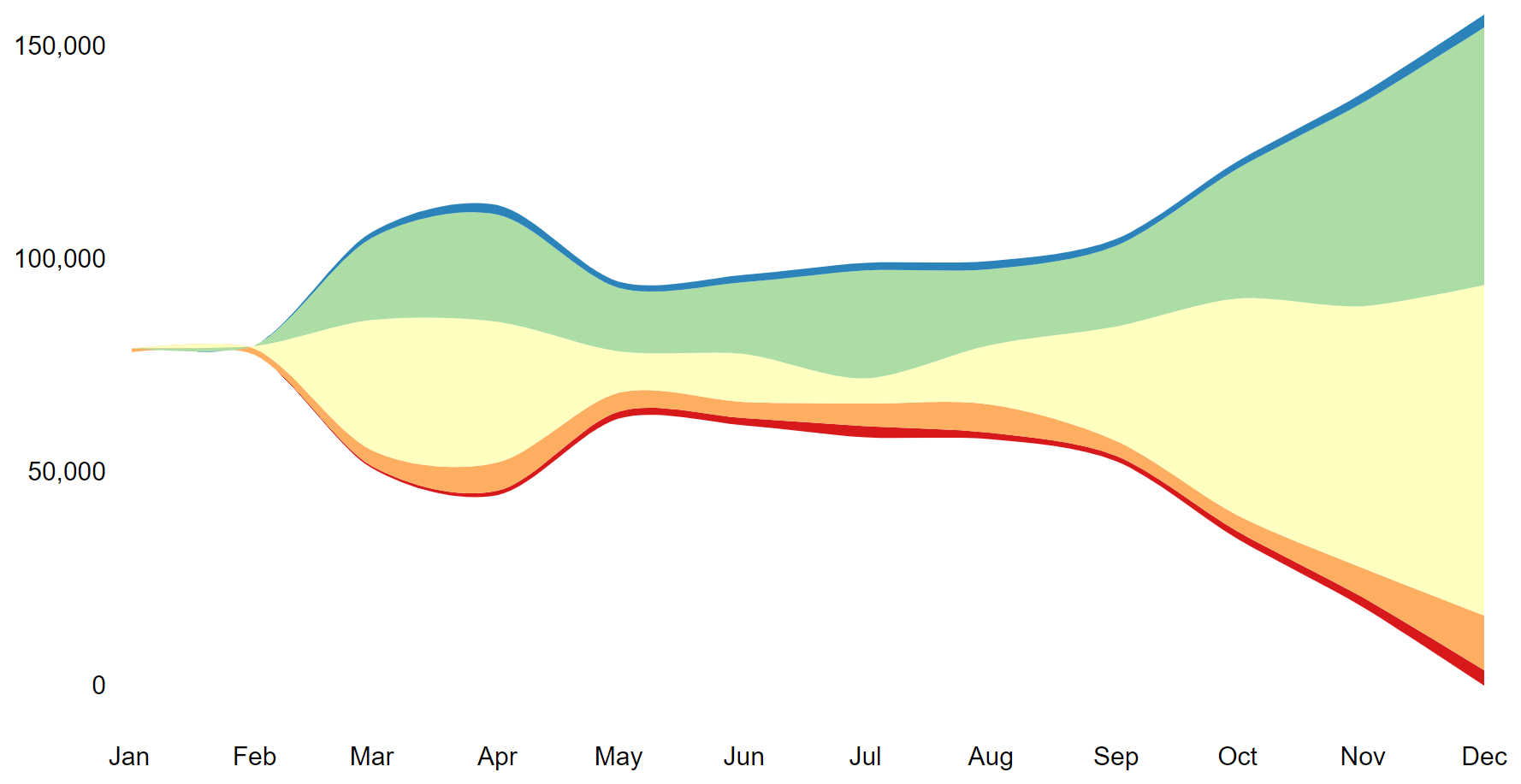
这个折线图描述了2020年新冠肺炎感染人数在全球不同地区的变化趋势。
4. 和弦图(使用chorddiag包)
chorddiag包允许使用 R 构建交互式和弦图。它需要一个方阵作为输入,提供将在圆周围显示的每对节点之间的流动强度。 一旦数据格式正确,该 chorddiag() 函数将自动为您构建图表。
# 创建数据集
m <- matrix(
  c(
    11975, 5871, 8916, 2868,
    1951, 10048, 2060, 6171,
    8010, 16145, 8090, 8045,
    1013, 990, 940, 6907
  ),
  byrow = TRUE,
  nrow = 4, ncol = 4
)
haircolors <- c("black", "blonde", "brown", "red")
dimnames(m) <- list(
  have = haircolors,
  prefer = haircolors
)
groupColors <- c("#000000", "#FFDD89", "#957244", "#F26223")

# 画图
p <- chorddiag(m, groupColors = groupColors, groupnamePadding = 60)
p

#将图像保存为html
#saveWidget(p, file=paste0( getwd(), "./chord_interactive.html")) 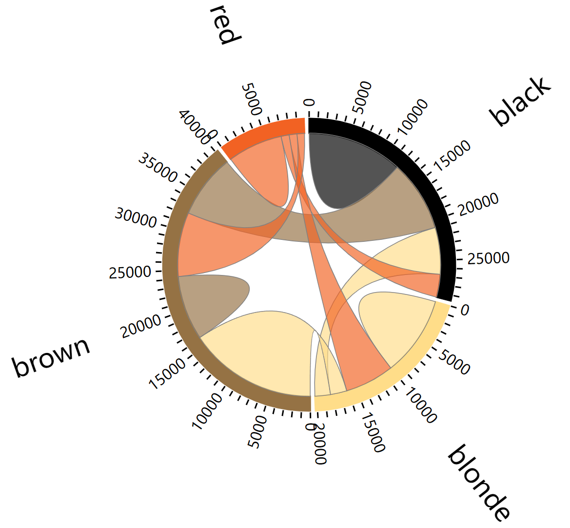
5. 时间序列图(使用dygraphs包)
# 数据整理,要注意把时间转换为 xts 的时间序列数据
covid_China$time <- as.Date(covid_China$time, format = "%Y-%m-%d")
don <- xts(x = covid_China$count, order.by = covid_China$time)

# 画图
p <- dygraph(don) %>%
  dyOptions(labelsUTC = TRUE, fillGraph=TRUE,
            fillAlpha=0.1, drawGrid = FALSE, colors="#D8AE5A") %>%
  dyRangeSelector() %>%
  dyCrosshair(direction = "vertical") %>%
  dyHighlight(highlightCircleSize = 5,
              highlightSeriesBackgroundAlpha = 0.2,
              hideOnMouseOut = FALSE)  %>%
  dyRoller(rollPeriod = 1)

p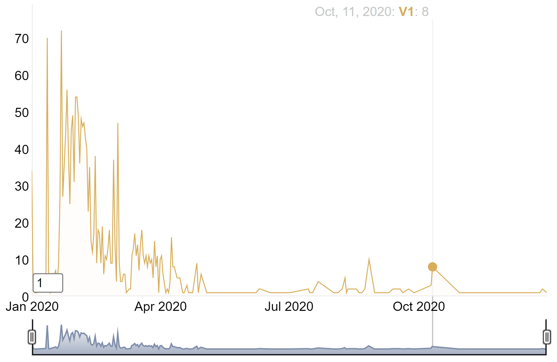
这个时间序列图描述了2020年中国新冠肺炎人数的增长情况。
6. ggiraph包
R中的ggiraph包是ggplot2包的扩展,旨在简化创建交互式和动态图的过程。它是一个htmlwidget,这意味着它与RMarkdown/Quarto文档和Shiny应用程序高度兼容。
6.1 基本用法
这是一个使用 geom_point_interactive() 函数的示例,该函数“替代”了 ggplot2 中的原始 geom_point() 函数。它也会在图表上绘制圆圈,但这些圆圈将是交互式的。这个几何图形有一些新的参数,比如 hover_nearest = TRUE,这确保我们总是考虑最近的点 被悬停。
以mtcars数据为例
# 绘图
myplot <- ggplot(
  data = mtcars_db,
  mapping = aes(
    x = disp, y = qsec,
    tooltip = carname, data_id = carname
  )
) +
  geom_point_interactive(
    size = 3, hover_nearest = TRUE
  )

# 把图像转换为交互式
interactive_plot <- girafe(ggobj = myplot)
interactive_plot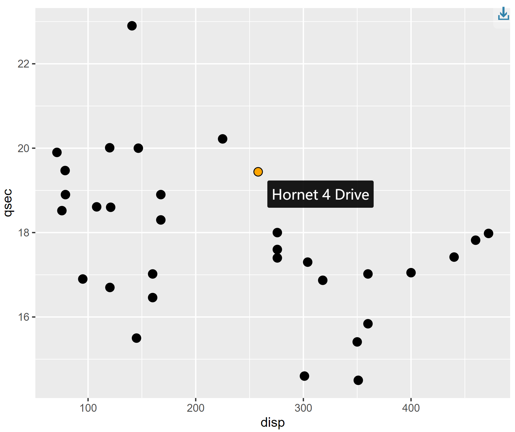
这个散点图展示了mtcars数据集里面不同汽车之间1/4英里用时与发动机排量之间的关系,鼠标接触原点可以显示每种汽车的名字。
6.2 合并图表
# 图一
scatter <- ggplot(
  data = mtcars_db,
  mapping = aes(
    x = disp, y = qsec,
    tooltip = carname, data_id = carname
  )
) +
  geom_point_interactive(
    size = 3, hover_nearest = TRUE
  ) +
  labs(
    title = "Displacement vs Quarter Mile",
    x = "Displacement", y = "Quarter Mile"
  ) +
  theme_bw()

# 图二
bar <- ggplot(
  data = mtcars_db,
  mapping = aes(
    x = reorder(carname, mpg), y = mpg,
    tooltip = paste("Car:", carname, "<br>MPG:", mpg),
    data_id = carname
  )
) +
  geom_col_interactive(fill = "skyblue") +
  coord_flip() +
  labs(
    title = "Miles per Gallon by Car",
    x = "Car", y = "Miles per Gallon"
  ) +
  theme_bw()

# 合并两个图表
combined_plot <- scatter + bar +
  plot_layout(ncol = 2)

# 把图像转换为交互式
interactive_plot_match <- girafe(ggobj = combined_plot)

# 设置交互式图表的选项
interactive_plot_match <- girafe_options(
  interactive_plot_match,
  opts_hover(css = "fill:cyan;stroke:black;cursor:pointer;"),
  opts_selection(type = "single", css = "fill:red;stroke:black;")
)

interactive_plot_match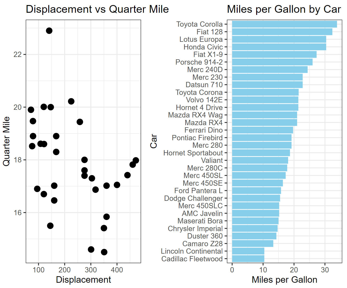
左图展示了mtcars数据集里面不同汽车之间1/4英里用时与发动机排量之间的关系,右图展示了不同汽车之间每加仑英里数的大小关系。通过两幅图交互式合并,可以直观快速获取每种汽车的性能。
6.3 使用CSS自定义交互式图表
虽然CSS主要用于设计网页,但它也可以在R中自定义视觉效果,在处理基于 Web 的输出(如交互式图表或 Shiny 应用程序)时较为方便。
基础图形部分(以折线图为例)
# 画图
plot <- covid_all %>%
  ggplot(mapping = aes(
    x = time,
    y = count,
    color = location,
    tooltip = location,
    data_id = location
  )) +
  geom_line_interactive(hover_nearest = TRUE) +
  theme_classic()

#把图像转换为交互式
interactive_plot_line <- girafe(ggobj = plot)

interactive_plot_line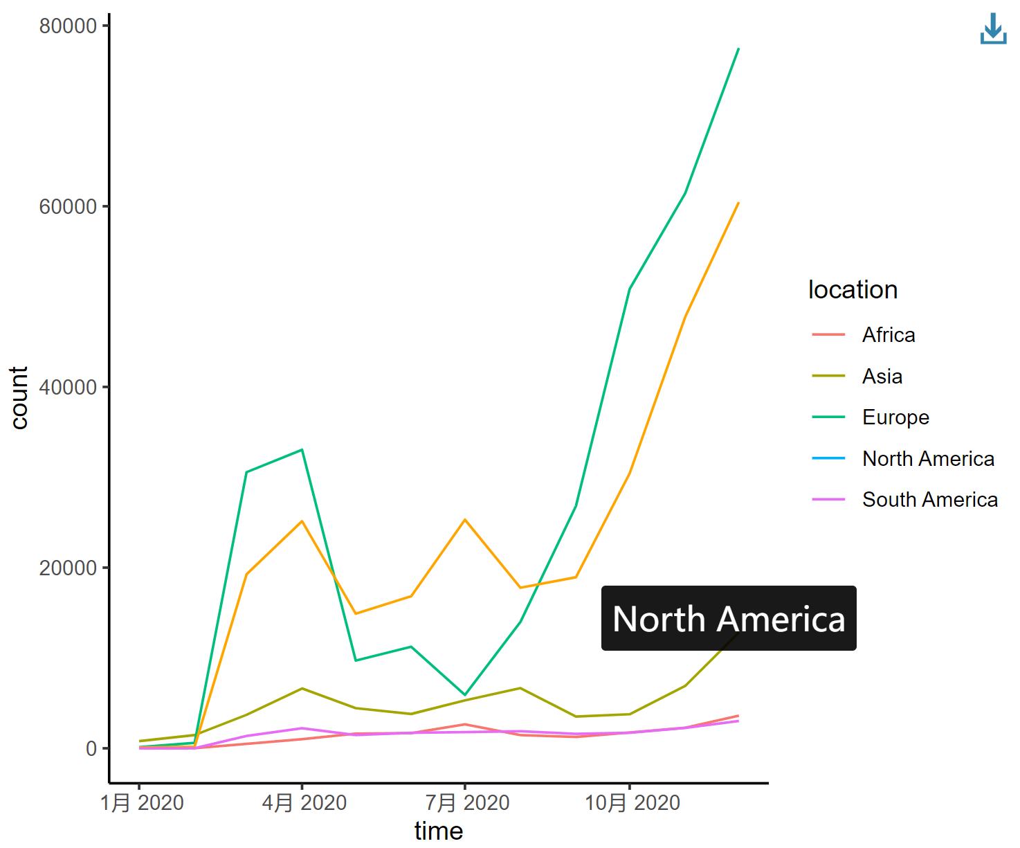
这个折线图描述了2020年新冠肺炎感染人数在全球不同地区的变化趋势,每条曲线代表不同大洲。
6.4 添加CSS
1. 添加填充效果
在ggiraph中添加CSS最简单的方法是使用 girafe_options() 函数。
interactive_plot_line <- girafe_options(
  interactive_plot_line,
  opts_hover(css = "fill:#ffe7a6;stroke:black;cursor:pointer;"),
  opts_selection(type = "single", css = "fill:red;stroke:black;"),
  opts_toolbar(saveaspng = FALSE)
)
interactive_plot_line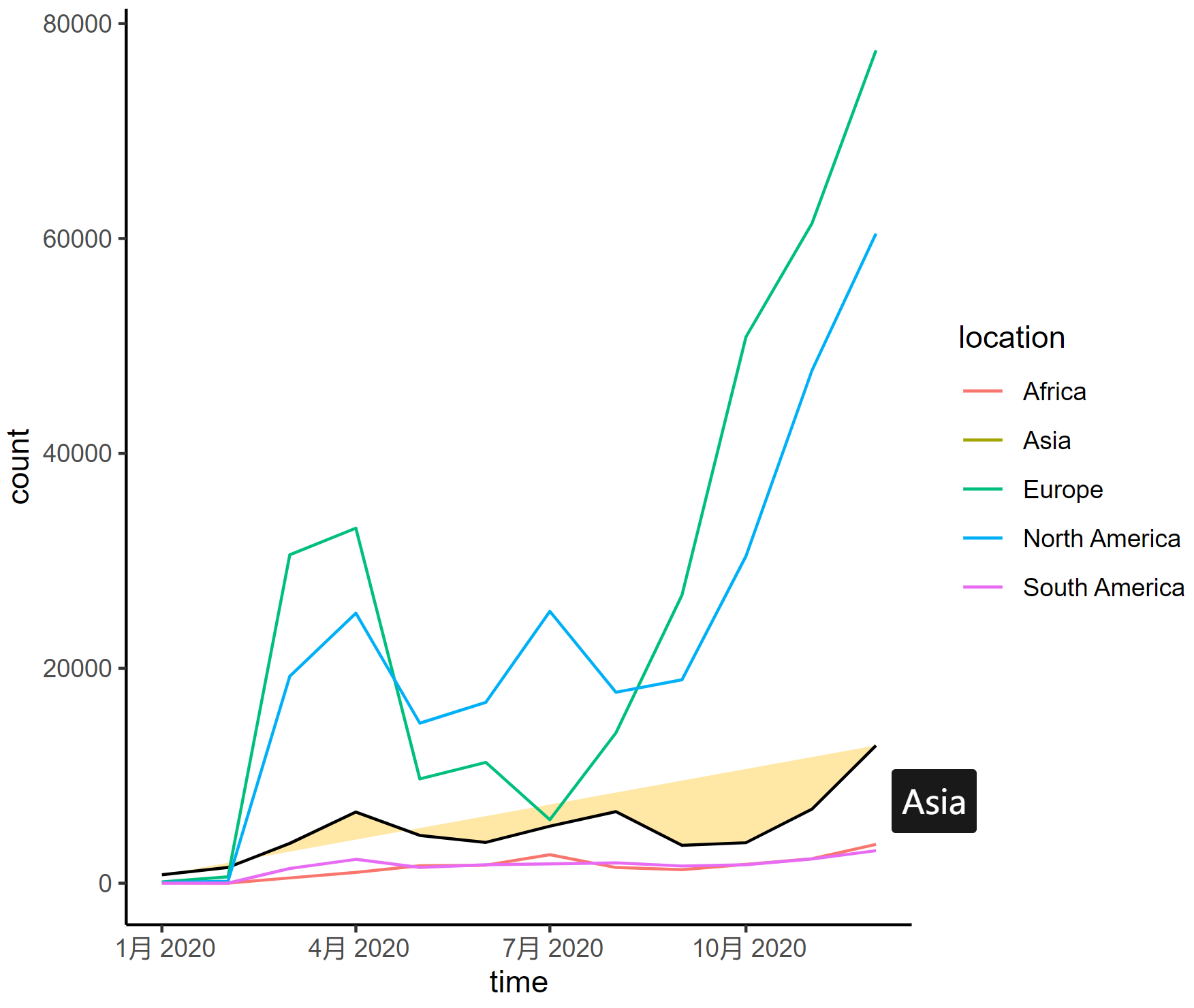
这个折线图描述了2020年新冠肺炎感染人数在全球不同地区的变化趋势,每条曲线代表不同大洲。
2. 突出显示某条曲线
某条折线被选中的时候,其他折线自动淡化颜色
以下是调整曲线的一些参数:
-
stroke:更改悬停线的颜色(例如,stroke: #69B3A2;) -
stroke-width:增加悬停线的宽度以进行强调 -
transition:添加平滑过渡效果(例如,transition: all 0.3s ease;) -
opacity:降低非悬停线的不透明度(例如,opacity: 0.5;) -
filter:对非悬停线应用灰度效果(例如,filter: grayscale(90%);)
interactive_plot_line2 <- girafe_options(
  interactive_plot_line,
  opts_hover(css = "stroke:#69B3A2; stroke-width: 3px; transition: all 0.3s ease;"),
  opts_hover_inv("opacity:0.5;filter:saturate(10%);"),
  opts_toolbar(saveaspng = FALSE)
)
interactive_plot_line2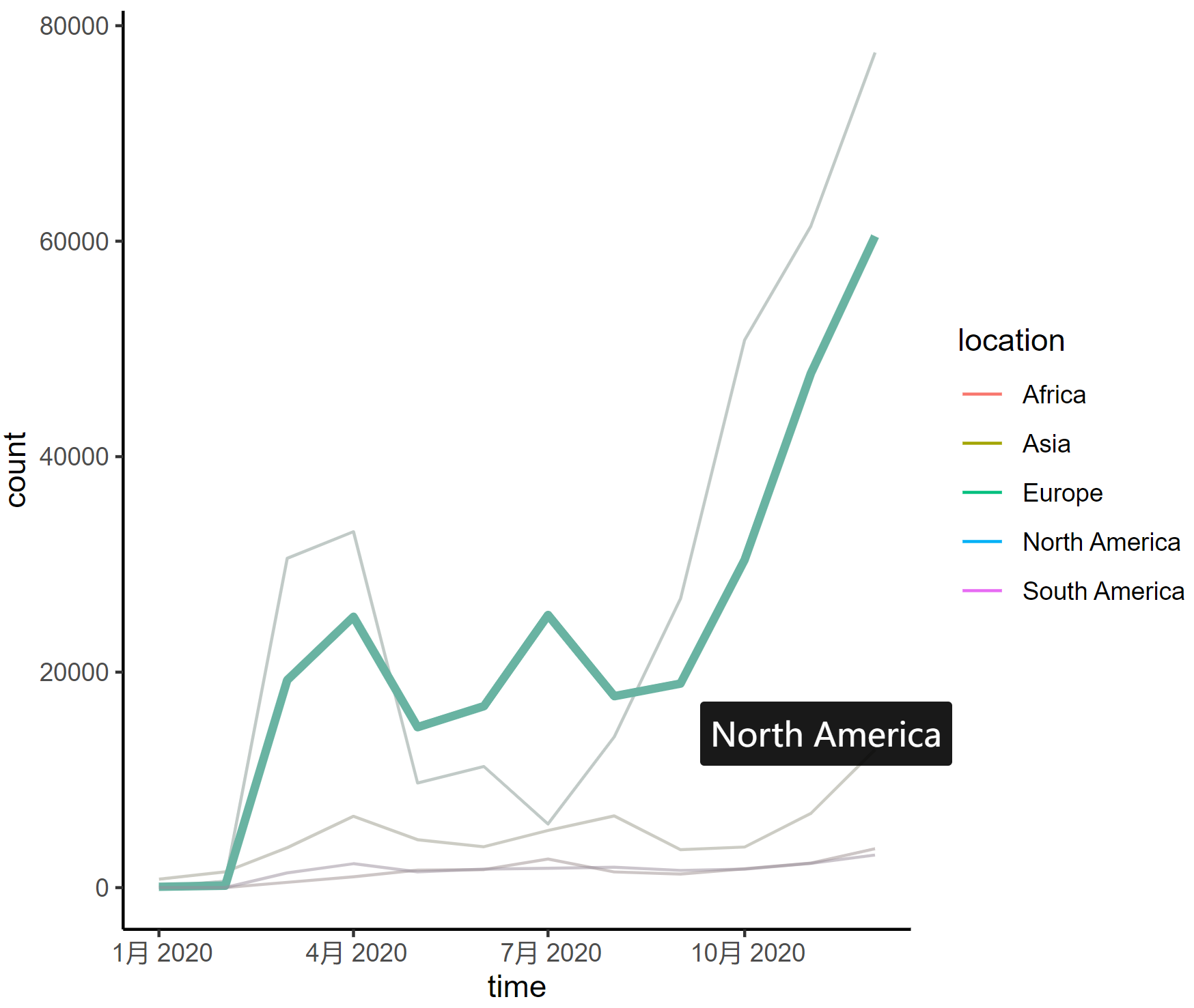
这个折线图描述了2020年新冠肺炎感染人数在全球不同地区的变化趋势,每条曲线代表不同大洲。
7. 将交互式图表保存到.PNG和.HTML
可以将交互式图表保存为.html和两种.png格式。为此,您必须分别依赖htmlwidget和webshot包。然后可以使用标签在任何网页中嵌入您的可视iframe化img。
#保存为html
saveWidget(p, file="myFile.html")

#保存为png
webshot::install_phantomjs()
webshot("paste_your_html_here" , "output.png", delay = 0.2 , cliprect = c(440, 0, 1000, 10))
应用场景
交互式图表可以使研究数据更加直观
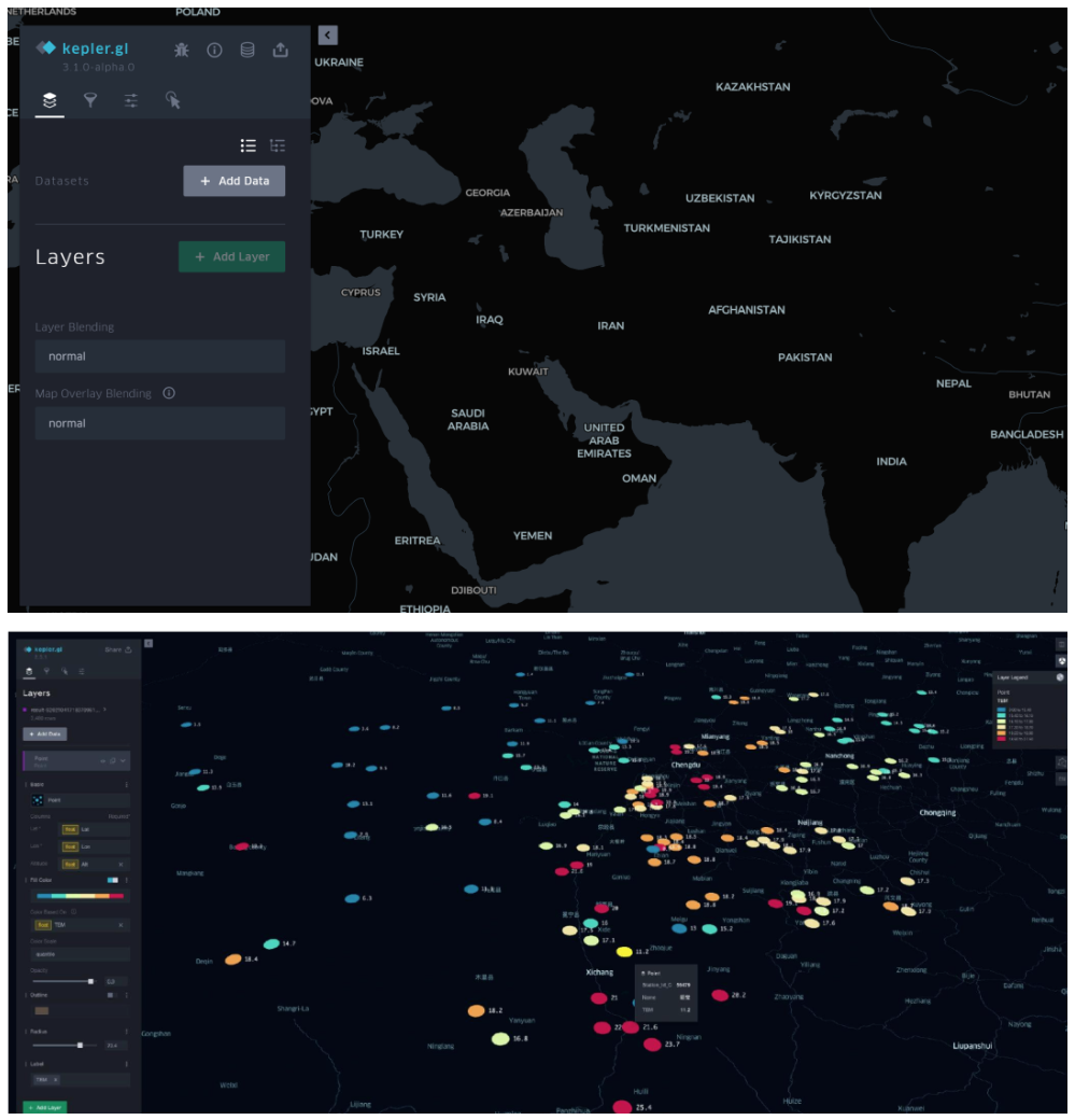
Kepler.gl 是由 Uber 开发并开源的一款强大的地理空间数据可视化工具,它旨在帮助用户快速、直观地探索和展示大规模地理空间数据集。[1]
导入基础数据后可以自动生成交互式的散点图、柱状图、热力图,有助于更好呈现立足于不同地理位置上的研究数据。
参考文献
[1] https://zhuanlan.zhihu.com/p/365767977
[2] Wickham, H., & François, R. (2019). dplyr: A Grammar of Data Manipulation (Version 1.0.0). https://CRAN.R-project.org/package=dplyr
[3] Gohel, D., & Skintzos, P. (2024). ggiraph: Make ‘ggplot2’ Graphics Interactive. https://CRAN.R-project.org/package=ggiraph
[4] Wickham, H., Hester, J., Chang, W., & Bryan, J. (2024). devtools: Tools to Make Developing R Packages Easier. R package version 2.4.5.9000. https://github.com/r-lib/devtools.
[5] Allaire, J. J., & Xie, Y. (2018). webshot: Save Web Content as an Image File [Computer software]. Retrieved from https://CRAN.R-project.org/package=webshot
[6] Wickham, H., Averick, M., Bryan, J., Chang, W., McGowan, L. D., François, R., … Yutani, H. (2019). tidyverse: Easily Install and Load the ‘Tidyverse’ (Version 1.2.1) [Computer software]. Retrieved from https://CRAN.R-project.org/package=tidyverse
[7] Wickham, H., & Chang, W. (2016). ggplot2: Elegant Graphics for Data Visualization. Springer-Verlag New York.
[8] Sievert, C. (2020). Interactive Web-Based Data Visualization with R, plotly, and shiny. Chapman and Hall/CRC. https://plotly-r.com
[9] Bryan J (2023). gapminder: Data from Gapminder. https://github.com/jennybc/gapminder, https://www.gapminder.org/data/, https://doi.org/10.5281/zenodo.594018, https://jennybc.github.io/gapminder/.
[11] Flor, M. (2018). chorddiag: Create a D3 Chord Diagram. https://rdrr.io/github/mattflor/chorddiag/
[12] Hart, E., & Wickham, H. (2017). streamgraph: Create Streamgraph in R. https://CRAN.R-project.org/package=streamgraph
[13] Vaidyanathan, R., Cheng, J., Allaire, J. J., Xie, Y., & Russell, K. (2018). htmlwidgets: HTML Widgets for R. https://github.com/ramnathv/htmlwidgets
[14] anderkam, D., Shevtsov, P., Allaire, J. J., Owen, J., Gromer, D., & Thieurmel, B. (2011). dygraphs: Interface to ‘Dygraphs’ Interactive Time Series Charting Library. R package version 1.1.1.7. https://CRAN.R-project.org/package=dygraphs
[15] Ryan, J. A., & Ulrich, J. M. (2024). xts: eXtensible Time Series. R package version 0.14.1. https://CRAN.R-project.org/package=xts
[16] Grolemund, G., & Wickham, H. (2011). Dates and Times Made Easy with lubridate. Journal of Statistical Software, 40(3), 1–25. https://www.jstatsoft.org/v40/i03/
[17] Cheng, J., Galili, T., RStudio, Inc., Bostock, M., & Palmer, J. (2019). d3heatmap: Interactive Heat Maps Using ‘htmlwidgets’ and ‘D3.js’. https://rdrr.io/cran/d3heatmap/