# 安装包
if (!requireNamespace("ggplot2", quietly = TRUE)) {
  install.packages("ggplot2")
}
if (!requireNamespace("dplyr", quietly = TRUE)) {
  install.packages("dplyr")
}
if (!requireNamespace("plotrix", quietly = TRUE)) {
  install.packages("plotrix")
}
if (!requireNamespace("ggforce", quietly = TRUE)) {
  install.packages("ggforce")
}
if (!requireNamespace("ggpubr", quietly = TRUE)) {
  install.packages("ggpubr")
}
if (!requireNamespace("patchwork", quietly = TRUE)) {
  install.packages("patchwork")
}

# 加载包
library(ggplot2)
library(dplyr)
library(plotrix)
library(ggforce)
library(ggpubr)
library(patchwork)部分高亮饼图
示例
(图片来源于Unsplash的Amy Shamblen)
饼图是数据可视化中常用的一种图表类型,能够直观地展示数据各部分所占的比例。通过将饼图的某些部分突起,可以更好地突出展示某些数据。
环境配置
系统要求: 跨平台(Linux/MacOS/Windows)
编程语言:R
依赖包:
ggplot2,ggpubr,patchwork,dplyr
sessioninfo::session_info("attached")─ Session info ───────────────────────────────────────────────────────────────
setting value
version R version 4.6.0 (2026-04-24)
os Ubuntu 24.04.4 LTS
system x86_64, linux-gnu
ui X11
language (EN)
collate C.UTF-8
ctype C.UTF-8
tz UTC
date 2026-05-09
pandoc 3.1.3 @ /usr/bin/ (via rmarkdown)
quarto 1.9.37 @ /usr/local/bin/quarto
─ Packages ───────────────────────────────────────────────────────────────────
package * version date (UTC) lib source
dplyr * 1.2.1 2026-04-03 [1] RSPM
ggforce * 0.5.0 2025-06-18 [1] RSPM
ggplot2 * 4.0.3.9000 2026-05-04 [1] Github (tidyverse/ggplot2@6870419)
ggpubr * 0.6.3 2026-02-24 [1] RSPM
patchwork * 1.3.2 2025-08-25 [1] RSPM
plotrix * 3.8-14 2026-02-13 [1] RSPM
[1] /home/runner/work/_temp/Library
[2] /opt/R/4.6.0/lib/R/site-library
[3] /opt/R/4.6.0/lib/R/library
* ── Packages attached to the search path.
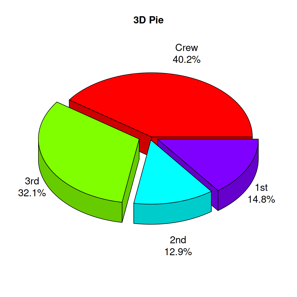
──────────────────────────────────────────────────────────────────────────────数据准备
# 生成模拟数据
count.data <- data.frame(
  class = c("1st", "2nd", "3rd", "Crew"),
  n = c(325, 285, 706, 885),
  prop = c(14.8, 12.9, 32.1, 40.2)
)
# 添加标签位置
count.data <- count.data %>%
  arrange(desc(class)) %>%
  mutate(lab.ypos = cumsum(prop) - 0.5*prop)
# 查看最终的合并数据集
head(count.data)
class n prop lab.ypos
1 Crew 885 40.2 20.10
2 3rd 706 32.1 56.25
3 2nd 285 12.9 78.75
4 1st 325 14.8 92.60可视化
1. 基础绘图
1.1 基础饼图
# 基础饼图
mycols <- c("#0073C2FF", "#EFC000FF", "#868686FF", "#CD534CFF")
p <-
  ggplot(count.data, aes(x = "", y = prop, fill = class)) +
  geom_bar(width = 1, stat = "identity", color = "white") +
  coord_polar("y", start = 0)+
  geom_text(aes(y = lab.ypos, label = prop), color = "white")+
  scale_fill_manual(values = mycols) +
  theme_void()

p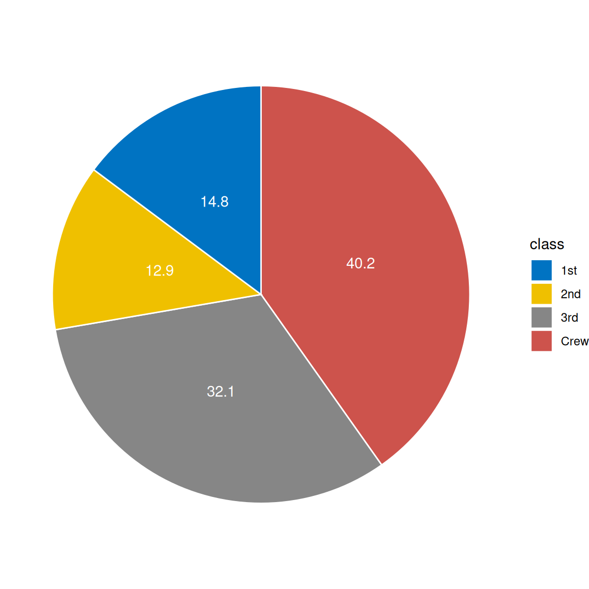
1.2 中间空洞型饼图
# 中间空洞型饼图
p2 <-
  ggplot(count.data, aes(x = 2, y = prop, fill = class)) +
  geom_bar(stat = "identity", color = "white") +
  coord_polar(theta = "y", start = 0) +
  geom_text(aes(y = lab.ypos, label = prop), color = "white") +
  scale_fill_manual(values = mycols) +
  theme_void() +
  xlim(0.5, 2.5)

p2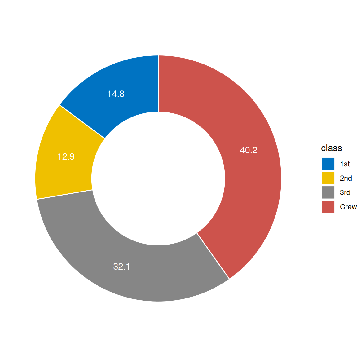
2. 高阶作图
2.1 3D 饼图
# 创建数据框
# 生成标签(组合类别和百分比)
labels <- paste(count.data$class, "\n", count.data$prop, "%", sep="")

# 绘制3D饼图
p3 <- pie3D(
  count.data$n,                # 使用数量作为数值
  labels = labels,             # 自定义标签
  explode = 0.1,               # 设置扇区间隔
  main = "3D Pie",
  col = rainbow(nrow(count.data)), # 使用彩虹色
  labelcex = 1.2,              # 标签字体大小
  theta = 1                    # 控制3D效果的角度
)
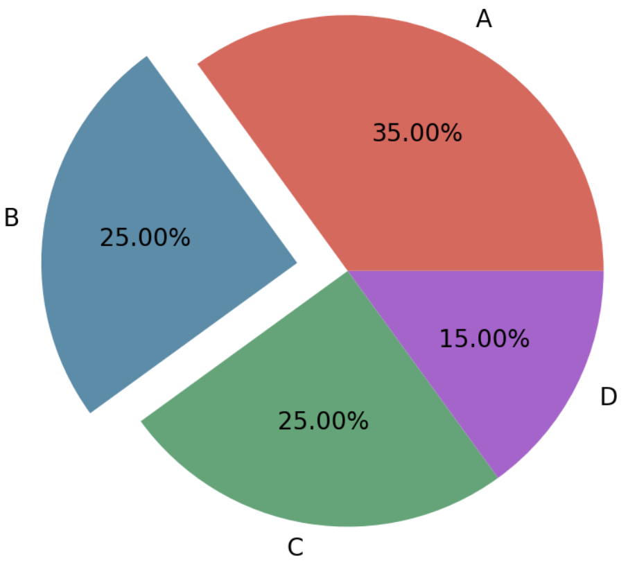
2.2 部分高亮饼图
# 创建数据框
data <- data.frame(
  gene = c("HRAS", "NRAS", "RET fusion", "MAP2K1", "ROS1 fusion", "ERBB2",
           "ALK fusion", "MET ex14",  "BRAF", "EGFR", "KRAS", "None", "RIT1",
           "ERBB2 amp", "MET amp", "NF1"),
  percentage = c(0.4, 0.4, 0.9, 0.9, 1.7, 1.7, 1.3, 4.3,  7.0, 11.3, 32.2, 24.4,
                 2.2, 0.9, 2.2, 8.3)
)
data$gene <- factor(data$gene,levels = data$gene)
data$focus = c(rep(0, 12), rep(0.2, 4))
data$anno <- ifelse(data$gene == "KRAS", "KRAS\n(32.2%)",
                    ifelse(data$gene == "EGFR", "EGFR\n(11.3%)",
                           ifelse(data$gene == "BRAF", "BRAF\n(7.0%)",
                                  ifelse(data$gene == "None", "None\n(24.4%)",
                                         ifelse(data$gene == "NF1", "NF1\n(8.3%)", NA)))))
data <-
  data %>%
  mutate(end_angle = 2*pi*cumsum(percentage)/100,
         start_angle = lag(end_angle, default = 0),
         mid_angle = 0.5*(start_angle + end_angle)) %>%
  mutate(legend = paste0(gene," (",percentage,"%)"))

data$legend <- factor(data$legend,levels = data$legend)

col <- c("#891619","#040503","#AF353D","#CF5057","#EE2129","#E7604D","#F58667","#F7A387","#FBC4AE","#FDE2D6","#FDF1EA","#AAD9C0","#0073AE","#069BDA","#68B0E1","#B8CBE8")

# 使用ggplot绘制饼图
pie <-
  ggplot() +
  geom_arc_bar(data=data, stat = "pie", # 在正常的笛卡尔坐标系中绘制饼图,不必使用极坐标
               aes(x0=0,y0=0,r0=0,r=2, #需要甜甜圈图只需要将r0改为1即可
                   amount=percentage,
                   fill=gene,color=gene,
                   explode=focus)) +
  geom_arc(data=data[1:8,], size=1,color="black",
           aes(x0=0, y0=0, r=2.1, start = start_angle, end = end_angle)) +
  geom_arc(data=data[11,], size=1,color="grey60",
           aes(x0=0, y0=0, r=2, start = start_angle-0.3, end = end_angle+0.3)) +
  geom_arc(data=data[13:15,], size = 1,color="black",
           aes(x0=0,y0=0,r=2.3,size = index,start = start_angle, end = end_angle))+
  annotate("text", x=1.3, y=0.9, label=expression(atop(italic("BRAF"),"(7.0%)")),
           size=6, angle=0, hjust=0.5) +
  annotate("text", x=1.4, y=0.08, label=expression(atop(italic("EGFR"),"(11.3%)")),
           size=6, angle=0, hjust=0.5) +
  annotate("text", x=0.2, y=-1.1, label=expression(atop(italic("KRAS"),"(32.2%)")),
           size=6, angle=0, hjust=0.5) +
  annotate("text", x=-1.2, y=0.1, label="None\n(24.4%)", size=6, angle=0,
           hjust=0.5) +
  annotate("text", x=-0.5, y=1.75, label=expression(atop(italic("NF1"),"(8.3%)")),
           size=6, angle=0, hjust=0.5) +
  coord_fixed() +
  theme_no_axes() +
  scale_fill_discrete(breaks=data$gene[c(1:8, 13:15)],
                      labels=data$legend[c(1:8, 13:15)], type=col) +
  scale_color_discrete(breaks=data$gene[c(1:8, 13:15)],
                       labels=data$legend[c(1:8, 13:15)], type=col) +
  theme(panel.border = element_blank(),
        legend.margin = margin(t = 1,r = 0,b = 0,l = 0,unit = "cm"),
        legend.title = element_blank(),
        legend.text = element_text(size=14),
        legend.key.spacing.y = unit(0.3,"cm"),
        legend.key.width = unit(0.4,"cm"),
        legend.key.height = unit(0.4,"cm"))

pie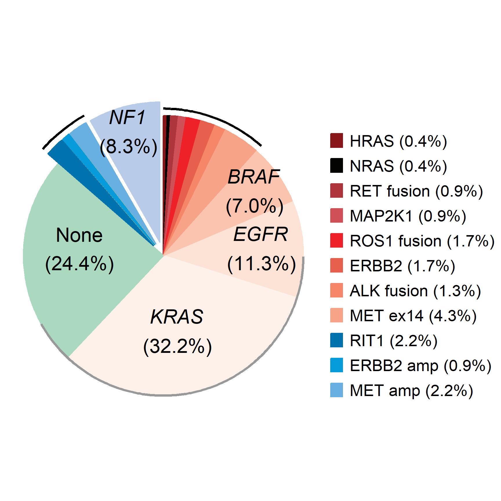
在癌症基因组研究中,饼图可以用来展示不同类型的基因突变(如点突变、插入、缺失等)在特定样本中的分布。
应用场景
1. 疾病分布
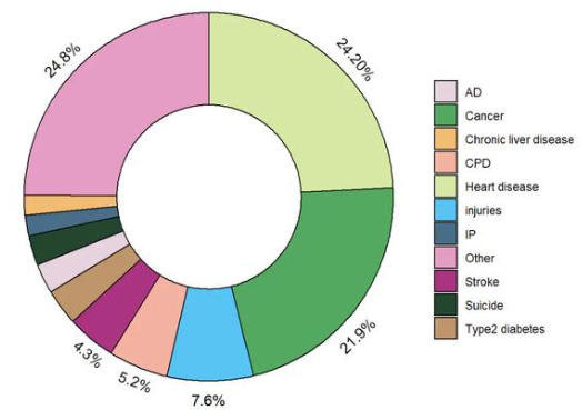
在流行病学研究中,饼图可以用来表示不同疾病在患者群体中所占的比例,比如不同癌症类型的分布。
2. 细胞比例图
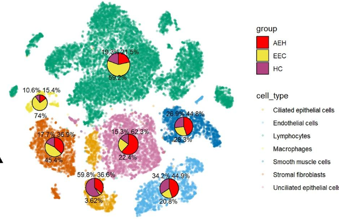
饼图可用于展示组织切片中不同细胞类型或组织成分的比例。
参考文献
[1] Wickham, H. (2016). “ggplot2: Elegant Graphics for Data Analysis.” Springer.
[2] Wickham, H. (2020). “ggplot2: Create Elegant Data Visualizations Using the Grammar of Graphics.” R package version 3.3.3.
[3] Pedersen, T. L. (2020). “ggforce: Accelerating ggplot2.” R package version 0.3.2.
[4] Kassambara, A. (2020). “ggpubr: ‘ggplot2’ Based Publication Ready Plots.” R package version 0.4.0.
[5] Harris, R. (2019). “export: Export ‘ggplot2’ and ‘base’ Graphics in Various Formats.” R package version 0.5.1.
[6] Rizzo, M. L. (2021). “ggplot2 for Beginners.” R Journal, 13(1), 84-91.
[7] Ma, F., & Zhang, J. (2020). “Exploring the use of R for visualizing complex data types.” Journal of Open Source Software, 5(51), 2008.