# 安装包
if (!requireNamespace("data.table", quietly = TRUE)) {
  install.packages("data.table")
}
if (!requireNamespace("jsonlite", quietly = TRUE)) {
  install.packages("jsonlite")
}
if (!requireNamespace("plot3D", quietly = TRUE)) {
  install.packages("plot3D")
}
if (!requireNamespace("ggplotify", quietly = TRUE)) {
  install.packages("ggplotify")
}

# 加载包
library(data.table)
library(jsonlite)
library(ggplot2)
library(stringr)颜色组柱状图
注记
Hiplot 网站
本页面为 Hiplot Barplot Color Group 插件的源码版本教程,您也可以使用 Hiplot 网站实现无代码绘图,更多信息请查看以下链接:
颜色组柱状图可以用于分组展示数据值,并按顺序标注不同颜色。
环境配置
系统: Cross-platform (Linux/MacOS/Windows)
编程语言: R
依赖包:
data.table;jsonlite;plot3D;ggplotify
sessioninfo::session_info("attached")─ Session info ───────────────────────────────────────────────────────────────
setting value
version R version 4.6.0 (2026-04-24)
os Ubuntu 24.04.4 LTS
system x86_64, linux-gnu
ui X11
language (EN)
collate C.UTF-8
ctype C.UTF-8
tz UTC
date 2026-05-09
pandoc 3.1.3 @ /usr/bin/ (via rmarkdown)
quarto 1.9.37 @ /usr/local/bin/quarto
─ Packages ───────────────────────────────────────────────────────────────────
package * version date (UTC) lib source
data.table * 1.18.4 2026-05-06 [1] RSPM
ggplot2 * 4.0.3.9000 2026-05-04 [1] Github (tidyverse/ggplot2@6870419)
jsonlite * 2.0.0 2025-03-27 [1] RSPM
stringr * 1.6.0 2025-11-04 [1] RSPM
[1] /home/runner/work/_temp/Library
[2] /opt/R/4.6.0/lib/R/site-library
[3] /opt/R/4.6.0/lib/R/library
* ── Packages attached to the search path.
──────────────────────────────────────────────────────────────────────────────数据准备
数据表格(三列):
Term | 条目名称,如 GO/KEGG 通路名称
Count | 条目的数值大小,如某通路富集到的基因数
Type | 该通路所属大类:如 BP/MF/CC/KEGG
# 加载数据
data <- data.table::fread(jsonlite::read_json("https://hiplot.cn/ui/basic/barplot-color-group/data.json")$exampleData$textarea[[1]])
data <- as.data.frame(data)

# 整理数据格式
colnames(data) <- c("term", "count", "type")
data[,"term"] <- str_to_sentence(str_remove(data[,"term"], pattern = "\\w+:\\d+\\W"))
data[,"term"] <- factor(data[,"term"],
                        levels =  data[,"term"][length(data[,"term"]):1])
data[,"type"] <- factor(data[,"type"],
                        levels = data[!duplicated(data[,"type"]), "type"])

# 查看数据
data
term count type
1 Immune response 20 BP
2 Defense response to bacterium 11 BP
3 Cell chemotaxis 8 BP
4 Cell adhesion 17 BP
5 Complement activation 8 BP
6 Cytokine-mediated signaling pathway 8 MF
7 Phagocytosis, engulfment 5 MF
8 Negative regulation of jak-stat cascade 5 MF
9 Epoxygenase p450 pathway 4 MF
10 Chemokine-mediated signaling pathway 6 MF
11 Negative regulation of leukocyte apoptotic process 3 MF
12 B cell receptor signaling pathway 5 MF
13 Cellular response to tumor necrosis factor 6 CC
14 Positive regulation of chemotaxis 3 CC
15 Positive regulation of angiogenesis 6 CC
16 Collagen fibril organization 4 CC
17 Positive regulation of homotypic cell-cell adhesion 20 KEGG
18 Regulation of cell projection assembly 14 KEGG
19 Prostate epithelial cord elongation 10 KEGG
20 Bile acid catabolic process 8 KEGG
21 Cellular response to drug 7 KEGG
22 Glycosaminoglycan metabolic process 4 KEGG可视化
# 三维柱状图
p <- ggplot(data = data, aes(x = term, y = count, fill = type)) +
  geom_bar(stat = "identity", width = 0.8) +
  theme_bw() +
  xlab("Count") +
  ylab("Term") +
  guides(fill = guide_legend(title="Type")) +
  ggtitle("Barplot Color Group") +
  coord_flip() +
  theme_classic() +
  scale_fill_manual(values = c("#E64B35FF","#4DBBD5FF","#00A087FF","#3C5488FF")) +
  theme(text = element_text(family = "Arial"),
        plot.title = element_text(size = 12,hjust = 0.5),
        axis.title = element_text(size = 12),
        axis.text = element_text(size = 10),
        axis.text.x = element_text(angle = 0, hjust = 0.5,vjust = 1),
        legend.position = "right",
        legend.direction = "vertical",
        legend.title = element_text(size = 10),
        legend.text = element_text(size = 10))

p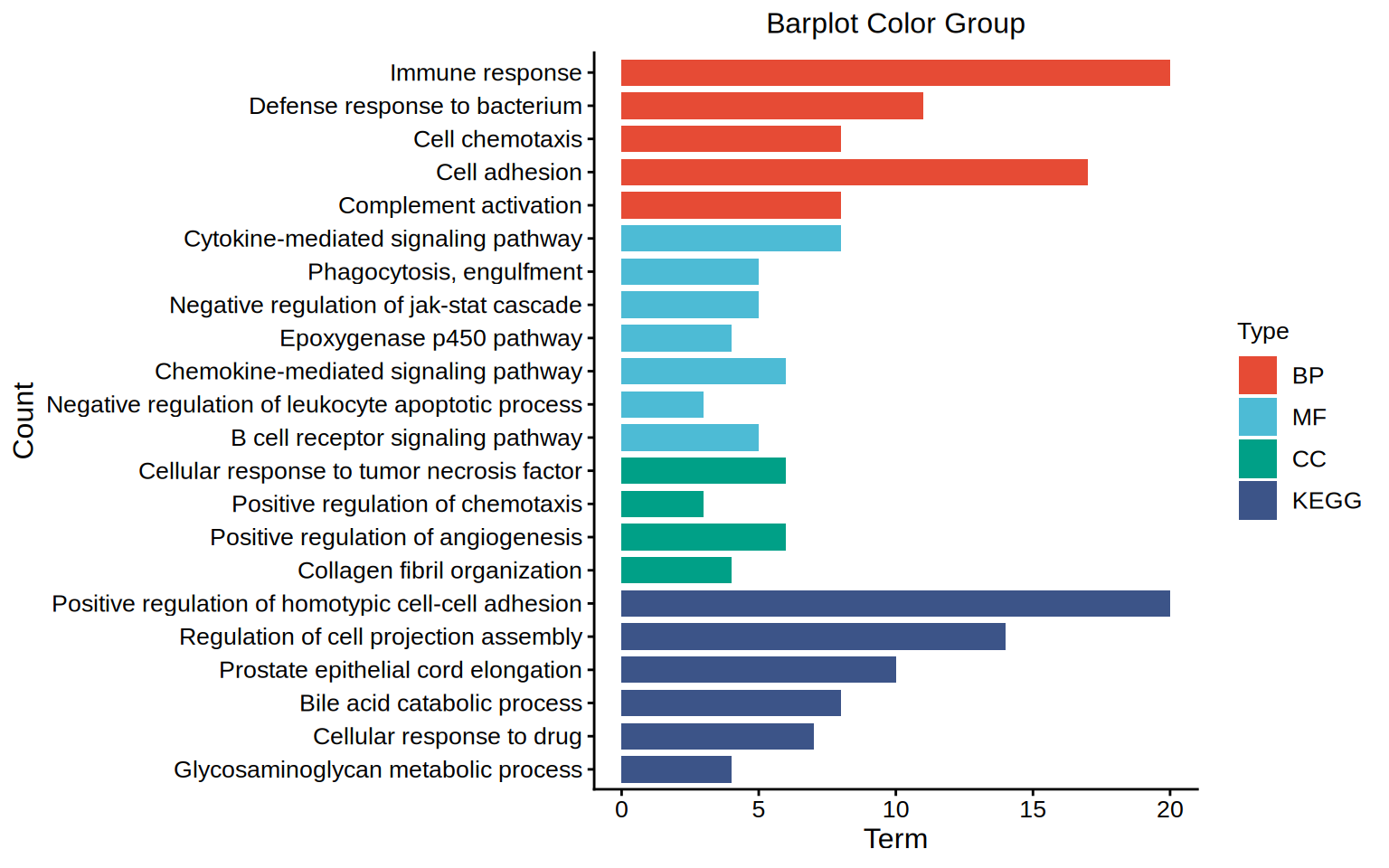
上图展示了 GO/KEGG 通路富集分析结果的可视化。