# 安装包
if (!requireNamespace("data.table", quietly = TRUE)) {
  install.packages("data.table")
}
if (!requireNamespace("jsonlite", quietly = TRUE)) {
  install.packages("jsonlite")
}
if (!requireNamespace("gmodels", quietly = TRUE)) {
  install.packages("gmodels")
}
if (!requireNamespace("ggpubr", quietly = TRUE)) {
  install.packages("ggpubr")
}
if (!requireNamespace("ggplot2", quietly = TRUE)) {
  install.packages("ggplot2")
}

# 加载包
library(data.table)
library(jsonlite)
library(gmodels)
library(ggpubr)
library(ggplot2)主成分分析
注记
Hiplot 网站
本页面为 Hiplot PCA 插件的源码版本教程,您也可以使用 Hiplot 网站实现无代码绘图,更多信息请查看以下链接:
主成分分析是以“降维”*” 为核心,用较少的几个综合指标(主成分)代替多指标的数据,还原数据最本质特征的数据处理方式。
环境配置
系统: 跨平台 (Linux/MacOS/Windows)
编程语言: R
依赖包:
data.table;jsonlite;gmodels,ggpubr,ggplot2
sessioninfo::session_info("attached")─ Session info ───────────────────────────────────────────────────────────────
setting value
version R version 4.6.0 (2026-04-24)
os Ubuntu 24.04.4 LTS
system x86_64, linux-gnu
ui X11
language (EN)
collate C.UTF-8
ctype C.UTF-8
tz UTC
date 2026-05-09
pandoc 3.1.3 @ /usr/bin/ (via rmarkdown)
quarto 1.9.37 @ /usr/local/bin/quarto
─ Packages ───────────────────────────────────────────────────────────────────
package * version date (UTC) lib source
data.table * 1.18.4 2026-05-06 [1] RSPM
ggplot2 * 4.0.3.9000 2026-05-04 [1] Github (tidyverse/ggplot2@6870419)
ggpubr * 0.6.3 2026-02-24 [1] RSPM
gmodels * 2.19.1 2024-03-06 [1] RSPM
jsonlite * 2.0.0 2025-03-27 [1] RSPM
[1] /home/runner/work/_temp/Library
[2] /opt/R/4.6.0/lib/R/site-library
[3] /opt/R/4.6.0/lib/R/library
* ── Packages attached to the search path.
──────────────────────────────────────────────────────────────────────────────数据准备
加载的数据包括基因表达值(基因名称及对应表达量)和样本信息(样本名称及分组)。
# 加载数据
data <- data.table::fread(jsonlite::read_json("https://hiplot.cn/ui/basic/pca/data.json")$exampleData[[1]]$textarea[[1]])
data <- as.data.frame(data)
group <- data.table::fread(jsonlite::read_json("https://hiplot.cn/ui/basic/pca/data.json")$exampleData[[1]]$textarea[[2]])
group <- as.data.frame(group)

# 整理数据格式
rownames(data) <- data[, 1]
data <- as.matrix(data[, -1])
pca_info <- fast.prcomp(data)
## 创建配置
conf <- list(
  dataArg = list(
    list(list(value = "group")),  # 按group列着色
    list(list(value = ""))         # 无形状分组
  ),
  general = list(
    title = "Principal Component Analysis",
    palette = "Set1"
  )
)
## 执行PCA - 注意需要转置数据,因为PCA是对样本(列)进行分析
pca_info <- prcomp(t(data), scale. = TRUE)
## 准备绘图数据
axis <- sapply(conf$dataArg[[1]], function(x) x$value)
## 处理颜色分组
if (is.null(axis[1]) || axis[1] == "") {
  colorBy <- rep('ALL', ncol(data))
} else {
  ## 确保样本顺序匹配
  colorBy <- group[match(colnames(data), group$sample), axis[1]]
}
colorBy <- factor(colorBy, levels = unique(colorBy))
## 创建PCA数据框
pca_data <- data.frame(
  sample = rownames(pca_info$x),
  PC1 = pca_info$x[, 1],
  PC2 = pca_info$x[, 2],
  colorBy = colorBy
)
## 计算解释方差
variance_explained <- round(pca_info$sdev^2 / sum(pca_info$sdev^2) * 100, 1)

# 查看数据
str(data)
num [1:9, 1:6] 6.6 5.76 9.56 8.4 8.42 ...
- attr(*, "dimnames")=List of 2
..$ : chr [1:9] "GBP4" "BCAT1" "CMPK2" "STOX2" ...
..$ : chr [1:6] "M1" "M2" "M3" "M8" ...str(group)'data.frame': 6 obs. of 2 variables:
$ sample: chr "M1" "M2" "M3" "M8" ...
$ group : chr "G1" "G1" "G1" "G2" ...head(pca_data) sample PC1 PC2 colorBy
M1 M1 0.8626164 2.17168331 G1
M2 M2 2.1114348 0.50696347 G1
M3 M3 2.9706882 -1.81112892 G1
M8 M8 -3.0779404 -0.85045239 G2
M9 M9 -2.5038211 0.08748266 G2
M10 M10 -0.3629779 -0.10454813 G2可视化
# 主成分分析
p <- ggplot(pca_data, aes(x = PC1, y = PC2, color = colorBy)) +
  geom_point(size = 4, alpha = 0.8) +
  geom_hline(yintercept = 0, linetype = "dashed", color = "gray70") +
  geom_vline(xintercept = 0, linetype = "dashed", color = "gray70") +
  stat_ellipse(level = 0.95, show.legend = FALSE) +
  ggtitle(conf$general$title) +
  labs(
    x = paste0("PC1 (", variance_explained[1], "%)"),
    y = paste0("PC2 (", variance_explained[2], "%)"),
    color = axis[1]
  ) +

  # 自定义颜色方案
  scale_color_brewer(palette = conf$general$palette) +

  # 添加样本标签
  geom_text(aes(label = sample),
            hjust = 0.5, vjust = -1, size = 3.5, show.legend = FALSE) +

  # 主题设置
  theme_bw(base_size = 12) +
  theme(
    plot.title = element_text(hjust = 0.5, face = "bold", size = 16),
    axis.title = element_text(size = 14, face = "bold"),
    axis.text = element_text(size = 12),
    legend.title = element_text(size = 12, face = "bold"),
    legend.text = element_text(size = 11),
    legend.position = "right",
    panel.grid.major = element_line(color = "grey90", linewidth = 0.3),
    panel.grid.minor = element_blank(),
    panel.border = element_rect(fill = NA, color = "grey50", linewidth = 0.5),
    aspect.ratio = 1
  )

# 显示图形
p
Too few points to calculate an ellipse
Too few points to calculate an ellipseWarning: Removed 2 rows containing missing values or values outside the scale range
(`geom_path()`).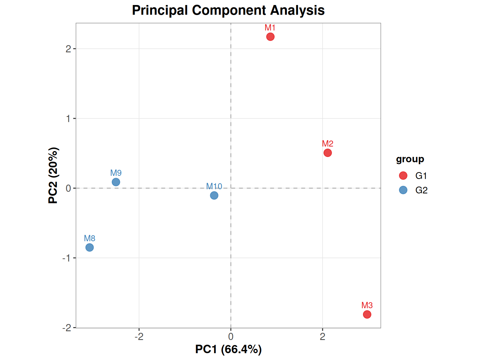
不同颜色表示不同样本,可解读主成分与原变量的关系,如:M1 对 PC1 具有较大的贡献,而 M8 与 PC1 呈较大的负相关性。