# 安装包
if (!requireNamespace("ggplot2", quietly = TRUE)) {
  install.packages("ggplot2")
}
if (!requireNamespace("dplyr", quietly = TRUE)) {
  install.packages("dplyr")
}

# 加载包
library(ggplot2)
library(dplyr)
library(stringr)连接散点图
连接散点图是在散点图的基础上,添加了按数据点出现顺序的连线,这使得从连接散点图中,既可以看出自变量和因变量间的相关性,也可以看出数据点的变化趋势。
示例
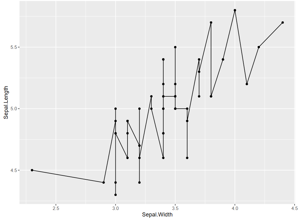
如图是一个基本的连接散点图,图中Sepal.Length与Sepal.Width间的变化曲线上下波动,但是总体上是因变量Sepal.Length随着自变量Sepal.Width的增大而增大。
环境配置
系统要求: 跨平台(Linux/MacOS/Windows)
编程语言:R
依赖包:
ggplot2,dplyr
sessioninfo::session_info("attached")─ Session info ───────────────────────────────────────────────────────────────
setting value
version R version 4.6.0 (2026-04-24)
os Ubuntu 24.04.4 LTS
system x86_64, linux-gnu
ui X11
language (EN)
collate C.UTF-8
ctype C.UTF-8
tz UTC
date 2026-05-09
pandoc 3.1.3 @ /usr/bin/ (via rmarkdown)
quarto 1.9.37 @ /usr/local/bin/quarto
─ Packages ───────────────────────────────────────────────────────────────────
package * version date (UTC) lib source
dplyr * 1.2.1 2026-04-03 [1] RSPM
ggplot2 * 4.0.3.9000 2026-05-04 [1] Github (tidyverse/ggplot2@6870419)
stringr * 1.6.0 2025-11-04 [1] RSPM
[1] /home/runner/work/_temp/Library
[2] /opt/R/4.6.0/lib/R/site-library
[3] /opt/R/4.6.0/lib/R/library
* ── Packages attached to the search path.
──────────────────────────────────────────────────────────────────────────────数据准备
使用R自带的数据集iris和economics,iris数据集包含3种鸢尾属植物的萼片长度和宽度以及花瓣长度和宽度的测量值;economics是美国经济的时序数据。同时使用了NCBI数据库的乳腺癌的基因表达数据,共有24个样本列,选取了两行基因表达数据进行绘图。
# 1.载入iris数据
data("iris", package = "datasets")
data <- iris

# 2. 载入时序数据
# 为了简化绘图过程,仅选择 12 月份的数据来代表全年
data_economics <- economics %>%
  select(date, psavert, uempmed) %>%
  filter(str_detect(date, "-12-01")) %>%
  slice_head(n = 25) %>%
  mutate(date = str_extract(date, "^\\d{4}")) %>% # 从每个日期字符串的开头提取 4 位数的年份。
  select(date, psavert, uempmed)

# 3.载入基因表达数据(前两行)
data_counts <- read.csv("https://bizard-1301043367.cos.ap-guangzhou.myqcloud.com/GSE243555_all_genes_with_counts.txt", sep = "\t", header = TRUE, nrows = 10)

axis_names <- data_counts[c(1, 2), 1]        # 保存名称

data_counts <- data_counts %>%
  select(-1) %>%               # 去除第一列
  slice(1:2) %>%               # 保留前两行
  t()  %>%                     # 倒置
  as.data.frame() %>%
  setNames(c("V1", "V2"))      # 设置列名

head(data_counts)
V1 V2
MCF7.HG..1. 2905 178
MCF7.HG..LG..2. 2496 161
ADIPO.HG..2. 1802 184
ADIPO.HG..LG..2. 1400 174
MCF7...ADIPO..HG..2. 2180 154
MCF7...ADIPO..HG..LG..2. 2123 118可视化
1. 基本绘图
图 1 在散点图的基础上,添加geom_line绘制的。
# 基本绘图,只添加了geom_line
p <- ggplot(data[data$Species == "setosa", ], aes(x = Sepal.Width, y = Sepal.Length)) +
  geom_point(shape = 17, size = 1.5, color = "blue") +
  geom_line()

p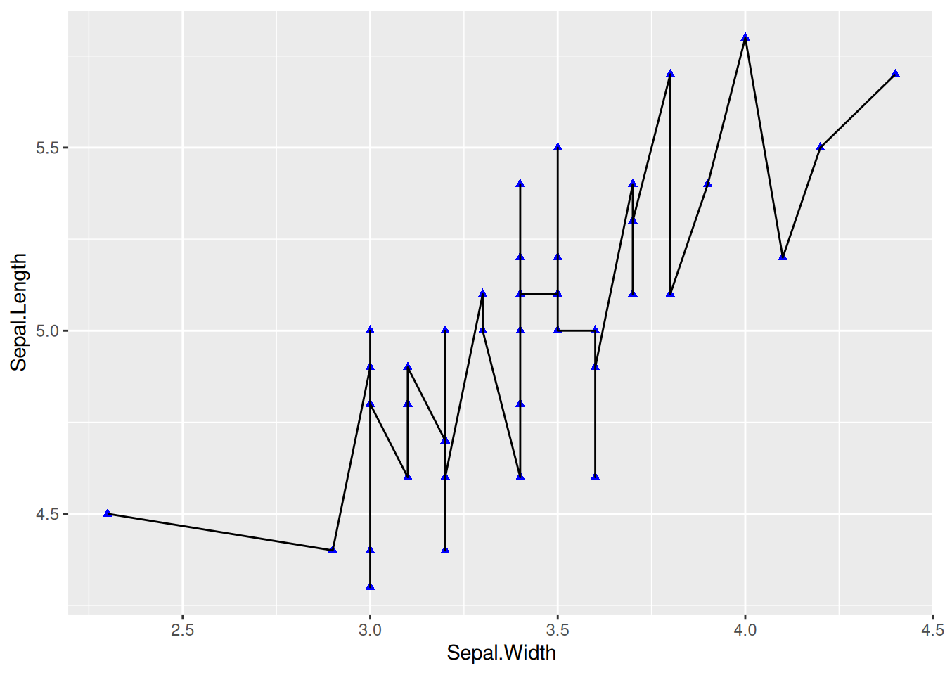
2. 设置线样式
图 2 通过参数设置线的朝向,宽度,类型,颜色。
## 设置线样式
p <- ggplot(data[data$Species == "setosa", ], aes(x = Sepal.Width, y = Sepal.Length)) +
  geom_point(shape = 17, size = 1.5, color = "blue") +
  geom_line(orientation = "x", linetype = 1, color = "red", linewidth = 0.1)

p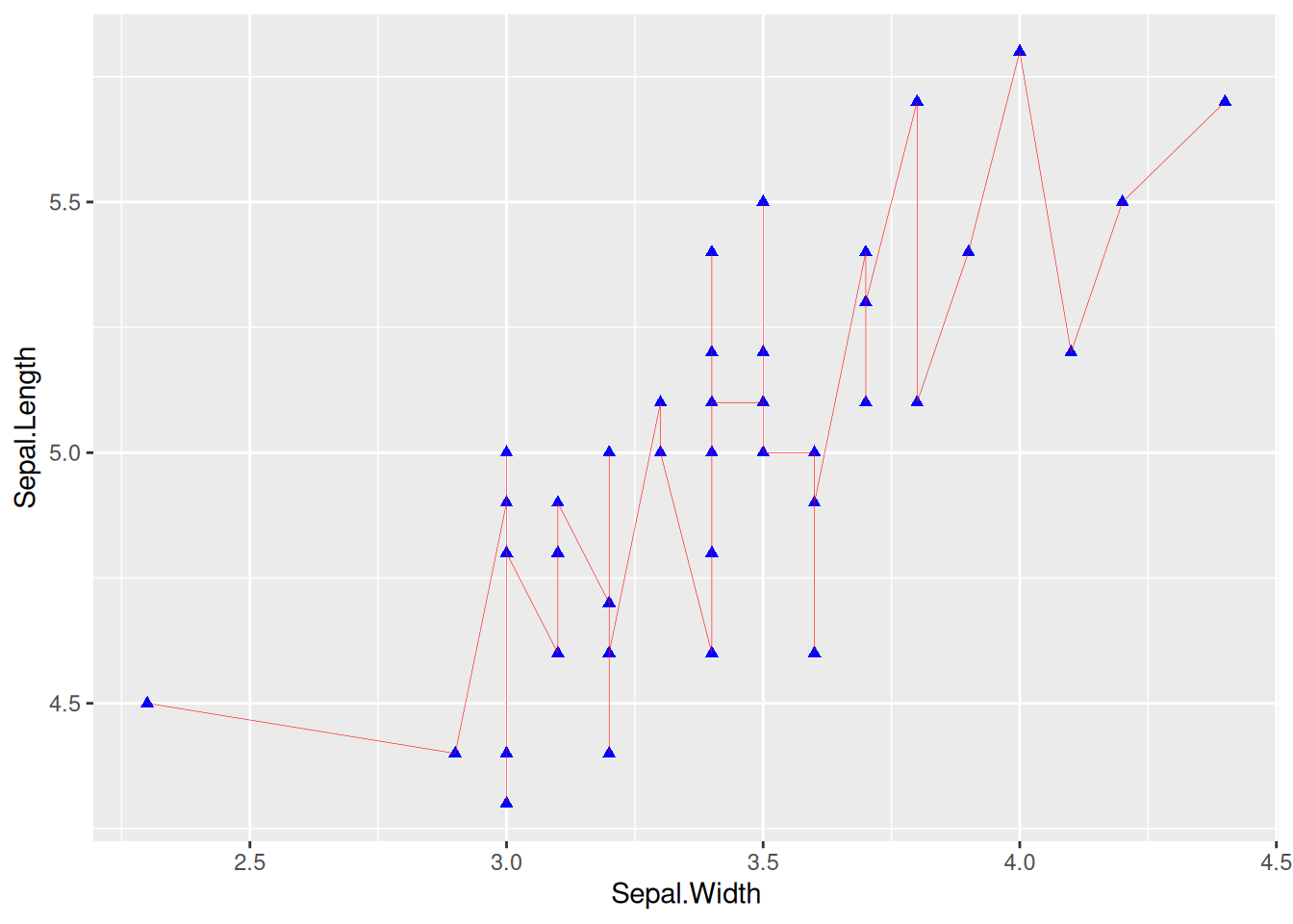
提示
关键参数: geom_line
linetype:
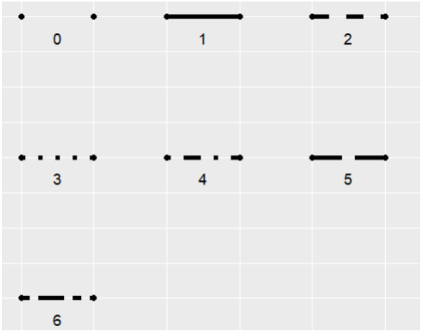
linetype 表示线的类型,可选项范围0-6(其中0 = blank, 1 = solid, 2 = dashed, 3 = dotted, 4 = dotdash, 5 = longdash, 6 = twodash),具体形状如下图:
orientation:
线段的朝向,可选项有”x”,“y”,orientation="x"是以x为自变量,y为因变量绘制。
linewidth:
线段的粗细。
3. 多类数据绘图
图 3 使用color=Species,shape=Species,linetype=Species将分类变量映射到多种特征中。
## 多类数据绘图
## 使用 `color=Species`,`shape=Species`,`linetype=Species` 将分类变量映射到多种特征中
p <- ggplot(
  data[data$Species == "setosa" | data$Species == "virginica", ],
  aes(x = Sepal.Width, y = Sepal.Length)
) +
  geom_point(aes(color = Species, shape = Species), size = 1.5) +
  geom_line(aes(linetype = Species)) +
  # 更改图例位置
  theme(legend.position = "inside", legend.position.inside = c(0.85, 0.8))

p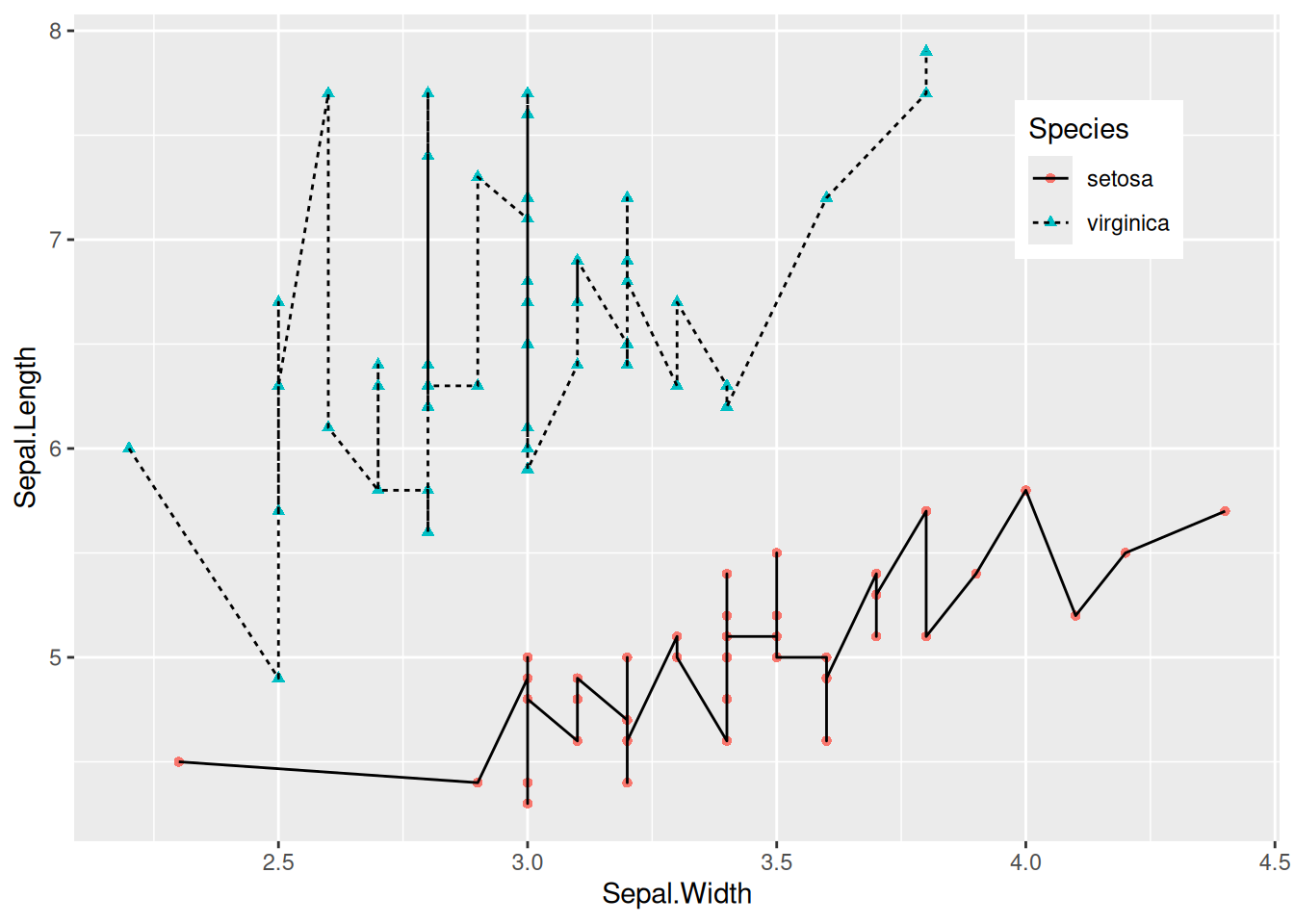
4. 使用基因数据绘图
图 4 显示了乳腺癌的两种基因的连接散点图。
# 使用基因数据绘图
p <- ggplot(data_counts, aes(x = V1, y = V2)) +
  geom_point(shape = 17, size = 1.5, color = "blue") +
  geom_line(orientation = "x", linetype = 1, color = "red", linewidth = 0.1) +
  theme(axis.text.x = element_text(angle = 90)) + # 避免文本重叠
  labs(x = axis_names[1], y = axis_names[2]) # 添加x,y轴标签

p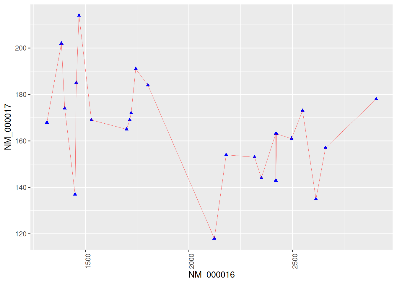
5. 按时序连线
不按时序连线(做对比)
图 5 使用了geom_line()绘图,geom_line()默认沿着x轴方向绘图(orientation="y"时沿y轴绘图)。
p <- ggplot(data_economics, aes(x = psavert, y = uempmed)) +
  geom_point(shape = 17, size = 1.5, color = "blue") +
  geom_text(
    label = data_economics$date, nudge_x = 0,
    nudge_y = -0.1, size = 3
  ) +
  geom_line(linewidth = 1)

p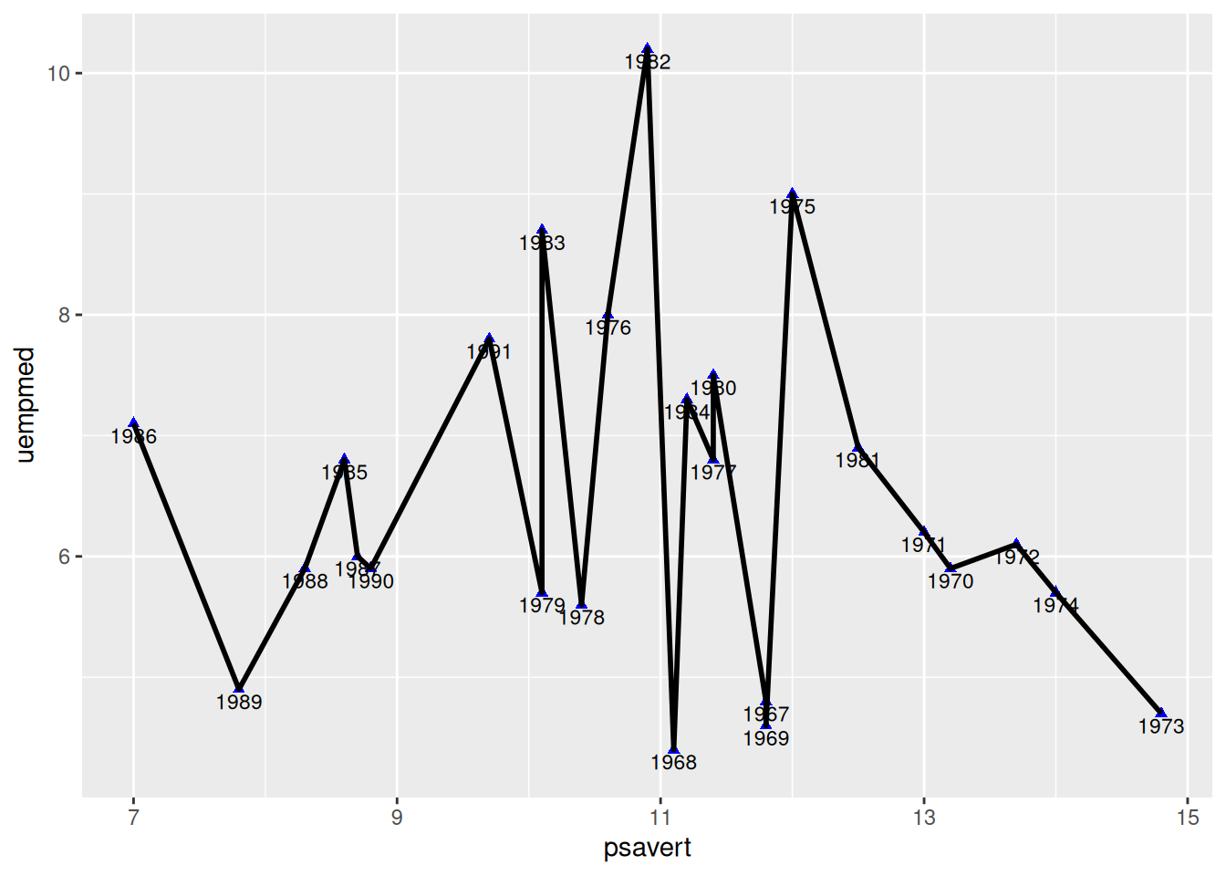
按时序连线
图 6 使用geom_segment()实现按照时序进行点的连线,和geom_line()绘制的图差别较大。
# 按照日期排序
data_economics <- data_economics[order(data_economics$date), ]

# 使用 `geom_segment()` 绘制线段
p <- ggplot(data_economics, aes(x = psavert, y = uempmed)) +
  geom_point(shape = 17, size = 1.5, color = "blue") +
  geom_text(
    label = data_economics$date, nudge_x = 0,
    nudge_y = -0.1, size = 5
  ) +
  geom_segment(
    aes(
      xend = c(tail(psavert, n = 24), NA),
      yend = c(tail(uempmed, n = 24), NA)
    ),
    linewidth = 1
  )

p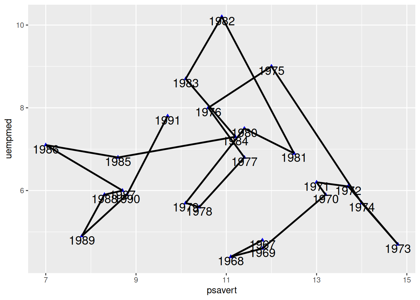
提示
关键参数: geom_segment
xend,yend:
与x,y相对应,也就是(x,y)指向(xend,yend)绘制线段。代码中c(tail(psavert, n=24),NA)是取psavert列的后面24个值,并加上了一个NA。这样就使前面的点指向后面一个点绘制线段,最后的点指向NA,不绘制线段。
绘制箭头
图 7 为每个连线添加了箭头,使连接散点图中的时序特征更加明显。
# 按照日期对数据进行排序
data_economics <- data_economics[order(data_economics$date), ]

# 使用 `geom_segment()` 绘制线段
p <- ggplot(data_economics, aes(x = psavert, y = uempmed)) +
  geom_point(shape = 17, size = 1.5, color = "blue") +
  geom_text(
    label = data_economics$date, nudge_x = 0,
    nudge_y = -0.1, size = 5
  ) +
  geom_segment(
    aes(
      xend = c(tail(psavert, n = 24), NA),
      yend = c(tail(uempmed, n = 24), NA)
    ),
    linewidth = 1, arrow = arrow(length = unit(0.5, "cm"))
  )

p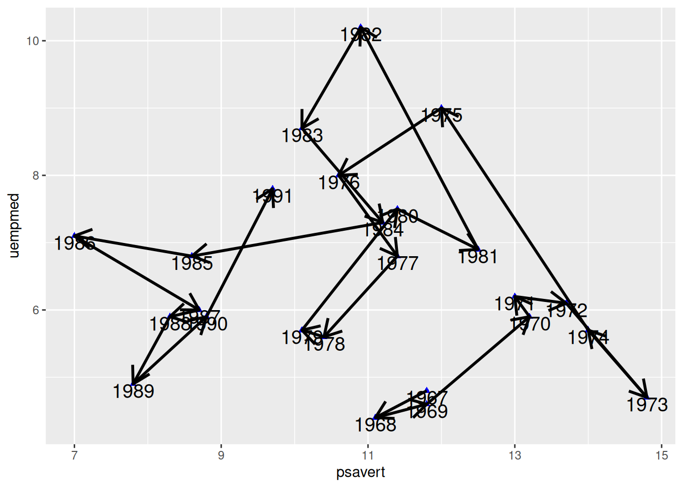
应用场景
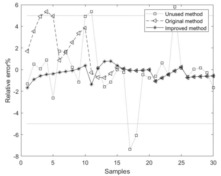
图中显示了基于未使用、原始和改进方法的模型方法相应的相对误差曲线, 其中基于改进方法的成分含量模型的平均相对误差优于基于未使用和原始方法的模型。[1]
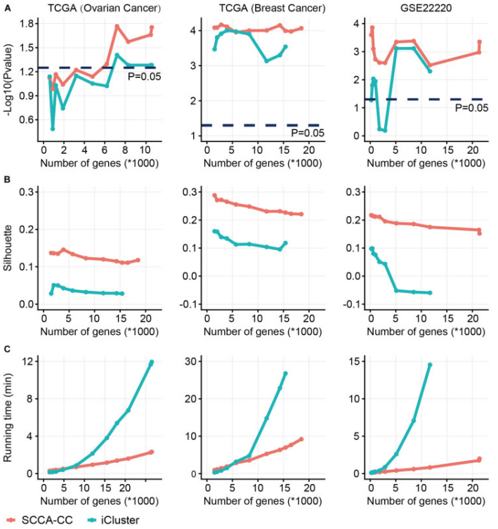
癌症分类(SCCA-CC)与iCluster的稀疏规范相关分析的比较。使用基于MAD预选的不同数量的基因,我们比较了SCCA-CC和iCluster之间的分类性能。(A)表示与生存相关的P值,通过log-rank测试计算;(B)表示聚类一致性的Silhouette分数;(C)评估计算复杂度的算法运行时间。[2]
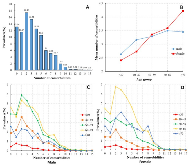
(A) HCC患者合并症数量的分布。(B) 不同年龄和性别的HCC患者的平均合并症数量。(C) 各年龄组男性HCC患者合并症数量的分布。(D) 各年龄组女性HCC患者合并症数量的分布。[3]
参考文献
[1] LU R, LIU H, YANG H, et al. Multi-Delay Identification of Rare Earth Extraction Process Based on Improved Time-Correlation Analysis[J]. Sensors (Basel), 2023,23(3).
[2] QI L, WANG W, WU T, et al. Multi-Omics Data Fusion for Cancer Molecular Subtyping Using Sparse Canonical Correlation Analysis[J]. Front Genet, 2021,12: 607817.
[3] MU X M, WANG W, JIANG Y Y, et al. Patterns of Comorbidity in Hepatocellular Carcinoma: A Network Perspective[J]. Int J Environ Res Public Health, 2020,17(9).