# 安装包
if (!requireNamespace("meta", quietly = TRUE)) {
  install.packages("meta")
}
if (!requireNamespace("metafor", quietly = TRUE)) {
  install.packages("metafor")
}
if (!requireNamespace("ggplot2", quietly = TRUE)) {
  install.packages("ggplot2")
}
if (!requireNamespace("dplyr", quietly = TRUE)) {
  install.packages("dplyr")
}
if (!requireNamespace("tidyr", quietly = TRUE)) {
  install.packages("tidyr")
}
if (!requireNamespace("grid", quietly = TRUE)) {
  install.packages("grid")
}
if (!requireNamespace("forestplot", quietly = TRUE)) {
  install.packages("forestplot")
}

# 加载包
library(meta)
library(metafor)
library(ggplot2)
library(dplyr)
library(tidyr)
library(grid)
library(forestplot)元分析森林图
示例
森林图是 meta 分析中常用的图形表示,以可视化单个研究的结果。它显示观察到的效果大小,置信区间和每项研究的重量,从而可以清楚地比较整个研究的结果。
环境配置
系统要求: 跨平台(Linux/MacOS/Windows)
编程语言:R
依赖包:
meta,metafor,ggplot2,dplyr,tidyr,grid,forestplot
sessioninfo::session_info("attached")─ Session info ───────────────────────────────────────────────────────────────
setting value
version R version 4.6.0 (2026-04-24)
os Ubuntu 24.04.4 LTS
system x86_64, linux-gnu
ui X11
language (EN)
collate C.UTF-8
ctype C.UTF-8
tz UTC
date 2026-05-09
pandoc 3.1.3 @ /usr/bin/ (via rmarkdown)
quarto 1.9.37 @ /usr/local/bin/quarto
─ Packages ───────────────────────────────────────────────────────────────────
package * version date (UTC) lib source
abind * 1.4-8 2024-09-12 [1] RSPM
checkmate * 2.3.4 2026-02-03 [1] RSPM
dplyr * 1.2.1 2026-04-03 [1] RSPM
forestplot * 3.2.0 2026-03-04 [1] RSPM
ggplot2 * 4.0.3.9000 2026-05-04 [1] Github (tidyverse/ggplot2@6870419)
Matrix * 1.7-5 2026-03-21 [3] CRAN (R 4.6.0)
meta * 8.3-0 2026-04-02 [1] RSPM
metabook * 0.2-0 2026-03-13 [1] RSPM
metadat * 1.6-0 2026-04-29 [1] RSPM
metafor * 5.0-1 2026-04-26 [1] RSPM
numDeriv * 2016.8-1.1 2019-06-06 [1] RSPM
tidyr * 1.3.2 2025-12-19 [1] RSPM
[1] /home/runner/work/_temp/Library
[2] /opt/R/4.6.0/lib/R/site-library
[3] /opt/R/4.6.0/lib/R/library
* ── Packages attached to the search path.
──────────────────────────────────────────────────────────────────────────────数据准备
# 生成模拟数据
set.seed(2023)
n_studies <- 15
meta_data <- tibble(
  `Study Name` = paste("Study", LETTERS[1:n_studies]),
  `Odds Ratio` = exp(rnorm(n_studies, mean = 0.2, sd = 0.4)),
  `Lower 95% CI` = exp(rnorm(n_studies, mean = 0.1, sd = 0.35)),
  `Upper 95% CI` = exp(rnorm(n_studies, mean = 0.3, sd = 0.45)),
  `Weight (%)` = runif(n_studies, 0.5, 3),
  `Treatment Group` = sample(c("DrugA", "DrugB"), n_studies, replace = TRUE)
) %>%
  mutate(
    across(c(`Odds Ratio`, `Lower 95% CI`, `Upper 95% CI`), ~round(., 2)),
    `Weight (%)` = round(`Weight (%)`/sum(`Weight (%)`)*100, 1),
    `Study Name` = factor(`Study Name`, levels = rev(`Study Name`))
  )

# 查看最终的合并数据集
head(meta_data)
# A tibble: 6 × 6
`Study Name` `Odds Ratio` `Lower 95% CI` `Upper 95% CI` `Weight (%)`
<fct> <dbl> <dbl> <dbl> <dbl>
1 Study A 1.18 1.41 1.19 7.5
2 Study B 0.82 1.36 2.4 3.3
3 Study C 0.58 1.29 0.94 9.3
4 Study D 1.13 1.51 1.32 9.2
5 Study E 0.95 1.35 1.01 8.3
6 Study F 1.89 0.96 1.11 3.4
# ℹ 1 more variable: `Treatment Group` <chr>可视化
1. 基础绘图
# 基础森林图
p <-
  ggplot(meta_data, aes(x = `Odds Ratio`, y = `Study Name`)) +
  geom_vline(xintercept = 1, linetype = "dashed", color = "grey50") +
  geom_errorbarh(aes(xmin = `Lower 95% CI`, xmax = `Upper 95% CI`),
                 height = 0.15, color = "#2c7fb8", linewidth = 0.8) +
  geom_point(aes(size = `Weight (%)`), shape = 18, color = "#d95f00") +
  scale_x_continuous(trans = "log",
                     breaks = c(0.25, 0.5, 1, 2, 4),
                     limits = c(0.2, 5)) +
  labs(x = "Odds Ratio (95% CI)",
       y = "",
       title = "Meta-Analysis Forest Plot",
       subtitle = "Random Effects Model") +
  theme_minimal(base_size = 12) +
  theme(
    panel.grid.major.y = element_blank(),
    panel.grid.minor.x = element_blank(),
    plot.title = element_text(face = "bold", hjust = 0.5),
    plot.subtitle = element_text(hjust = 0.5, color = "grey50"),
    legend.position = "bottom"
  )
p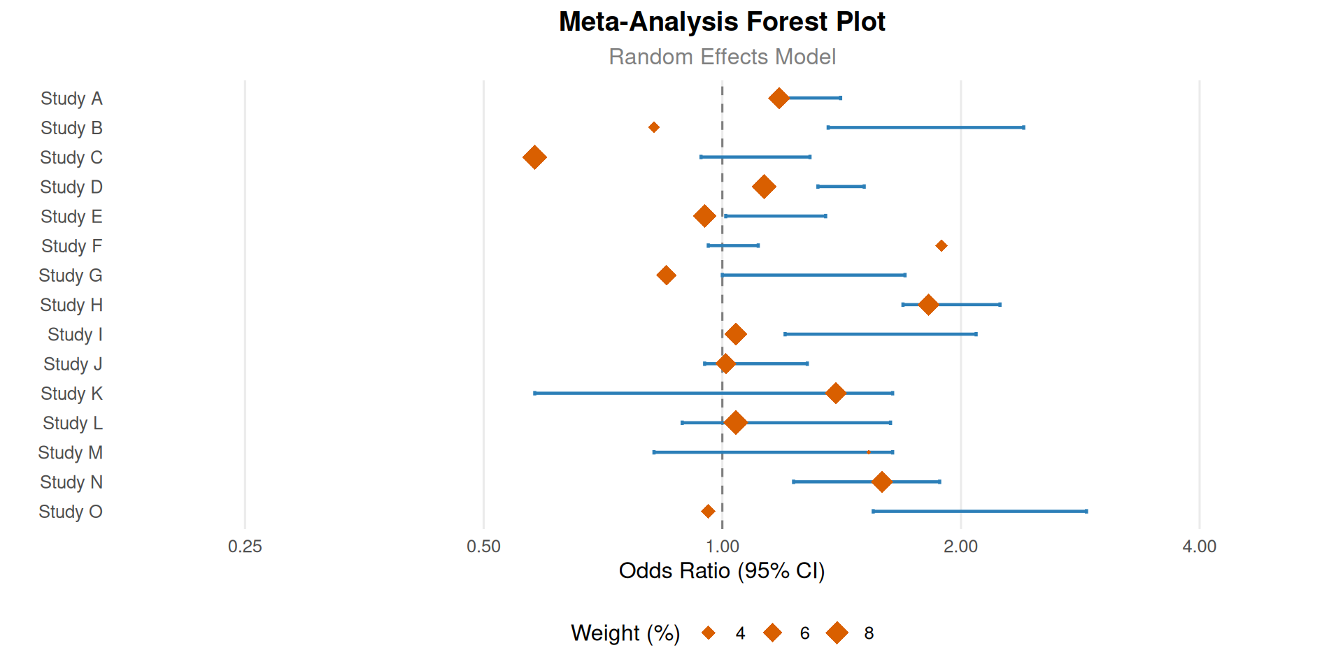
# 数据准备 ---------------------------------------------------------------
dataset <- data.frame(
Study_Name = c("ART","WBC","CPR","DTA","EPC","FFT","GEO","HBC","PTT","JOK"),
Odds_Ratio = c(0.9, 2, 0.3, 0.4, 0.5, 1.3, 2.5, 1.6, 1.9, 1.1),
Lower_95_CI = c(0.75, 1.79, 0.18, 0.2, 0.38, 1.15, 2.41, 1.41, 1.66, 0.97),
Upper_95_CI = c(1.05, 2.21, 0.42, 0.6, 0.62, 1.45, 2.59, 1.79, 2.14, 1.23),
Effect_Type = factor(c('Not sig.', 'Risk', 'Protective', 'Protective', 'Protective',
                       'Risk', 'Risk', 'Risk', 'Risk', 'Not sig.'),
                     levels = c("Risk", "Protective", "Not sig.")),
Sample_Size = c(450, 420, 390, 400, 470, 390, 400, 388, 480, 460)
) %>%
mutate(
  log_OR = log(Odds_Ratio),
  log_Lower = log(Lower_95_CI),
  log_Upper = log(Upper_95_CI),
  Study_Name = factor(Study_Name, levels = rev(Study_Name)))


x_limits <- c(-3.9, 2)  # 数据坐标范围(左边界到log(5)≈1.6)
get_npc <- function(x) {
(x - x_limits[1]) / diff(x_limits)  # 标准化坐标转换
}


column_system <- list(
study = list(
  data_x = -3.8,
  npc_x = get_npc(-3.8),
  label = "Study",
  width = 1.2
),
events = list(
  data_x = -3.5,
  npc_x = get_npc(-3.5),
  label = "Events\n(Case/Control)",
  width = 1.8
),
or = list(
  data_x = -3.1,
  npc_x = get_npc(-3.1),
  label = "Odds Ratio\n(95% CI)",
  width = 2.2
),
p = list(
  data_x = -2.7,
  npc_x = get_npc(-2.7),
  label = "P Value",
  width = 1.2
),
sample = list(
  data_x = -2.4,
  npc_x = get_npc(-2.4),
  label = "Sample\nSize",
  width = 1.2
)
)


ggplot(dataset, aes(y = Study_Name)) +

annotation_custom(
  grob = textGrob(
    label = sapply(column_system, function(x) x$label),
    x = unit(sapply(column_system, function(x) x$npc_x), "npc"),
    y = unit(1.06, "npc"),
    hjust = 0.5,
    vjust = 0,
    gp = gpar(
      fontface = "bold",
      fontsize = 12,
      lineheight = 0.8,
      col = "black"
    )
  )
) +


# 研究名称(右对齐)
geom_text(
  aes(x = column_system$study$data_x, label = Study_Name),
  size = 3.5,
  hjust = 1,
  nudge_x = -0.05  # 微调位置
) +

# 事件发生率(右对齐)
geom_text(
  aes(x = column_system$events$data_x,
      label = c("17/13", "23/18", "30/25", "10/8", "31/25",
                "17/13", "23/18", "24/20", "17/12", "2.00/1.90")),
  size = 3.5,
  hjust = 1
) +

# OR值(右对齐)
geom_text(
  aes(x = column_system$or$data_x,
      label = sprintf("%.2f (%.2f-%.2f)", Odds_Ratio, Lower_95_CI, Upper_95_CI)),
  size = 3.5,
  hjust = 1
) +

# P值(右对齐)
geom_text(
  aes(x = column_system$p$data_x,
      label = c("<0.001", "<0.001", "0.075", "<0.001", "<0.001",
                "<0.001", "<0.001", "<0.001", "<0.001", "0.650")),
  size = 3.5,
  color = "#d95f02",
  hjust = 1
) +

# 样本量(右对齐)
geom_text(
  aes(x = column_system$sample$data_x, label = Sample_Size),
  size = 3.5,
  fontface = "bold",
  hjust = 1
) +


geom_vline(
  xintercept = 0,
  linetype = "solid",
  color = "black",
  linewidth = 0.8
) +
geom_errorbarh(
  aes(xmin = log_Lower, xmax = log_Upper),
  height = 0.15,
  color = "grey40",
  linewidth = 0.8
) +
geom_point(
  aes(x = log_OR, size = Sample_Size, fill = Effect_Type),
  shape = 21,
  color = "white",
  stroke = 1
) +


scale_x_continuous(
  name = "Odds Ratio (log scale)",
  breaks = log(c(0.25, 0.5, 1, 2, 4)),
  labels = c(0.25, 0.5, 1, 2, 4),
  limits = x_limits,
  expand = expansion(add = c(0.1, 0.2))
) +
scale_size_continuous(
  range = c(4, 10),
  breaks = c(300, 400, 500),
  guide = guide_legend(
    title.position = "top",
    title = "Sample Size",
    nrow = 1,
    override.aes = list(shape = 21, fill = "grey50")
  )
) +
scale_fill_manual(
  values = c(
    Risk = "#d95f02",
    Protective = "#1b9e77",
    "Not sig." = "#7570b3"
  ),
  guide = guide_legend(
    title = NULL,
    nrow = 1,
    override.aes = list(size = 5)
  )
) +


labs(title = "Multivariable Analysis of Clinical Factors") +
theme_minimal(base_size = 12) +
theme(
  panel.grid.major.y = element_blank(),
  panel.grid.minor.y = element_blank(),
  axis.title.y = element_blank(),
  axis.text.y = element_blank(),
  axis.ticks.y = element_blank(),
  axis.title.x = element_text(
    color = "grey30",
    margin = margin(t = 10)
  ),
  axis.text.x = element_text(color = "grey30"),
  plot.title = element_text(
    hjust = 0.5,
    face = "bold",
    size = 16,
    margin = margin(b = 20)
  ),
  legend.position = "bottom",
  legend.box = "horizontal",
  legend.spacing.x = unit(0.8, "cm"),
  legend.title = element_text(size = 11),
  legend.text = element_text(size = 10),
  plot.margin = margin(t = 80, b = 20, l = 30, r = 30),
  plot.background = element_rect(
    fill = "#f0f8ff",
    color = NA,
    linewidth = 0.5
  )
) +
coord_cartesian(clip = "off")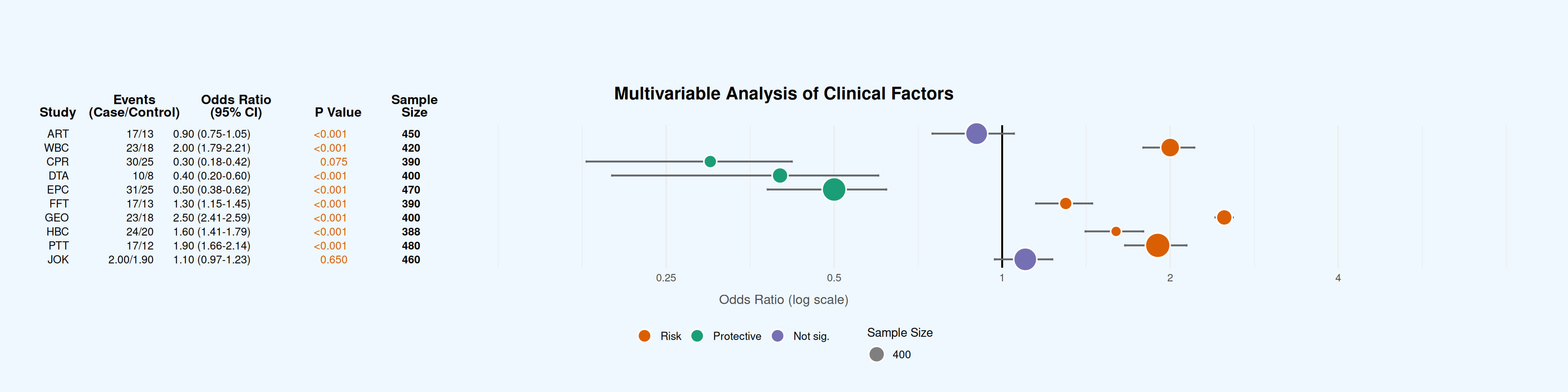
2. 现有R包作图
# 森林图
test_data <- data.frame(id = 1:4,
                        coef1 = c(1, 1.59, 1.3, 1.24),
                        coef2 = c(1, 1.7, 1.4, 1.04),
                        low1 = c(1, 1.3, 1.1, 0.99),
                        low2 = c(1, 1.6, 1.2, 0.7),
                        high1 = c(1, 1.94, 1.6, 1.55),
                        high2 = c(1, 1.8, 1.55, 1.33))

# Convert into dplyr formatted data
out_data <- test_data |>
  pivot_longer(cols = everything() & -id) |>
  mutate(group = gsub("(.+)([12])$", "\\2", name),
         name = gsub("(.+)([12])$", "\\1", name)) |>
  pivot_wider() |>
  group_by(id) |>
  mutate(col1 = lapply(id, \(x) ifelse(x < 4,
                                       paste("Category", id),
                                       expression(Category >= 4))),
         col2 = lapply(1:n(), \(i) substitute(expression(bar(x) == val),
                                              list(val = mean(coef) |> round(2)))),
         col2 = if_else(id == 1,
                        rep("ref", n()) |> as.list(),
                        col2)) |>
  group_by(group)

out_data |>
  forestplot(mean = coef,
             lower = low,
             upper = high,
             labeltext = c(col1, col2),
             title = "Cool study",
             zero = c(0.98, 1.02),
             grid = structure(c(2^-.5, 2^.5),
                              gp = gpar(col = "steelblue", lty = 2)
             ),
             boxsize = 0.25,
             xlab = "The estimates",
             new_page = TRUE,
             legend = c("Treatment", "Placebo"),
             legend_args = fpLegend(
               pos = list("topright"),
               title = "Group",
               r = unit(.1, "snpc"),
               gp = gpar(col = "#CCCCCC", lwd = 1.5)
             )) |>
  fp_set_style(box = c("royalblue", "gold"),
               line = c("darkblue", "orange"),
               summary = c("darkblue", "red"))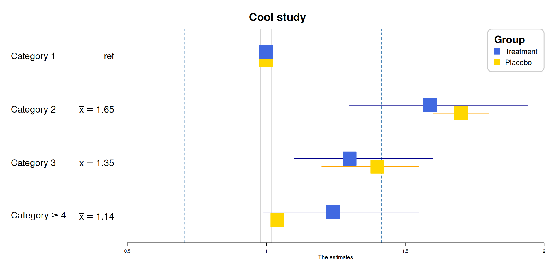
应用场景
1. Meta分析结果可视化
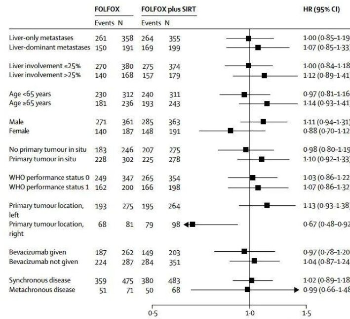
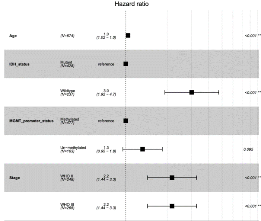
森林图(forest plot),从定义上讲,它一般是在平面直角坐标系中,以一条垂直于X轴的无效线(通常坐标X=1或0)为中心,用若干条平行于X轴的线段,来表示每个研究的效应量大小及其95%可信区间,并用一个棱形来表示多个研究合并的效应量及可信区间,它是Meta分析中最常用的结果综合表达形式。
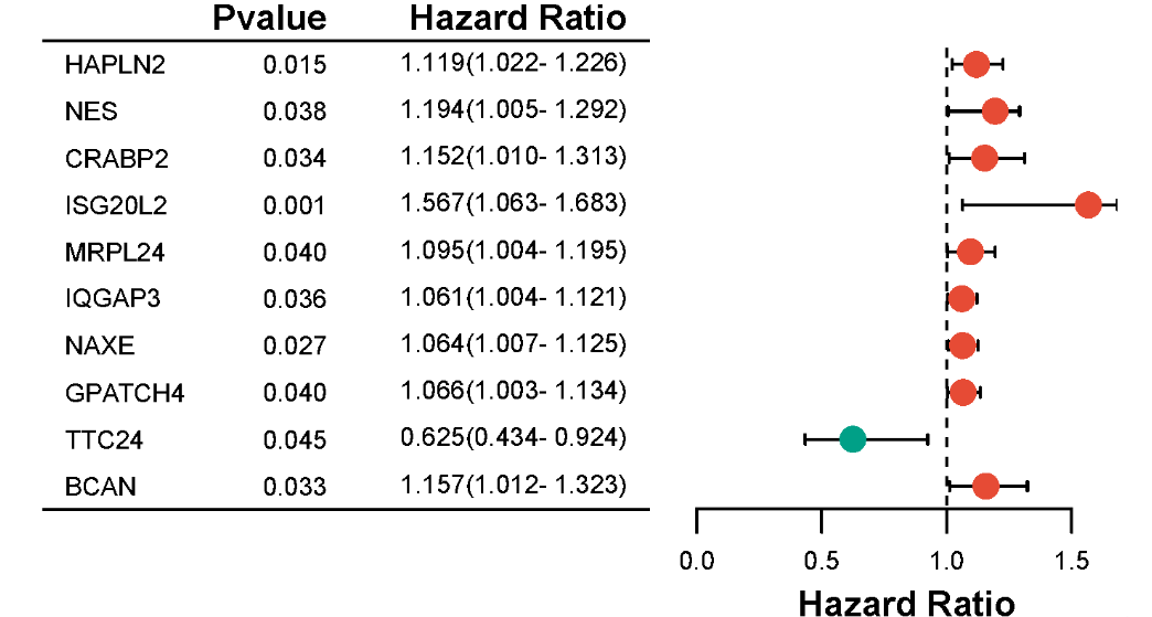
2. 多因素回归分析结果展示
森林图是一种非常灵活的可视化工具,不仅可以用于展示Meta分析的结果,还可以用于展示单因素或多因素回归分析的结果。
3. 基因关联研究可视化
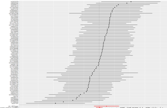
TwoSampleMR包做出来的森林图。
参考文献
[1] Lewis, S., & Clarke, M. (2001). Forest Plots: Trying to See the Wood and the Trees. BMJ, 322(7300), 1479–1480.DOI: 10.1136/bmj.322.7300.1479.
[2] Higgins, J. P. T., Thomas, J., Chandler, J., et al. (2022). Cochrane Handbook for Systematic Reviews of Interventions (Version 6.3).
[3] Gordon, M., & Lumley, T. (2023). forestplot: Advanced Forest Plot Using ‘grid’ Graphics (R package version 3.1.1).
[4] Moher, D., Hopewell, S., Schulz, K. F., et al. (2010). CONSORT 2010 Statement: Updated Guidelines for Reporting Parallel Group Randomized Trials. Annals of Internal Medicine, 152(11), 726–732.DOI: 10.7326/0003-4819-152-11-201006010-00232.
[5] Murrell, P. (2018). R Graphics (3rd ed.). Chapman & Hall/CRC.ISBN: 978-1439888417