# 安装包
if (!requireNamespace("data.table", quietly = TRUE)) {
  install.packages("data.table")
}
if (!requireNamespace("jsonlite", quietly = TRUE)) {
  install.packages("jsonlite")
}
if (!requireNamespace("ggplot2", quietly = TRUE)) {
  install.packages("ggplot2")
}
if (!requireNamespace("dplyr", quietly = TRUE)) {
  install.packages("dplyr")
}
if (!requireNamespace("ggrepel", quietly = TRUE)) {
  install.packages("ggrepel")
}

# 加载包
library(data.table)
library(jsonlite)
library(ggplot2)
library(dplyr)
library(ggrepel)连接散点图
注记
Hiplot 网站
本页面为 Hiplot Connected Scatterplot 插件的源码版本教程,您也可以使用 Hiplot 网站实现无代码绘图,更多信息请查看以下链接:
连接散点图
环境配置
系统: Cross-platform (Linux/MacOS/Windows)
编程语言: R
依赖包:
data.table;jsonlite;ggplot2;dplyr;ggrepel
sessioninfo::session_info("attached")─ Session info ───────────────────────────────────────────────────────────────
setting value
version R version 4.6.0 (2026-04-24)
os Ubuntu 24.04.4 LTS
system x86_64, linux-gnu
ui X11
language (EN)
collate C.UTF-8
ctype C.UTF-8
tz UTC
date 2026-05-09
pandoc 3.1.3 @ /usr/bin/ (via rmarkdown)
quarto 1.9.37 @ /usr/local/bin/quarto
─ Packages ───────────────────────────────────────────────────────────────────
package * version date (UTC) lib source
data.table * 1.18.4 2026-05-06 [1] RSPM
dplyr * 1.2.1 2026-04-03 [1] RSPM
ggplot2 * 4.0.3.9000 2026-05-04 [1] Github (tidyverse/ggplot2@6870419)
ggrepel * 0.9.8 2026-03-17 [1] RSPM
jsonlite * 2.0.0 2025-03-27 [1] RSPM
[1] /home/runner/work/_temp/Library
[2] /opt/R/4.6.0/lib/R/site-library
[3] /opt/R/4.6.0/lib/R/library
* ── Packages attached to the search path.
──────────────────────────────────────────────────────────────────────────────数据准备
# 加载数据
data <- data.table::fread(jsonlite::read_json("https://hiplot.cn/ui/basic/connected-scatterplot/data.json")$exampleData$textarea[[1]])
data <- as.data.frame(data)

# 查看数据
head(data)
year Alice Anna
1 1991 724 7118
2 1992 686 6846
3 1993 684 6808
4 1994 595 7523
5 1995 579 8564
6 1996 593 8565可视化
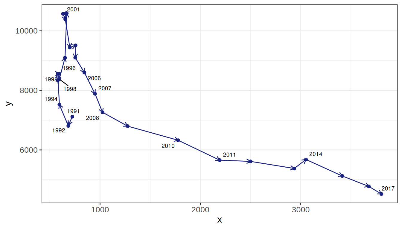
# 连接散点图
connected_scatterplot <- function(data, x, y, label, label_ratio, line_color, arrow_size, label_size) {

  draw_data <- data.frame(
    x = data[[x]],
    y = data[[y]],
    label = data[[label]]
  )

  add_label_data <- draw_data %>% sample_frac(label_ratio)
  rm(data)

  p <- ggplot(draw_data, aes(x = x, y = y, label = label)) +
    geom_point(color = line_color) +
    geom_text_repel(data = add_label_data, size = label_size) +
    geom_segment(
      color = line_color,
      aes(
        xend = c(tail(x, n = -1), NA),
        yend = c(tail(y, n = -1), NA)
      ),
      arrow = arrow(length = unit(arrow_size, "mm"))
    )

  return(p)
}

p <- connected_scatterplot(
  data = if (exists("data") && is.data.frame(data)) data else "",
  x = "Alice",
  y = "Anna",
  label = "year",
  label_ratio = 0.5,
  line_color = "#1A237E",
  arrow_size = 2,
  label_size = 2.5
) +
  theme_bw() +
  theme(text = element_text(family = "Arial"),
        plot.title = element_text(size = 12,hjust = 0.5),
        axis.title = element_text(size = 12),
        axis.text = element_text(size = 10),
        axis.text.x = element_text(angle = 0, hjust = 0.5,vjust = 1),
        legend.position = "right",
        legend.direction = "vertical",
        legend.title = element_text(size = 10),
        legend.text = element_text(size = 10))

p