# 安装包
if (!requireNamespace("data.table", quietly = TRUE)) {
  install.packages("data.table")
}
if (!requireNamespace("jsonlite", quietly = TRUE)) {
  install.packages("jsonlite")
}
if (!requireNamespace("ggplot2", quietly = TRUE)) {
  install.packages("ggplot2")
}

# 加载包
library(data.table)
library(jsonlite)
library(ggplot2)区间区域图
注记
Hiplot 网站
本页面为 Hiplot Interval Area Chart 插件的源码版本教程,您也可以使用 Hiplot 网站实现无代码绘图,更多信息请查看以下链接:
环境配置
系统: Cross-platform (Linux/MacOS/Windows)
编程语言: R
依赖包:
data.table;jsonlite;ggplot2
sessioninfo::session_info("attached")─ Session info ───────────────────────────────────────────────────────────────
setting value
version R version 4.6.0 (2026-04-24)
os Ubuntu 24.04.4 LTS
system x86_64, linux-gnu
ui X11
language (EN)
collate C.UTF-8
ctype C.UTF-8
tz UTC
date 2026-05-09
pandoc 3.1.3 @ /usr/bin/ (via rmarkdown)
quarto 1.9.37 @ /usr/local/bin/quarto
─ Packages ───────────────────────────────────────────────────────────────────
package * version date (UTC) lib source
data.table * 1.18.4 2026-05-06 [1] RSPM
ggplot2 * 4.0.3.9000 2026-05-04 [1] Github (tidyverse/ggplot2@6870419)
jsonlite * 2.0.0 2025-03-27 [1] RSPM
[1] /home/runner/work/_temp/Library
[2] /opt/R/4.6.0/lib/R/site-library
[3] /opt/R/4.6.0/lib/R/library
* ── Packages attached to the search path.
──────────────────────────────────────────────────────────────────────────────数据准备
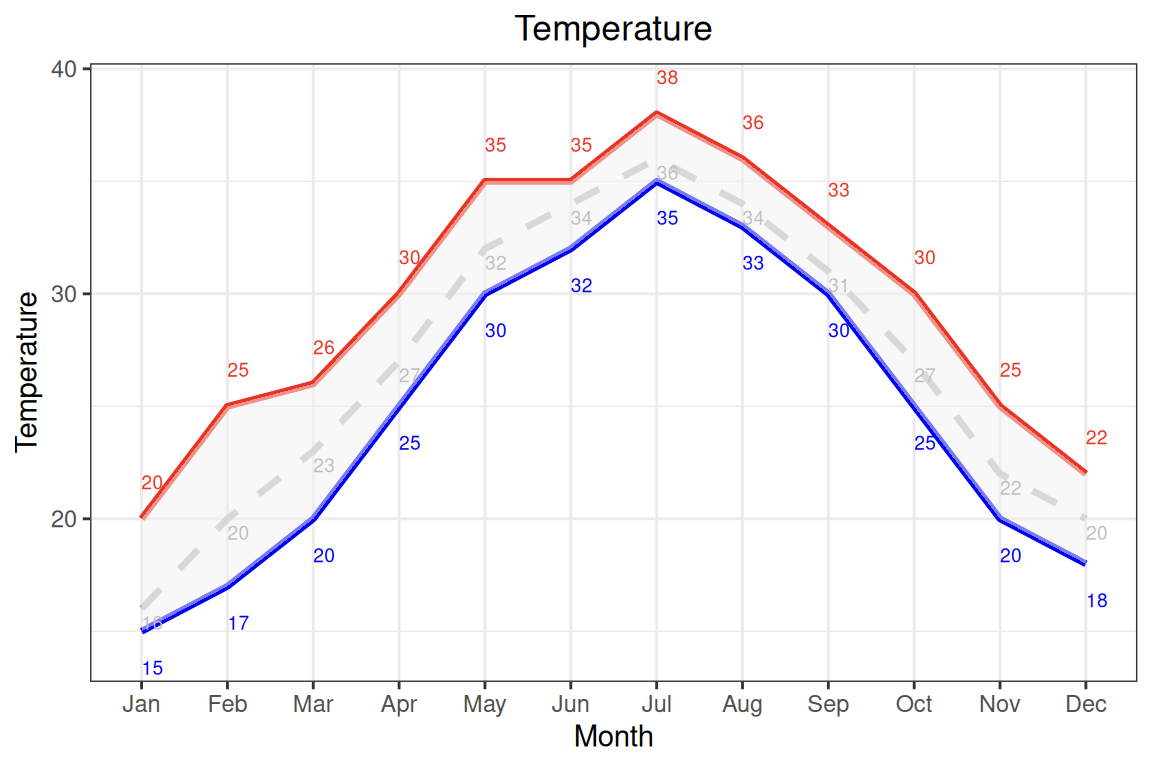
案例数据为一年十二个月份的最高和最低温度和对应的月份简称。通过案例数据绘制了每个月份的温度区间及温度均线。
# 加载数据
data <- data.table::fread(jsonlite::read_json("https://hiplot.cn/ui/basic/interval-area-chart/data.json")$exampleData$textarea[[1]])
data <- as.data.frame(data)

# 整理数据格式
data[["month"]] <- factor(data[["month"]], levels = data[["month"]])

# 查看数据
head(data)
month min_temperature max_temperature mean
1 Jan 15 20 16
2 Feb 17 25 20
3 Mar 20 26 23
4 Apr 25 30 27
5 May 30 35 32
6 Jun 32 35 34可视化
# 区间区域图
p <- ggplot(data, aes(x = month, group = 1)) +
  geom_line(aes(y = max_temperature), size = 1.2, color = "#EA3323",
            linetype = "solid") +
  geom_line(aes(y = min_temperature), size = 1.2, color = "#0000F5",
            linetype = "solid") +
  geom_line(aes(x = month, y = mean), size = 1.2, color = "#BEBEBE",
            linetype = "dashed") +
  geom_ribbon(aes(ymin = min_temperature, ymax = max_temperature),
              fill = "#F2F2F2", alpha = 0.5) +
  geom_text(aes(x = month, y = max_temperature + 1, label = max_temperature),
            color = "#EA3323", size = 2.5, vjust = -0.5, hjust = 0) +
  geom_text(aes(x = month, y = min_temperature - 1, label = min_temperature),
            color = "#0000F5", size = 2.5, vjust = 1.5, hjust = 0) +
  geom_text(aes(x = month, y = mean, label = mean),
            color = "#BEBEBE", size = 2.5, vjust = 1.5, hjust = 0) +
  labs(title = "Temperature", x = "Month", y = "Temperature") +
  scale_color_manual(values = c(max = "#EA3323", min = "#0000F5")) +
  theme_bw() +
  theme(plot.title = element_text(hjust = 0.5))

p