# 安装包
if (!requireNamespace("GGally", quietly = TRUE)) {
  install.packages("GGally")
}
if (!requireNamespace("corrplot", quietly = TRUE)) {
  install.packages("corrplot")
}
if (!requireNamespace("ggcorrplot", quietly = TRUE)) {
  install.packages("ggcorrplot")
}
if (!requireNamespace("corrgram", quietly = TRUE)) {
  install.packages("corrgram")
}

# 加载包
library(GGally)
library(corrplot)
library(ggcorrplot)
library(corrgram)相关图
相关图或相关矩阵多用于概述整个数据集中各组数据的相关性信息。
示例
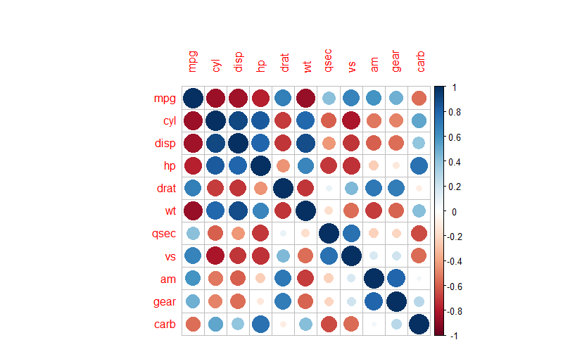
例如上图则为mtcars数据集中各组数据的相关性热图,用颜色来表示不同组别数据的两两相关性,颜色的深浅代表了P值的大小。
环境配置
系统要求: 跨平台(Linux/MacOS/Windows)
编程语言:R
依赖包:
GGally;corrplot;ggcorrplot;corrgram
sessioninfo::session_info("attached")─ Session info ───────────────────────────────────────────────────────────────
setting value
version R version 4.6.0 (2026-04-24)
os Ubuntu 24.04.4 LTS
system x86_64, linux-gnu
ui X11
language (EN)
collate C.UTF-8
ctype C.UTF-8
tz UTC
date 2026-05-09
pandoc 3.1.3 @ /usr/bin/ (via rmarkdown)
quarto 1.9.37 @ /usr/local/bin/quarto
─ Packages ───────────────────────────────────────────────────────────────────
package * version date (UTC) lib source
corrgram * 1.14 2021-04-29 [1] RSPM
corrplot * 0.95 2024-10-14 [1] RSPM
GGally * 2.4.0 2025-08-23 [1] RSPM
ggcorrplot * 0.1.4.1 2023-09-05 [1] RSPM
ggplot2 * 4.0.3.9000 2026-05-04 [1] Github (tidyverse/ggplot2@6870419)
[1] /home/runner/work/_temp/Library
[2] /opt/R/4.6.0/lib/R/site-library
[3] /opt/R/4.6.0/lib/R/library
* ── Packages attached to the search path.
──────────────────────────────────────────────────────────────────────────────数据准备
相关性热图主要应用内置数据集进行绘图。
data("flea", package = "GGally")
data_flea <- flea

data("mtcars", package = "datasets")
data_mtcars <- mtcars

data("tips", package = "GGally")
data_tips <- tips
可视化
1. GGally 包
GGally是常用的相关性图绘制工具,允许注入ggplot2代码,但不具有排序功能。
基础相关图绘制
ggpairs(data_flea, columns = 2:5)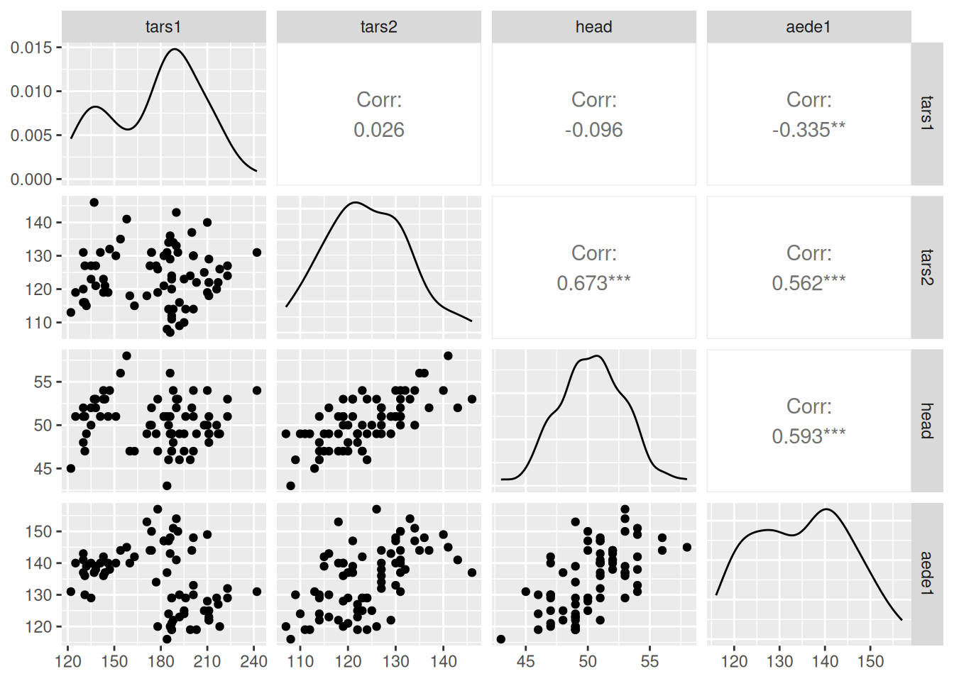
上图展示了
flea数据集各组数据的相关性可视化。图片共有三部分:下半部分的对应两组数据的相关散点图;对角线的单组数据密度图;上半部分的对应两组数据的Pearson相关系数值。
注入 ggplot2 代码,为每个类别着色
ggpairs(data_flea, columns = 2:4, ggplot2::aes(colour=species,alpha=0.7)) 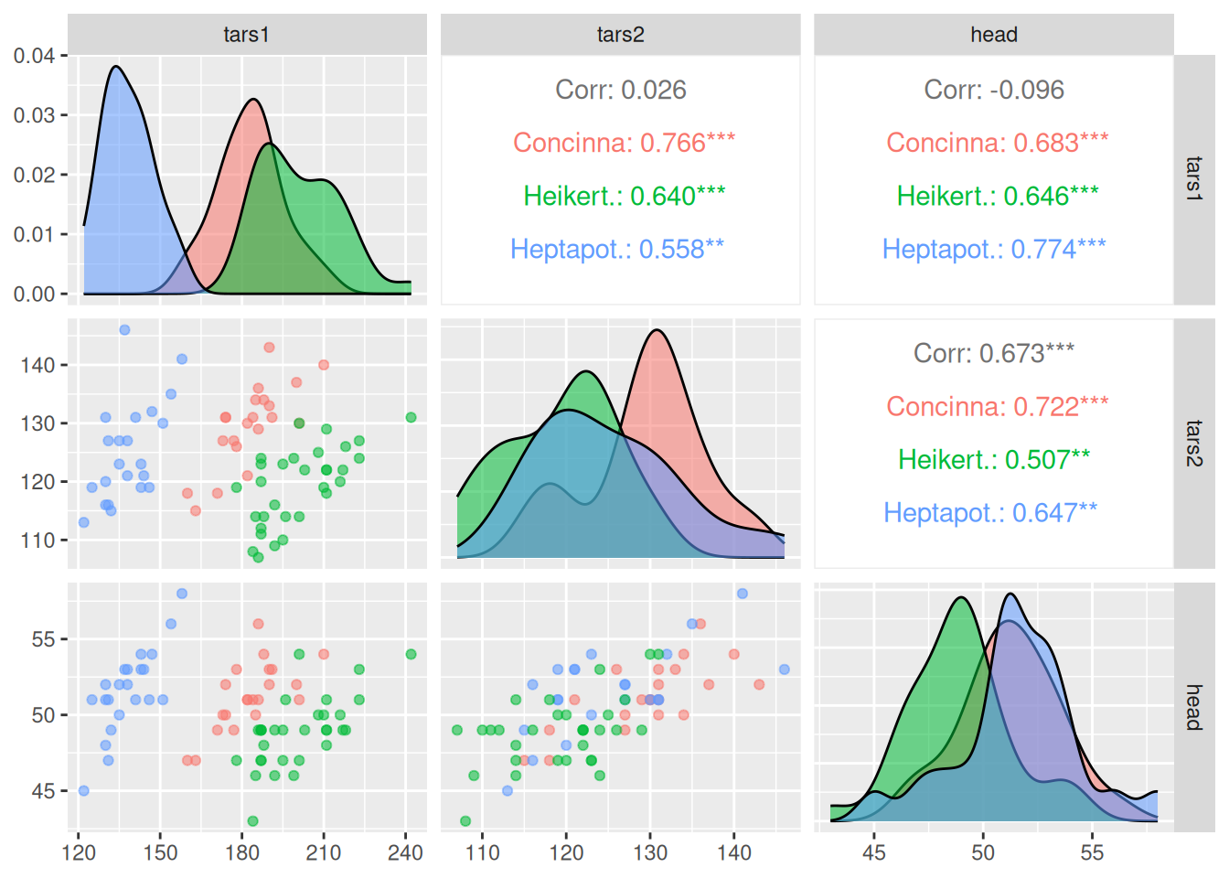
上图在进行相关性可视化的基础上,对各个类别进行了颜色分类。
自定义绘图类型
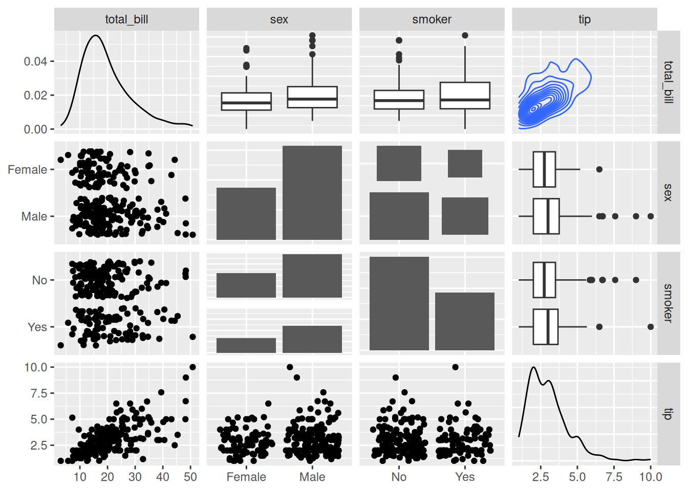
ggpairs(data_tips[, c(1, 3, 4, 2)])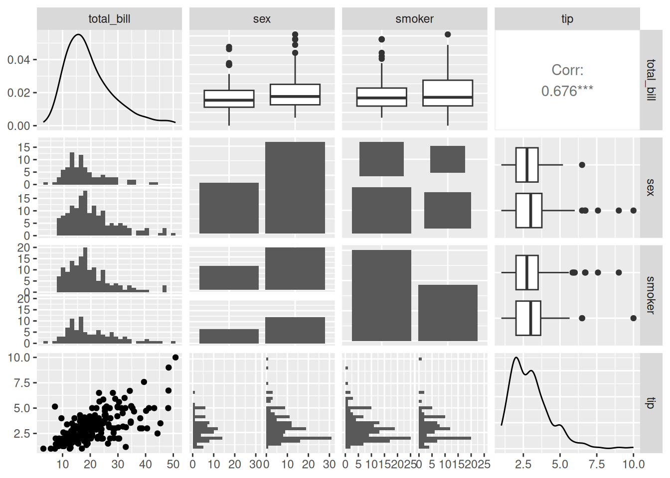
summary(data_tips) total_bill tip sex smoker day time
Min. : 3.07 Min. : 1.000 Female: 87 No :151 Fri :19 Dinner:176
1st Qu.:13.35 1st Qu.: 2.000 Male :157 Yes: 93 Sat :87 Lunch : 68
Median :17.80 Median : 2.900 Sun :76
Mean :19.79 Mean : 2.998 Thur:62
3rd Qu.:24.13 3rd Qu.: 3.562
Max. :50.81 Max. :10.000
size
Min. :1.00
1st Qu.:2.00
Median :2.00
Mean :2.57
3rd Qu.:3.00
Max. :6.00 上图中,
tatal_bill与tip为定量数据,sex与smoker为定性数据。下半部分主要根据数据类型的不同绘制了两两相关的散点图、直方图和直条图;对角线部分则为各组数据的分布图;上半部分根据数据类型分别绘制了两两相关的线形图,对于两个定量数据则给出了Pearson相关系数值。
# Changing the plotting type
ggpairs(
  data_tips[, c(1, 3, 4, 2)],
  upper = list(continuous = "density",
               combo = "box_no_facet"),
  lower = list(continuous = "points",
               combo = "dot_no_facet")
)
通过自定义,将下半部分的直方图修改为散点图,上半部分的相关系数值修改为密度图。
相关性可视化
将相关系数可视化呈现。
ggcorr(data_mtcars) # 绘制相关系数热图,默认为Pearson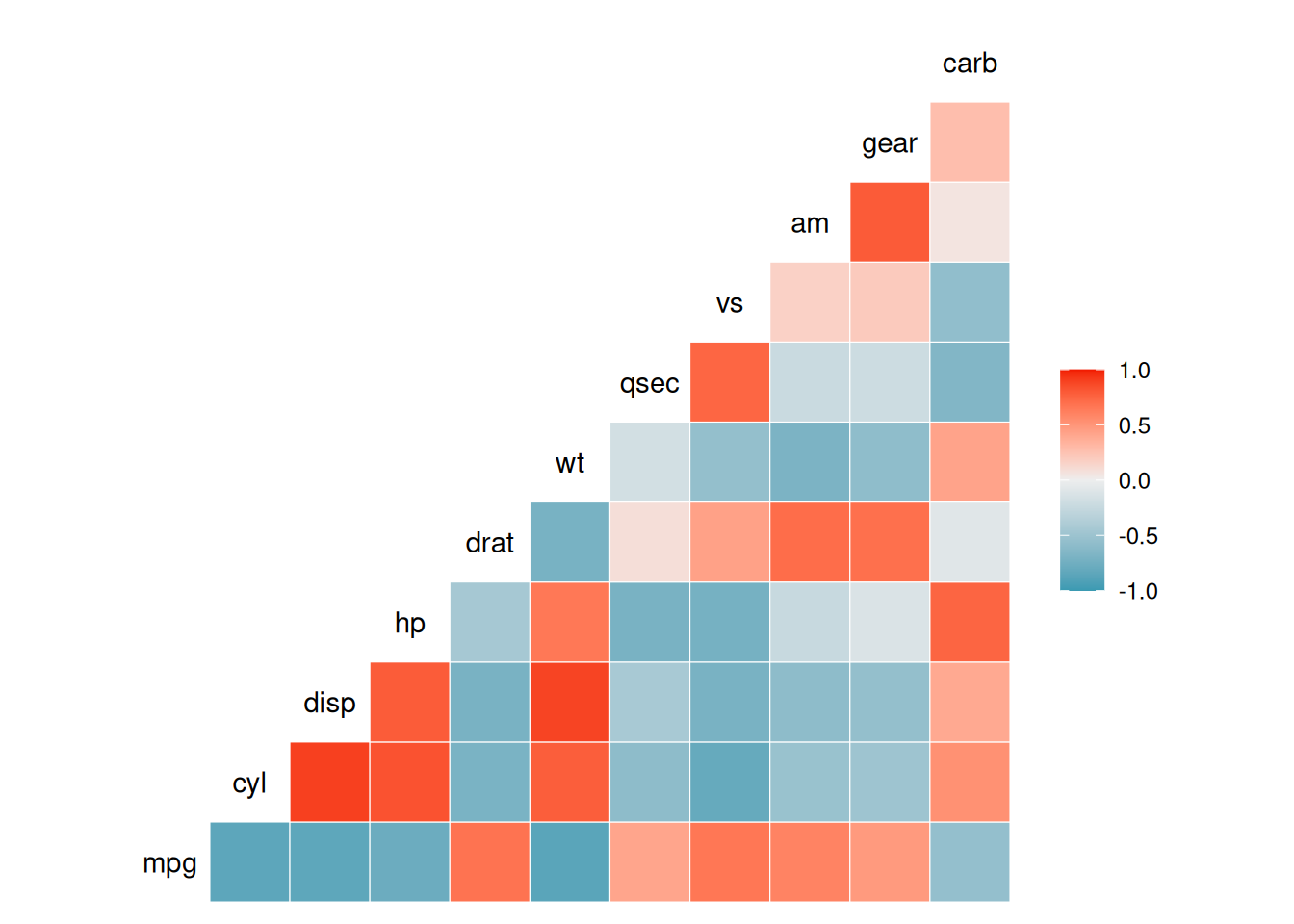
上图通过
ggcorr()函数进行相关系数可视化
ggcorr的method参数:默认为
c("pairwise","pearson")的形式,第一个参数为确定协方差计算时对于缺失值的处理,第二个参数则用于确定相关系数的类型,比如"pearson","kendall","spearman"
2. corrplot 包
corrplot包是常用的相关性可视化工具,其具有强大的自定义功能和排序功能。
基础绘图
corr <- cor(data_mtcars)
corrplot(corr)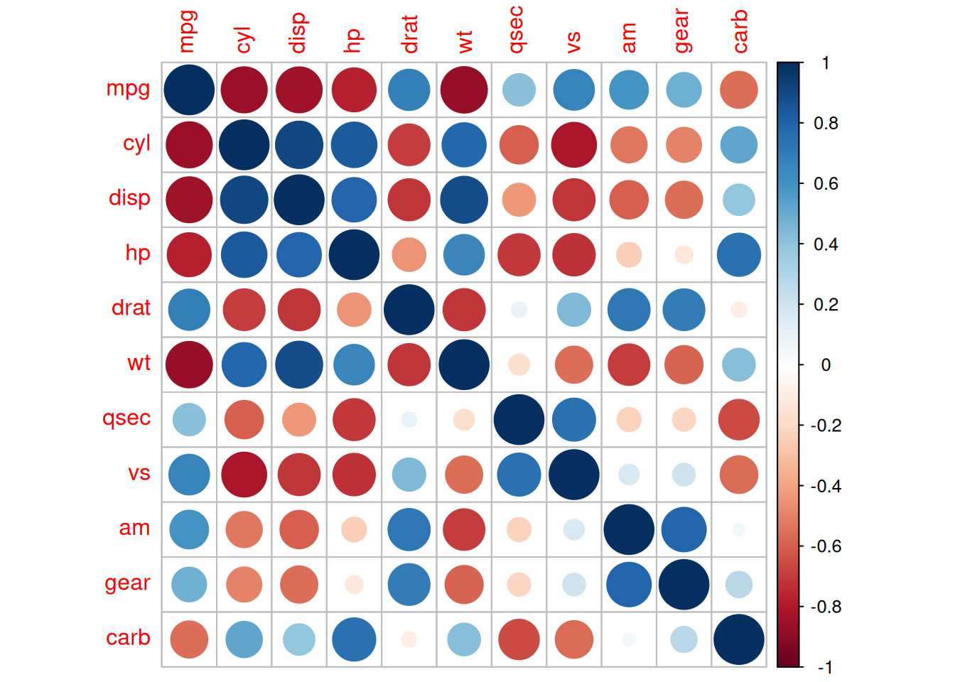
参数自定义
corrplot()的主要关键参数:
corr需要可视化的相关系数矩阵
method可视化的形状
type显示范围(full 、lower、upper)
col图形展示的颜色
addCoef.col相关系数值的颜色
order相关系数排序方法
is.corr是否为相关系数绘图,默认为TRUE,同样也可以实现非相关系数的可视化,只需使该参数设为FALSE即可……
corrplot(corr,method = "ellipse" ,# method,指定可视化形状
         order = "AOE", # order,相关系数排序方式
         addCoef.col="black", # 指定相关系数颜色
         type="lower") # 指定显示部位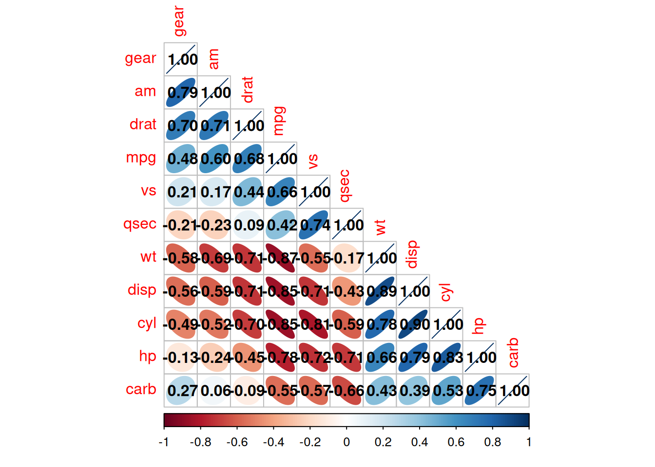
上图为
mtcars数据集的相关系数热图。
type="lower"指定显示热图的下半部分。颜色的深浅代表相关系数的大小。
椭圆的形状表示相关系数:离心率越大,椭圆越扁,相关系数绝对值较大;离心率越小,椭圆越圆,相关系数绝对值较小。椭圆长轴的方向表示相关系数的正负,右上-左下方向对应正值,左上-右下方向对应负值。
添加显著性标签
res1 <-cor.mtest(data_mtcars, conf.level= .95)
corrplot(corr, method= "circle",
         p.mat= res1$p, sig.level= 0.01, # p值大于0.01被认为无统计学意义
         mar= c(1,1,1,1))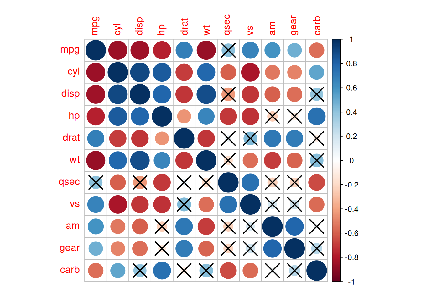
上图在相关系数热图的基础上添加了显著性标签,P值大于0.01视为无统计学意义。
3. ggcorrplot 包
ggcorrplot包相当于corrplot包的精简版,主要包括cor_pmat计算功能和ggcorrplot绘图功能。
cor_pmat计算p值
p.mat <- cor_pmat(data_mtcars)
head(p.mat[, 1:6])
mpg cyl disp hp drat
mpg 0.000000e+00 6.112687e-10 9.380327e-10 1.787835e-07 1.776240e-05
cyl 6.112687e-10 0.000000e+00 1.802838e-12 3.477861e-09 8.244636e-06
disp 9.380327e-10 1.802838e-12 0.000000e+00 7.142679e-08 5.282022e-06
hp 1.787835e-07 3.477861e-09 7.142679e-08 0.000000e+00 9.988772e-03
drat 1.776240e-05 8.244636e-06 5.282022e-06 9.988772e-03 0.000000e+00
wt 1.293959e-10 1.217567e-07 1.222320e-11 4.145827e-05 4.784260e-06
wt
mpg 1.293959e-10
cyl 1.217567e-07
disp 1.222320e-11
hp 4.145827e-05
drat 4.784260e-06
wt 0.000000e+00ggcorrplot绘图
ggcorrplot(corr, method = "square" )Warning: `aes_string()` was deprecated in ggplot2 3.0.0.
ℹ Please use tidy evaluation idioms with `aes()`.
ℹ See also `vignette("ggplot2-in-packages")` for more information.
ℹ The deprecated feature was likely used in the ggcorrplot package.
Please report the issue at <https://github.com/kassambara/ggcorrplot/issues>.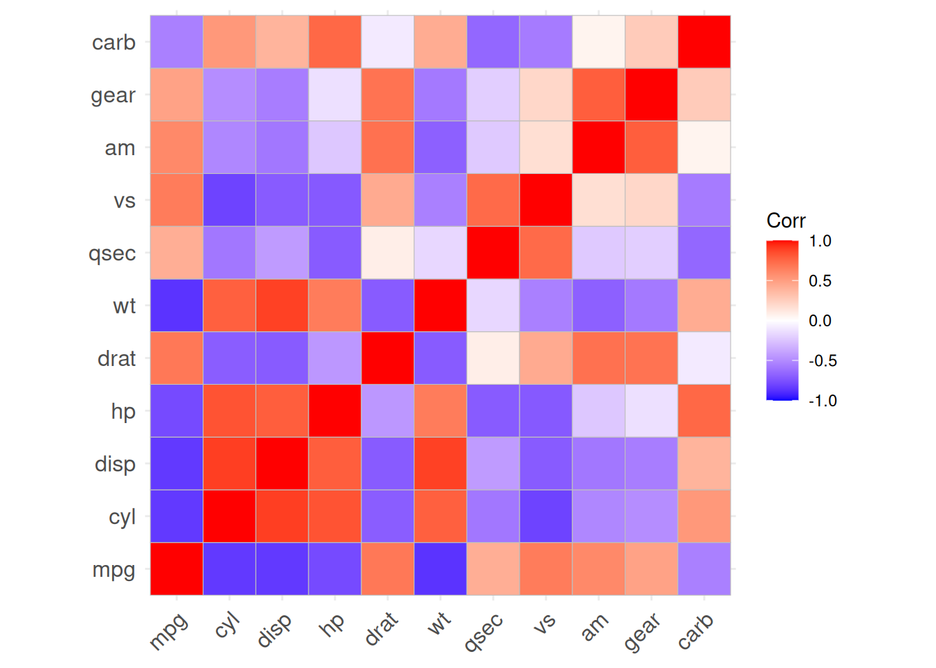
上图为
mtcar数据集相关系数的颜色热图
ggcorrplot(corr, method = "circle" )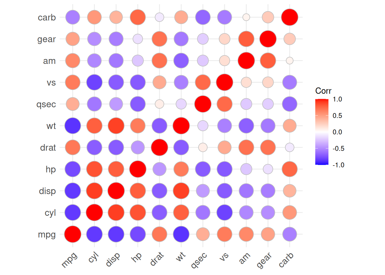
这里我们把绘图类型改为了圆形
4. corrgram 包
corrgram包也是绘制相关图的一个不错选择,它可以选择在上、下和对角线中显示的内容。我们主要利用
corrgram()函数进行相关图的绘制:
cor.method确定相关系数类型pearson(默认),spearman,kendall可以使用不同的方法可视化:
panel.ellipse显示椭圆panel.shade用于色块panel.pie用于饼图panel.pts用于散点图
corrgram(data_mtcars, order=TRUE,
         lower.panel=panel.shade, # 彩色方块
         upper.panel=panel.pie, # 饼图
         text.panel=panel.txt,
main="Car Milage Data in PC2/PC1 Order") 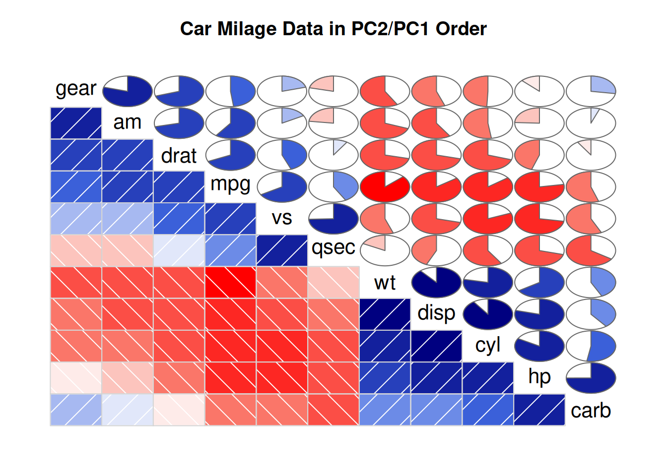
通过
lower.panel=panel.shade,upper.panel=panel.pie将上半部分设置为饼图,下半部分设置为颜色图。
corrgram(data_mtcars, order=TRUE,
         lower.panel=panel.ellipse, # 显示椭圆
         upper.panel=panel.pts,  # 散点图
         text.panel=panel.txt,
         diag.panel=panel.minmax,
main="Car Milage Data in PC2/PC1 Order") 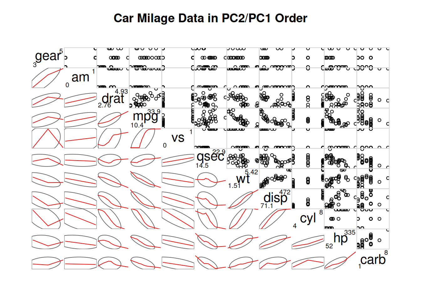
通过
lower.panel=panel.ellipse,upper.panel=panel.pts将上半部分设置为散点图,下半部分设置为椭圆图(其中红线为拟合曲线)。
corrgram(data_mtcars, order=NULL,
         lower.panel=panel.shade, # 彩色方块
         upper.panel=NULL,
         text.panel=panel.txt,
         main="Car Milage Data (unsorted)")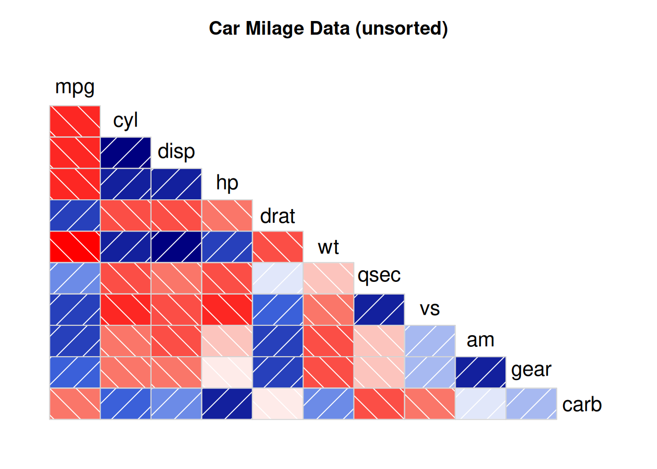
通过
lower.panel=panel.shade,upper.panel=NULL只显示下半部分的颜色图
应用场景
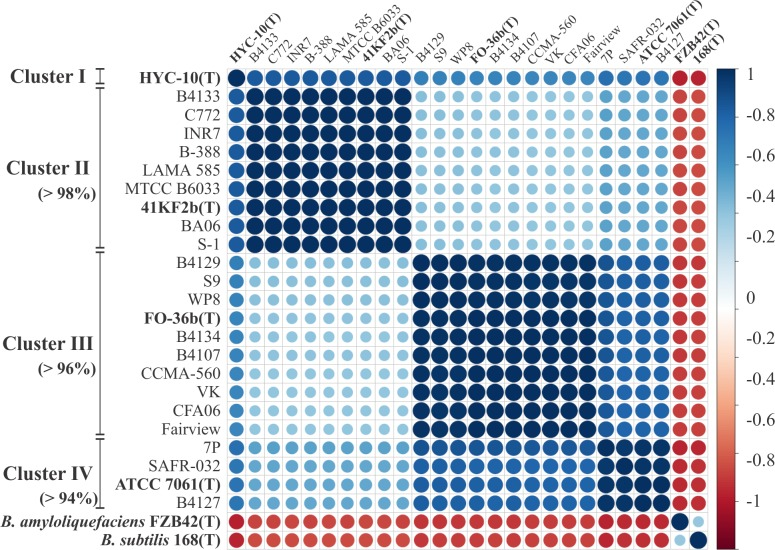
上图为基于菌株 ANI 值的相关图。 使用 JSpecies 软件计算每个指示菌株之间的 ANI 值,并用于Pearson相关矩阵构建。该图显示了使用
corrplot包通过层次聚类构建和排序的相关性。 [1]
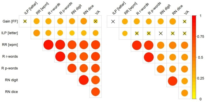
上图展示了Gain [FF]、ILP、wpm、RR、R r-words、R p-words、 RN 、VA之间的相关性。左图显示未排除儿童年级影响的相关性;右图显示分化年级后的相关性。相关性的大小由圆圈的大小(和颜色)表示。使用了
corrplot包进行绘制。 [2]
参考文献
[1] Espariz M, Zuljan FA, Esteban L, Magni C. Taxonomic Identity Resolution of Highly Phylogenetically Related Strains and Selection of Phylogenetic Markers by Using Genome-Scale Methods: The Bacillus pumilus Group Case. PLoS One. 2016 Sep 22;11(9):e0163098. doi: 10.1371/journal.pone.0163098. PMID: 27658251; PMCID: PMC5033322.
[2] Marx C, Hutzler F, Schuster S, Hawelka S. On the Development of Parafoveal Preprocessing: Evidence from the Incremental Boundary Paradigm. Front Psychol. 2016 Apr 14;7:514. doi: 10.3389/fpsyg.2016.00514. PMID: 27148123; PMCID: PMC4830847.
[3] Schloerke B, Cook D, Larmarange J, Briatte F, Marbach M, Thoen E, Elberg A, Crowley J (2024). GGally: Extension to ‘ggplot2’. R package version 2.2.1, CRAN: Package GGally.
[4] Taiyun Wei and Viliam Simko (2024). R package ‘corrplot’: Visualization of a Correlation Matrix (Version 0.94). Available from GitHub - taiyun/corrplot: A visual exploratory tool on correlation matrix
[5] Kassambara A (2023). ggcorrplot: Visualization of a Correlation Matrix using ‘ggplot2’. R package version 0.1.4.1, CRAN: Package ggcorrplot.
[6] Wright K (2021). corrgram: Plot a Correlogram. R package version 1.14, CRAN: Package corrgram.