# 安装包
if (!requireNamespace("data.table", quietly = TRUE)) {
  install.packages("data.table")
}
if (!requireNamespace("jsonlite", quietly = TRUE)) {
  install.packages("jsonlite")
}
if (!requireNamespace("ggplot2", quietly = TRUE)) {
  install.packages("ggplot2")
}
if (!requireNamespace("ggisoband", quietly = TRUE)) {
  remotes::install_github("clauswilke/ggisoband")
}

# 加载包
library(data.table)
library(jsonlite)
library(ggplot2)
library(ggisoband)等高线图 (XY)
注记
Hiplot 网站
本页面为 Hiplot Contour (XY) 插件的源码版本教程,您也可以使用 Hiplot 网站实现无代码绘图,更多信息请查看以下链接:
等高线图 (XY) 是一种通过等高线反映数据密集程度的数据处理方式。
环境配置
系统: Cross-platform (Linux/MacOS/Windows)
编程语言: R
依赖包:
data.table;jsonlite;ggplot2;ggisoband
sessioninfo::session_info("attached")─ Session info ───────────────────────────────────────────────────────────────
setting value
version R version 4.6.0 (2026-04-24)
os Ubuntu 24.04.4 LTS
system x86_64, linux-gnu
ui X11
language (EN)
collate C.UTF-8
ctype C.UTF-8
tz UTC
date 2026-05-09
pandoc 3.1.3 @ /usr/bin/ (via rmarkdown)
quarto 1.9.37 @ /usr/local/bin/quarto
─ Packages ───────────────────────────────────────────────────────────────────
package * version date (UTC) lib source
data.table * 1.18.4 2026-05-06 [1] RSPM
ggisoband * 0.0.0.9000 2026-05-04 [1] Github (clauswilke/ggisoband@eef779f)
ggplot2 * 4.0.3.9000 2026-05-04 [1] Github (tidyverse/ggplot2@6870419)
jsonlite * 2.0.0 2025-03-27 [1] RSPM
[1] /home/runner/work/_temp/Library
[2] /opt/R/4.6.0/lib/R/site-library
[3] /opt/R/4.6.0/lib/R/library
* ── Packages attached to the search path.
──────────────────────────────────────────────────────────────────────────────数据准备
载入数据为两个变量。
# 加载数据
data <- data.table::fread(jsonlite::read_json("https://hiplot.cn/ui/basic/contour-xy/data.json")$exampleData$textarea[[1]])
data <- as.data.frame(data)

# 整理数据格式
colnames(data) <- c("xvalue", "yvalue")

# 查看数据
head(data)
xvalue yvalue
1 2.620 110
2 2.875 110
3 2.320 93
4 3.215 110
5 3.440 175
6 3.460 105可视化
# 等高线图 (XY)
p <- ggplot(data, aes(xvalue, yvalue)) +
  geom_density_bands(
    alpha = 1,
    aes(fill = stat(density)), color = "gray40", size = 0.2
    ) +
  geom_point(alpha = 1, shape = 21, fill = "white") +
  scale_fill_viridis_c(guide = "legend") +
  ylab("value2") +
  xlab("value1") +
  ggtitle("Contour-XY Plot") +
  theme_bw() +
  theme(text = element_text(family = "Arial"),
        plot.title = element_text(size = 12,hjust = 0.5),
        axis.title = element_text(size = 12),
        axis.text = element_text(size = 10),
        axis.text.x = element_text(angle = 0, hjust = 0.5,vjust = 1),
        legend.position = "right",
        legend.direction = "vertical",
        legend.title = element_text(size = 10),
        legend.text = element_text(size = 10))

p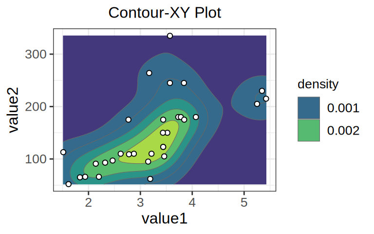
正如地理上的等高线代表不同高度一样,等高线图上的不同等高线代表不同密度,越靠中心,等高线圈越小,代表其区域数据密度程度越高。如:黄色区域数据密集程度最高,而蓝色区域数据密集程度最低。