# 安装包
if (!requireNamespace("data.table", quietly = TRUE)) {
  install.packages("data.table")
}
if (!requireNamespace("jsonlite", quietly = TRUE)) {
  install.packages("jsonlite")
}
if (!requireNamespace("ggplot2", quietly = TRUE)) {
  install.packages("ggplot2")
}

# 加载包
library(data.table)
library(jsonlite)
library(ggplot2)环形饼图
注记
Hiplot 网站
本页面为 Hiplot Circular Pie Chart 插件的源码版本教程,您也可以使用 Hiplot 网站实现无代码绘图,更多信息请查看以下链接:
饼图的另一种形式
环境配置
系统: Cross-platform (Linux/MacOS/Windows)
编程语言: R
依赖包:
data.table;jsonlite;ggplot2
sessioninfo::session_info("attached")─ Session info ───────────────────────────────────────────────────────────────
setting value
version R version 4.6.0 (2026-04-24)
os Ubuntu 24.04.4 LTS
system x86_64, linux-gnu
ui X11
language (EN)
collate C.UTF-8
ctype C.UTF-8
tz UTC
date 2026-05-09
pandoc 3.1.3 @ /usr/bin/ (via rmarkdown)
quarto 1.9.37 @ /usr/local/bin/quarto
─ Packages ───────────────────────────────────────────────────────────────────
package * version date (UTC) lib source
data.table * 1.18.4 2026-05-06 [1] RSPM
ggplot2 * 4.0.3.9000 2026-05-04 [1] Github (tidyverse/ggplot2@6870419)
jsonlite * 2.0.0 2025-03-27 [1] RSPM
[1] /home/runner/work/_temp/Library
[2] /opt/R/4.6.0/lib/R/site-library
[3] /opt/R/4.6.0/lib/R/library
* ── Packages attached to the search path.
──────────────────────────────────────────────────────────────────────────────数据准备
# 加载数据
data <- data.table::fread(jsonlite::read_json("https://hiplot.cn/ui/basic/circular-pie-chart/data.json")$exampleData$textarea[[1]])
data <- as.data.frame(data)
# 整理数据格式
data$draw_percent <- data[["values"]] / sum(data[["values"]]) * 100
data$draw_class <- 1
data2 <- data
data2[["values"]] <- 0
data2$draw_class <- 0
data <- rbind(data, data2)
filtered_data <- data[data[["values"]] > 0,]
# 查看数据
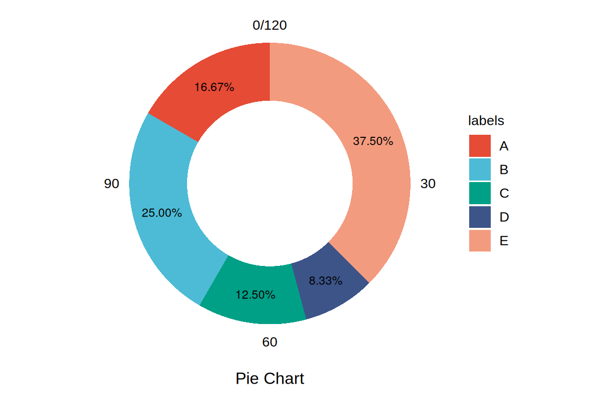
head(data) labels values draw_percent draw_class
1 A 20 16.666667 1
2 B 30 25.000000 1
3 C 15 12.500000 1
4 D 10 8.333333 1
5 E 45 37.500000 1
6 A 0 16.666667 0可视化
# 环形饼图
p <- ggplot(data, aes(x = draw_class, y = values, fill = labels)) +
  geom_bar(position = "stack", stat = "identity", width = 0.7) +
  geom_text(data = filtered_data, aes(label = sprintf("%.2f%%", draw_percent)),
            position = position_stack(vjust = 0.5), size = 3) +
  coord_polar(theta = "y") +
  xlab("") +
  ylab("Pie Chart") +
  scale_fill_manual(values = c("#e64b35ff","#4dbbd5ff","#00a087ff","#3c5488ff","#f39b7fff")) +
  theme_minimal() +
  theme(text = element_text(family = "Arial"),
        plot.title = element_text(size = 12,hjust = 0.5),
        axis.title = element_text(size = 12),
        axis.text = element_text(size = 10),
        axis.text.x = element_text(color = "black"),
        axis.text.y = element_blank(),
        legend.position = "right",
        legend.direction = "vertical",
        legend.title = element_text(size = 10),
        legend.text = element_text(size = 10),
        panel.grid.major = element_blank(),
        panel.grid.minor = element_blank())

p