# 安装包
if (!requireNamespace("sf", quietly = TRUE)) {
  install.packages("sf")
}
if (!requireNamespace("rnaturalearth", quietly = TRUE)) {
  install.packages("rnaturalearth")
}
if (!requireNamespace("rnaturalearthdata", quietly = TRUE)) {
  install.packages("rnaturalearthdata")
}
if (!requireNamespace("gstat", quietly = TRUE)) {
  install.packages("gstat")
}
if (!requireNamespace("dplyr", quietly = TRUE)) {
  install.packages("dplyr")
}
if (!requireNamespace("ggplot2", quietly = TRUE)) {
  install.packages("ggplot2")
}
if (!requireNamespace("ggspatial", quietly = TRUE)) {
  install.packages("ggspatial")
}
if (!requireNamespace("ggnewscale", quietly = TRUE)) {
  install.packages("ggnewscale")
}
if (!requireNamespace("ggrepel", quietly = TRUE)) {
  install.packages("ggrepel")
}
if (!requireNamespace("ggfx", quietly = TRUE)) {
  install.packages("ggfx")
}
if (!requireNamespace("doParallel", quietly = TRUE)) {
  install.packages("doParallel")
}
if (!requireNamespace("viridis", quietly = TRUE)) {
  install.packages("viridis")
}

# 加载包
library(sf)
library(rnaturalearth)
library(rnaturalearthdata)
library(gstat)
library(dplyr)
library(ggplot2)
library(ggspatial)
library(ggnewscale)
library(ggrepel)
library(ggfx)
library(doParallel)
library(viridis)人口图
示例
展示疾病发病率的地理分布,颜色深浅表示发病率高低,地图边界表示行政区划。
环境配置
系统: 跨平台(Linux/MacOS/Windows)
编程语言: R
依赖包:
sf;rnaturalearth;rnaturalearthdata;gstat;dplyr;ggplot2;ggspatial;ggnewscale;ggrepel;ggfx;doParallel;viridis
sessioninfo::session_info("attached")─ Session info ───────────────────────────────────────────────────────────────
setting value
version R version 4.6.0 (2026-04-24)
os Ubuntu 24.04.4 LTS
system x86_64, linux-gnu
ui X11
language (EN)
collate C.UTF-8
ctype C.UTF-8
tz UTC
date 2026-05-09
pandoc 3.1.3 @ /usr/bin/ (via rmarkdown)
quarto 1.9.37 @ /usr/local/bin/quarto
─ Packages ───────────────────────────────────────────────────────────────────
package * version date (UTC) lib source
doParallel * 1.0.17 2022-02-07 [1] RSPM
dplyr * 1.2.1 2026-04-03 [1] RSPM
foreach * 1.5.2 2022-02-02 [1] RSPM
ggfx * 1.0.3 2025-09-03 [1] RSPM
ggnewscale * 0.5.2 2025-06-20 [1] RSPM
ggplot2 * 4.0.3.9000 2026-05-04 [1] Github (tidyverse/ggplot2@6870419)
ggrepel * 0.9.8 2026-03-17 [1] RSPM
ggspatial * 1.1.10 2025-08-24 [1] RSPM
gstat * 2.1-6 2026-03-30 [1] RSPM
iterators * 1.0.14 2022-02-05 [1] RSPM
rnaturalearth * 1.2.0 2026-01-19 [1] RSPM
rnaturalearthdata * 1.0.0 2024-02-09 [1] RSPM
sf * 1.1-1 2026-05-06 [1] RSPM
viridis * 0.6.5 2024-01-29 [1] RSPM
viridisLite * 0.4.3 2026-02-04 [1] RSPM
[1] /home/runner/work/_temp/Library
[2] /opt/R/4.6.0/lib/R/site-library
[3] /opt/R/4.6.0/lib/R/library
* ── Packages attached to the search path.
──────────────────────────────────────────────────────────────────────────────数据准备
# 全球地理数据
world <- ne_countries(scale = "medium", returnclass = "sf")
# 模拟流行病学数据
set.seed(123)
world$incidence <- runif(nrow(world), 0, 100)  # 随机生成发病率数据
可视化
1. 基础绘图
# 全球疾病发病率分布基础地图
p1 <- ggplot(data = world) +
  geom_sf(aes(fill = incidence)) +
  scale_fill_viridis(option = "C") +
  labs(title = "Global Disease Incidence",
       fill = "Incidence Rate\n(per 100k)")

p1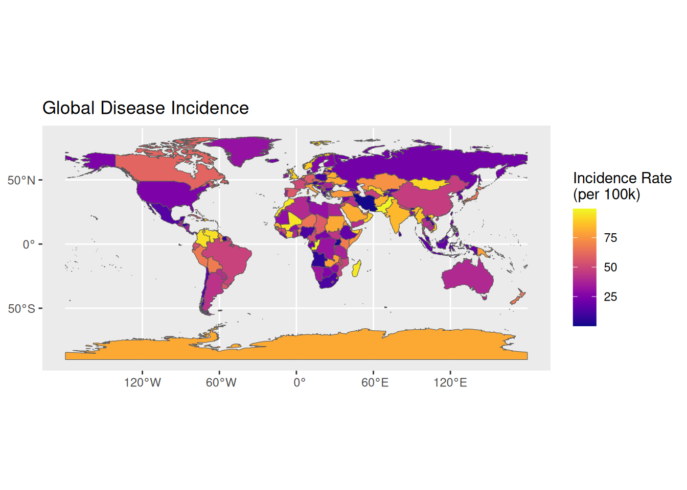
提示
关键参数解析: binwidth / bins aes(fill): 定义颜色映射的流行病学指标
scale_fill_viridis(): 使用无障碍颜色梯度
ne_countries(): 控制地图详细程度的scale参数(small/medium/large)
# 定制化流行病学地图
p2 <- ggplot(data = world) +
  geom_sf(aes(fill = incidence), color = "white", size = 0.2) +
  scale_fill_gradientn(colors = c("#2c7bb6", "#abd9e9", "#ffffbf", "#fdae61", "#d7191c"),
                       breaks = c(20, 40, 60, 80)) +
  # 比例尺
  annotation_scale(
    location = "bl",
    plot_unit = "km",
    style = "ticks",
    width_hint = 0.1
  ) +
  # 指北针(修复后)
  annotation_north_arrow(
    location = "tr",
    which_north = "grid",  # 使用网格北
    style = north_arrow_minimal(
      line_width = 1,
      text_size = 10
    ),
    pad_x = unit(1.2, "cm"),
    pad_y = unit(1.2, "cm")
  ) +
  coord_sf(crs =  "+proj=robin",
           xlim = c(-1.6e7, 1.6e7),
           ylim = c(-7.5e6, 8.5e6),
           expand = FALSE) +  # 使用罗宾森投影
  theme_void() +
  guides(fill = guide_colorbar(barwidth = 1)) +
  labs(fill = "Incidence Rate")+
  theme(
    legend.position = c(0.1, 0.3)  # 相对位置坐标(左下角为0,0)
  )

p2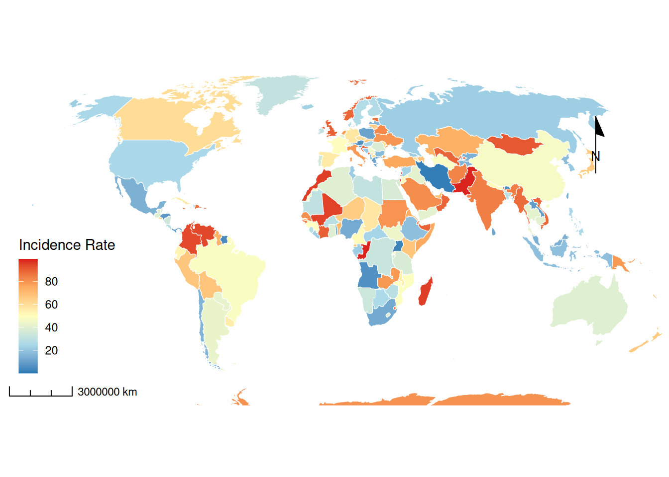
2. 进阶绘图
# 进阶绘图
#进一步处理数据,利用空间点,来推断附近面的情况
#减少计算时间,以下点较少,推算距离越近,分辨率提高,更准确
# 并行初始化
registerDoParallel(cores = 4)

# 数据准备
world_proj <- st_transform(world, "+proj=eqc +units=m")
centroids <- st_centroid(world_proj) %>%
  dplyr::select(incidence)

# 创建低分辨率网格(100x100)
grid <- st_make_grid(world_proj, n = c(100,100)) %>%
  st_as_sf() %>%
  st_join(world_proj, join = st_intersects)

# 变异函数模型优化
variogram_model <- vgm(
  psill = 30,
  model = "Exp",  # 改用指数模型
  range = 2e6,    # 2000公里相关范围
  nugget = 5
)

# 分块并行计算
grid_chunks <- split(grid, cut(st_coordinates(st_centroid(grid))[,1], 4))

krige_result <- foreach(i=1:4, .combine=rbind) %dopar% {
  krige(incidence ~ 1,
        locations = centroids,
        newdata = grid_chunks[[i]],
        model = variogram_model,
        nmax = 30)
} %>% st_as_sf()

# 转换回WGS84坐标系
krige_result <- st_transform(krige_result, 4326)


advanced_map <- ggplot() +
  # 空间插值表面
  geom_sf(data = krige_result,
          aes(fill = var1.pred, color = var1.pred),
          alpha = 0.6) +
  scale_fill_gradientn(
    colors = c("#2c7bb6", "#abd9e9", "#ffffbf", "#fdae61", "#d7191c"),
    name = "Interpolated\nIncidence"
  ) +
  scale_color_gradientn(
    colors = c("#2c7bb6", "#abd9e9", "#ffffbf", "#fdae61", "#d7191c"),
    guide = "none"
  ) +
  ggnewscale::new_scale_fill() +

  # 原始国家边界
  geom_sf(data = world,
          aes(fill = incidence),
          color = "white",
          size = 0.1,
          alpha = 0.5) +
  scale_fill_gradientn(
    colors = c("#2c7bb6", "#abd9e9", "#ffffbf", "#fdae61", "#d7191c"),
    name = "Country\nIncidence",
    breaks = seq(0, 100, 20)
  ) +

  # 3D浮雕效果
  ggfx::with_shadow(
    geom_sf(data = world,
            aes(geometry = geometry),
            color = "grey30",
            fill = NA,
            size = 0.2),
    sigma = 5,
    x_offset = 3,
    y_offset = 3
  ) +

  # 热点标注
  geom_sf(data = world %>% filter(incidence > quantile(incidence, 0.9)),
          color = "red",
          fill = NA,
          size = 0.5) +
  ggrepel::geom_label_repel(
    data = world %>% filter(incidence > quantile(incidence, 0.9)),
    aes(label = name, geometry = geometry),
    stat = "sf_coordinates",
    size = 2.5,
    box.padding = 0.2,
    min.segment.length = 0,
    fill = alpha("white", 0.8)
  ) +

  # 地图元素
  annotation_north_arrow(
    location = "tr",
    width = unit(1.2, "cm"),   # 新增宽度参数
    height = unit(1.2, "cm"),  # 新增高度参数
    style = north_arrow_minimal()  # 移除尺寸参数
  ) +

  # 坐标投影
  coord_sf(crs = "+proj=robin") +

  # 主题设置
  theme_void() +
  theme(
    legend.position = c(0.12, 0.3),
    legend.background = element_rect(fill = alpha("white", 0.8), color = NA),
    plot.title = element_text(hjust = 0.5, face = "bold", size = 16),
    panel.background = element_rect(fill = "#F0F8FF")
  ) +
  labs(title = "Advanced Spatial Distribution of Disease Incidence")

advanced_map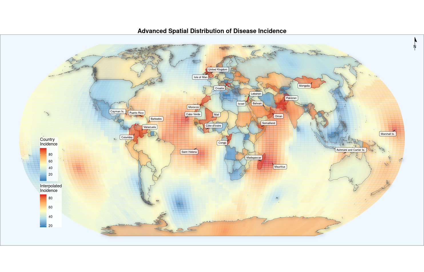
如果你有需要的话可以选择使用callout-tip添加对参数的详细描述。
应用
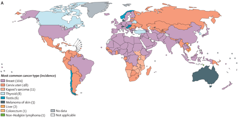
人口图应用
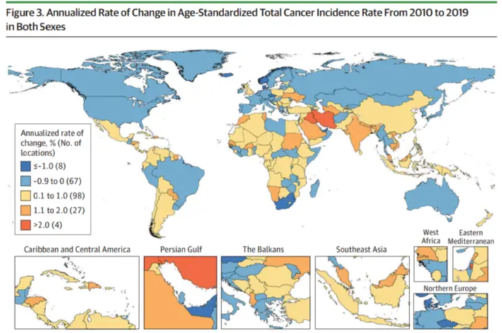
该图显示了全球各国常见肿瘤的差异。 [1]
参考资料
[1] Global Burden of Disease 2019 Cancer Collaboration; Kocarnik JM, Compton K, Dean FE, et al. Cancer Incidence, Mortality, Years of Life Lost, Years Lived With Disability, and Disability-Adjusted Life Years for 29 Cancer Groups From 2010 to 2019: A Systematic Analysis for the Global Burden of Disease Study 2019. JAMA Oncol. 2022;8(3):420-444. https://doi.org/10.1001/jamaoncol.2021.6987
[2] Fidler MM, Gupta S, Soerjomataram I, Ferlay J, Steliarova-Foucher E, Bray F. Cancer incidence and mortality among young adults aged 20-39 years worldwide in 2012: a population-based study. Lancet Oncol. 2017;18(12):1579-1589. https://doi.org/10.1016/S1470-2045(17)30677-0
[3] Wickham H, Chang W, Henry L, et al. ggplot2: Create Elegant Data Visualisations Using the Grammar of Graphics [Computer software]. (Version 3.4.0). 2022. https://ggplot2.tidyverse.org/reference/ggsf.html