# 安装包
if (!requireNamespace("data.table", quietly = TRUE)) {
  install.packages("data.table")
}
if (!requireNamespace("jsonlite", quietly = TRUE)) {
  install.packages("jsonlite")
}
if (!requireNamespace("ggpubr", quietly = TRUE)) {
  install.packages("ggpubr")
}

# 加载包
library(data.table)
library(jsonlite)
library(ggpubr)滑珠图
注记
Hiplot 网站
本页面为 Hiplot Dotchart 插件的源码版本教程,您也可以使用 Hiplot 网站实现无代码绘图,更多信息请查看以下链接:
滑珠图是一种珠子在柱上滑行的图形,是条形图与散点图的叠加。
环境配置
系统: Cross-platform (Linux/MacOS/Windows)
编程语言: R
依赖包:
data.table;jsonlite;ggpubr
sessioninfo::session_info("attached")─ Session info ───────────────────────────────────────────────────────────────
setting value
version R version 4.6.0 (2026-04-24)
os Ubuntu 24.04.4 LTS
system x86_64, linux-gnu
ui X11
language (EN)
collate C.UTF-8
ctype C.UTF-8
tz UTC
date 2026-05-09
pandoc 3.1.3 @ /usr/bin/ (via rmarkdown)
quarto 1.9.37 @ /usr/local/bin/quarto
─ Packages ───────────────────────────────────────────────────────────────────
package * version date (UTC) lib source
data.table * 1.18.4 2026-05-06 [1] RSPM
ggplot2 * 4.0.3.9000 2026-05-04 [1] Github (tidyverse/ggplot2@6870419)
ggpubr * 0.6.3 2026-02-24 [1] RSPM
jsonlite * 2.0.0 2025-03-27 [1] RSPM
[1] /home/runner/work/_temp/Library
[2] /opt/R/4.6.0/lib/R/site-library
[3] /opt/R/4.6.0/lib/R/library
* ── Packages attached to the search path.
──────────────────────────────────────────────────────────────────────────────数据准备
载入数据为基因名称及其对应的基因表达值和分组。
# 加载数据
data <- data.table::fread(jsonlite::read_json("https://hiplot.cn/ui/basic/dotchart/data.json")$exampleData$textarea[[1]])
data <- as.data.frame(data)

# 查看数据
head(data)
Name Value Group
1 BMP2 18.7 Group1
2 XIST 14.3 Group1
3 C19orf38 16.4 Group1
4 PDZD3 17.3 Group1
5 MAPRE2 15.2 Group1
6 IRF4 10.4 Group1可视化
# 滑珠图
p <- ggdotchart(data, x = "Name", y = "Value", group = "Group", color = "Group",
                rotate = T, sorting = "descending",
                y.text.col = F, add = "segments", dot.size = 2) +
  xlab("Name") +
  ylab("Value") +
  ggtitle("DotChart Plot") +
  scale_color_manual(values = c("#e04d39","#5bbad6","#1e9f86")) +
  theme_classic() +
  theme(text = element_text(family = "Arial"),
        plot.title = element_text(size = 12,hjust = 0.5),
        axis.title = element_text(size = 12),
        axis.text = element_text(size = 10),
        axis.text.x = element_text(angle = 0, hjust = 0.5,vjust = 1),
        legend.position = "right",
        legend.direction = "vertical",
        legend.title = element_text(size = 10),
        legend.text = element_text(size = 10))

p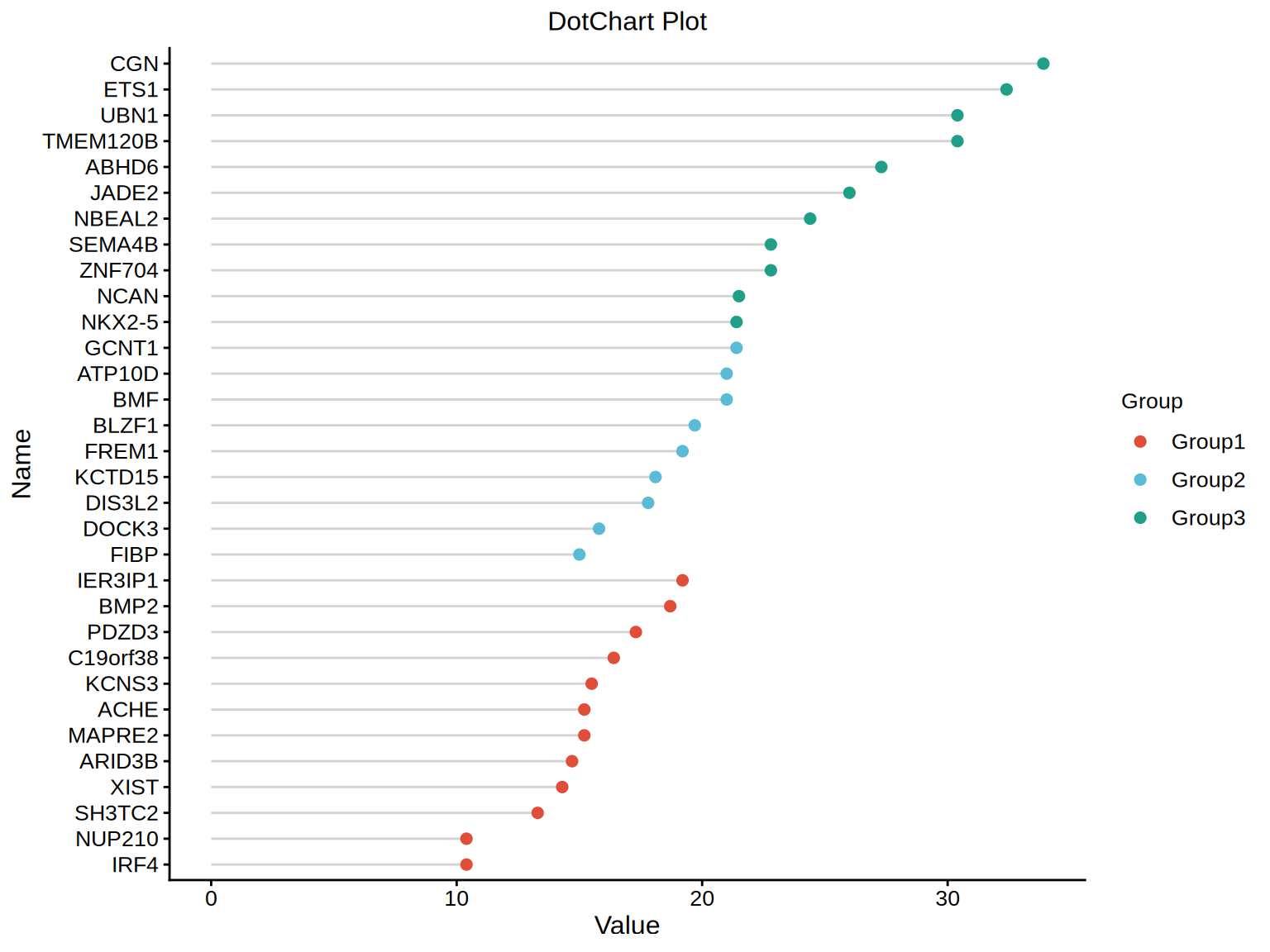
每种颜色表示不同的分组,能够直观了解不同基因表达值的差异。