# 安装包
if (!requireNamespace("data.table", quietly = TRUE)) {
  install.packages("data.table")
}
if (!requireNamespace("jsonlite", quietly = TRUE)) {
  install.packages("jsonlite")
}
if (!requireNamespace("ggplot2", quietly = TRUE)) {
  install.packages("ggplot2")
}
if (!requireNamespace("stringr", quietly = TRUE)) {
  install.packages("stringr")
}

# 加载包
library(data.table)
library(jsonlite)
library(ggplot2)
library(stringr)渐变柱状图
注记
Hiplot 网站
本页面为 Hiplot Barplot Gradient 插件的源码版本教程,您也可以使用 Hiplot 网站实现无代码绘图,更多信息请查看以下链接:
同气泡图相似,不过是在柱状图的基础上,用颜色渐变的长方形同时展示两个变量的可视化图形。
环境配置
系统: Cross-platform (Linux/MacOS/Windows)
编程语言: R
依赖包:
data.table;jsonlite;ggplot2;stringr
sessioninfo::session_info("attached")─ Session info ───────────────────────────────────────────────────────────────
setting value
version R version 4.6.0 (2026-04-24)
os Ubuntu 24.04.4 LTS
system x86_64, linux-gnu
ui X11
language (EN)
collate C.UTF-8
ctype C.UTF-8
tz UTC
date 2026-05-09
pandoc 3.1.3 @ /usr/bin/ (via rmarkdown)
quarto 1.9.37 @ /usr/local/bin/quarto
─ Packages ───────────────────────────────────────────────────────────────────
package * version date (UTC) lib source
data.table * 1.18.4 2026-05-06 [1] RSPM
ggplot2 * 4.0.3.9000 2026-05-04 [1] Github (tidyverse/ggplot2@6870419)
jsonlite * 2.0.0 2025-03-27 [1] RSPM
stringr * 1.6.0 2025-11-04 [1] RSPM
[1] /home/runner/work/_temp/Library
[2] /opt/R/4.6.0/lib/R/site-library
[3] /opt/R/4.6.0/lib/R/library
* ── Packages attached to the search path.
──────────────────────────────────────────────────────────────────────────────数据准备
案例数据,第一列为Go Term(Go语言编号),第二列为基因数,第三列输入pvalue。
# 加载数据
data <- data.table::fread(jsonlite::read_json("https://hiplot.cn/ui/basic/barplot-gradient/data.json")$exampleData$textarea[[1]])
data <- as.data.frame(data)

# 整理数据格式
data[, 1] <- str_to_sentence(str_remove(data[, 1], pattern = "\\w+:\\d+\\W"))
topnum <- 7
data <- data[1:topnum, ]
data[, 1] <- factor(data[, 1], level = rev(unique(data[, 1])))

# 查看数据
head(data)
Term Count PValue
1 Immune response 20 9.61e-08
2 Defense response to bacterium 11 3.02e-06
3 Cell chemotaxis 8 5.14e-06
4 Cell adhesion 17 2.73e-05
5 Complement activation 8 3.56e-05
6 Extracellular matrix organization 11 4.23e-05可视化
# 渐变柱状图
p <- ggplot(data, aes(x = Term, y = Count, fill = -log10(PValue))) +
  geom_bar(stat = "identity") +
  ggtitle("GO BarPlot") +
  scale_fill_continuous(low = "#00438E", high = "#E43535") +
  scale_x_discrete(labels = function(x) {str_wrap(x, width = 65)}) +
  labs(fill = "-log10 (PValue)", y = "Term", x = "Count") +
  coord_flip() +
  theme_bw() +
  theme(text = element_text(family = "Arial"),
        plot.title = element_text(size = 12,hjust = 0.5),
        axis.title = element_text(size = 12),
        axis.text = element_text(size = 10),
        axis.text.x = element_text(angle = 0, hjust = 0.5),
        legend.position = "right",
        legend.direction = "vertical",
        legend.title = element_text(size = 10),
        legend.text = element_text(size = 10))

p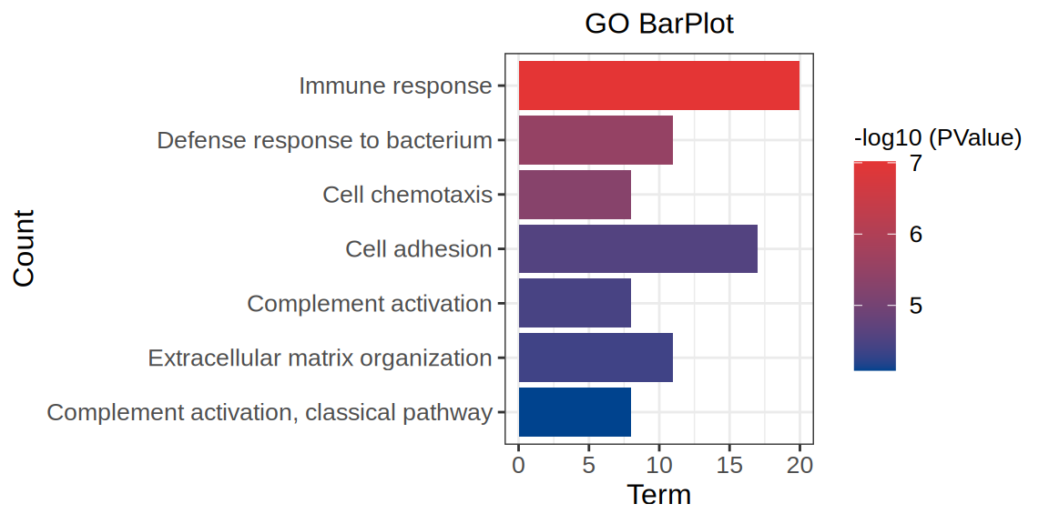
如图示,蓝色为低pvalue颜色,红色为高pvalue颜色,随着pvalue增大颜色由蓝向红渐变。横坐标表示基因数目。